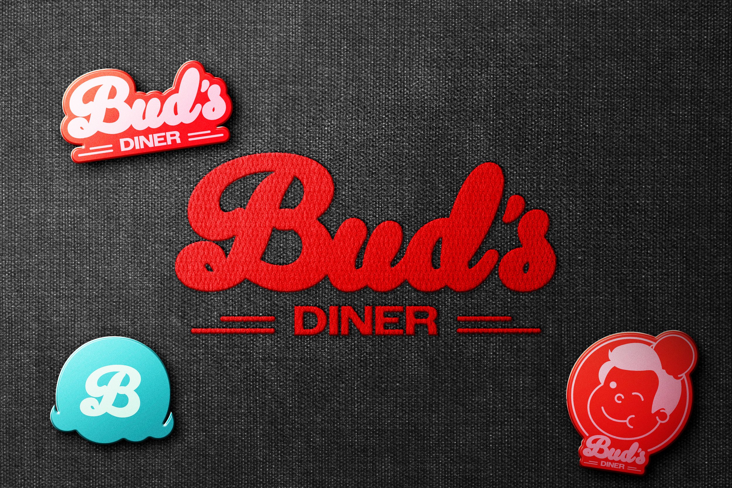
Bud’s Diner
Inspired by mid-century architecture and iconic neon signs, the Bud's Diner logo evokes a bygone era while remaining firmly rooted in the present. The fusion of a classic script with a contemporary sans-serif font reflects the brand's deep dive into Googie and Diner aesthetics. Two minimalist stripes anchor the word "Diner," adding a touch of modernism and geometric flair.
Supporting the logo is Bud, the friendly brand mascot. Inspired by the iconic mascots of mid-century America. Bud will grace everything from burger wrappers to drinks and merchandise, creating a welcoming and familiar presence. The Bud's Diner monogram, inspired by the diner’s famous ice cream floats is used sparingly on social media and advertisements, further strengthening the brand identity.

SPWS logo
Sir William Perkins is a private school located in Surrey. They wanted to refresh their brand, including their logo. The school wanted something modern, fresh and innovative that could be used across posters, booklets, website and even school uniforms. I was fortunate that the SWPS creative lock up I put forward was chosen to be used in the middle of the crest to create the logo.

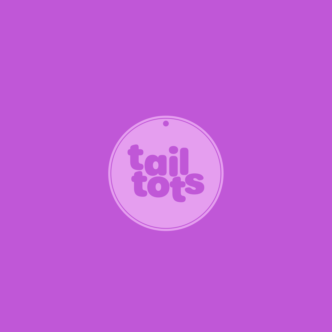
tail tots
The brand identity reflects warmth, trust, and a sense of community through friendly colours, fonts, and occasional illustrations that add personality to stand alone copy. This ethos is also reflected in the logo. Turing a pets tag into a crafted ident serving as a physical token of a pet's cherished place within the family. The logo is subsequently integrated across a range of brand touch-points, including graphic framing devices and illustrative elements.
Trigger
Inspired by the potent combination of turmeric and ginger, our flagship product, the name "Trigger" embodies the energising impact the brand delivers. The brand identity, influenced by Roy Lichtenstein's pop art, is characterised by bold, vibrant colours and a dynamic logo that captures the explosive and bold energy of the product.

Mini Trends
Mini Trends was a new business who were looking to set up, via Instagram, to be a children’s clothing supplier. They were looking for a flexible logo using the M and the T from the brand name. This would then be use online and social as well as on clothes in labels (in the future), and on clothes buttons.
SanPellegrino
Inspired by the Art Nouveau Grand Hotel and Casino of San Pellegrino, the new logo is elegant and modern. The star, a symbol of quality and luxury during the early 20th century, is now integrated into the brand, reflecting San Pellegrino's status as the star of the show.