Pair Dead
Clay Shooting Apparel
Forget stuffy tweeds and dusty shotguns. Pair Dead redefines clay shooting apparel by shifting it from heritage tradition to a bold, high-energy cultural expression.
The category is rooted in tradition, often limiting its relevance to a younger audience. The challenge was to create a brand that felt contemporary and fashion-led, while still retaining credibility within the sport.
The category is rooted in tradition, often limiting its relevance to a younger audience. The challenge was to create a brand that felt contemporary and fashion-led, while still retaining credibility within the sport.
I led the concept and development of the brand, shaping the identity from initial idea through to art direction in collaboration with the managing directors.
Year
2023
Branding
Conceptual
Design
Visual Identity
Art Direction
Layout
Typography
Motion

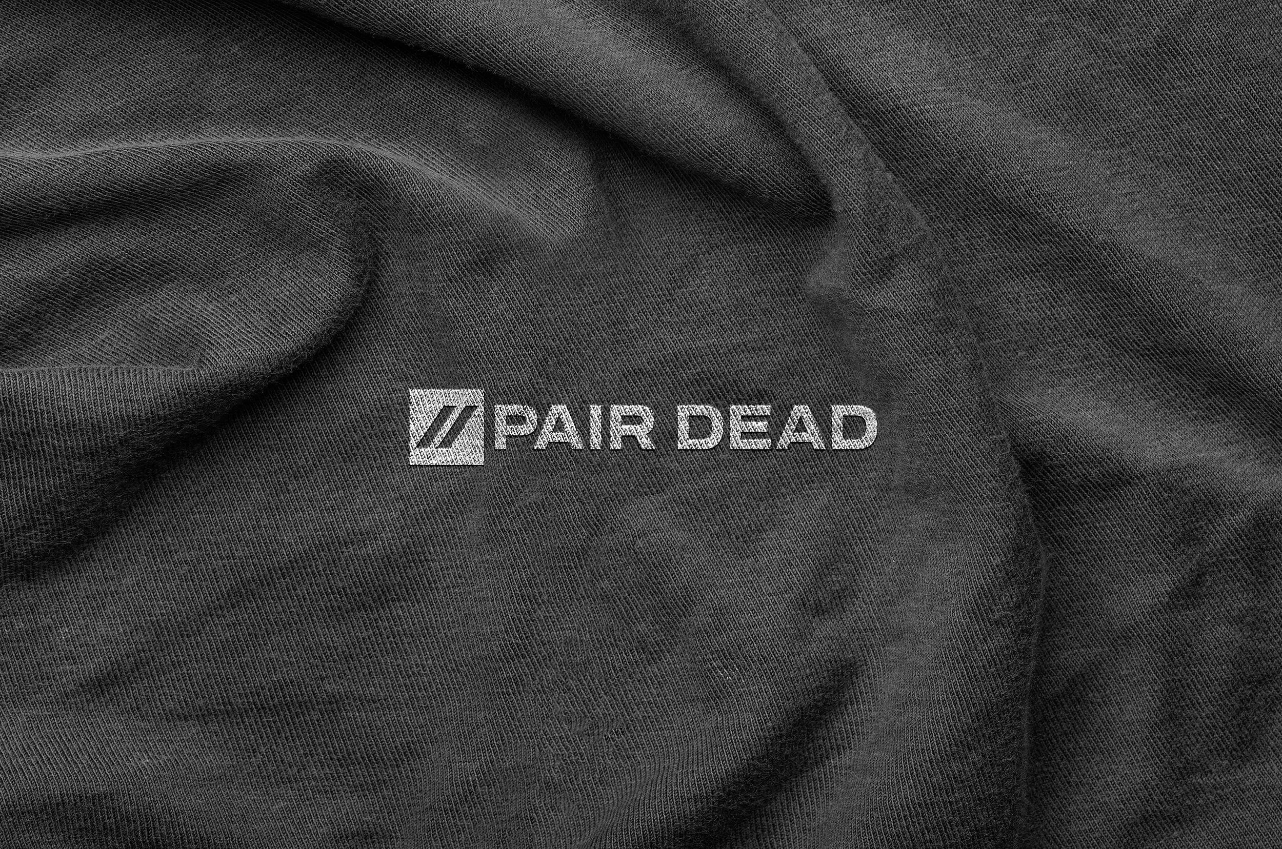
Inspired by the sport’s scoring system, the logo integrates the iconic “dead pair” dashes with a bold, modern twist, creating a mark that feels both distinctive and rooted in the game.
Brand in Action
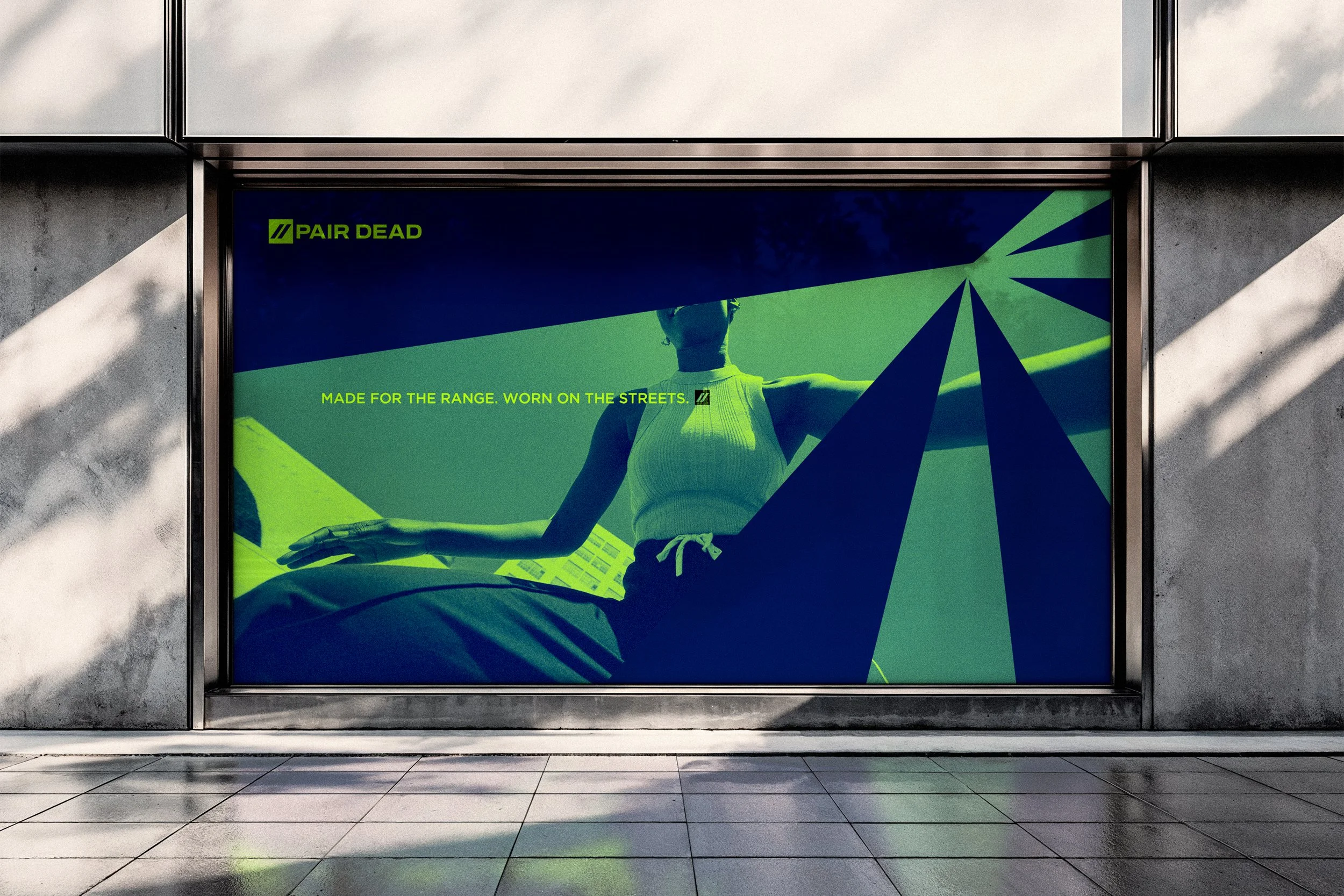
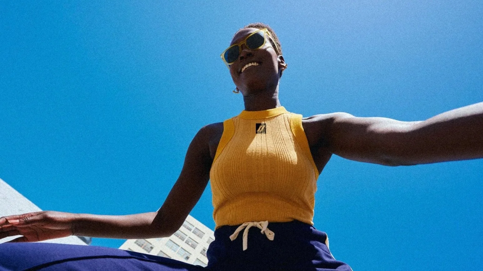
Pair Dead positions clay shooting within a more contemporary, lifestyle-driven space where performance and style exist side by side.
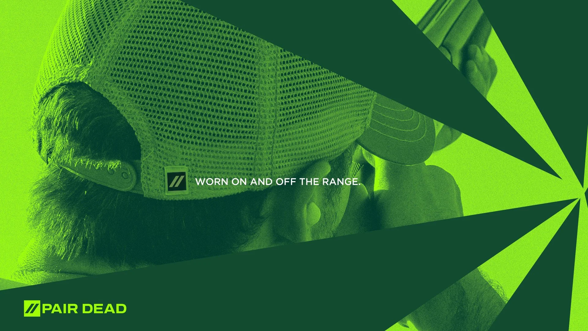
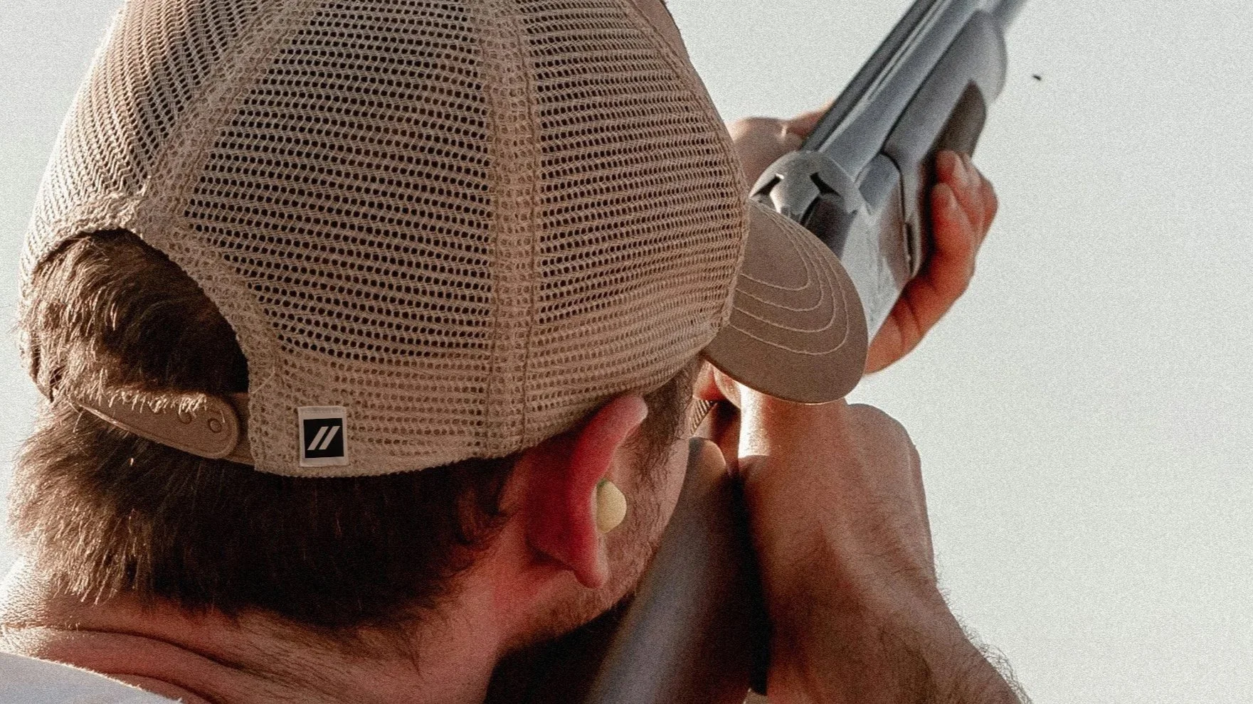
Designed to be worn both on and off the range, the identity gives athletes a way to express the brand beyond the sport itself, creating a more relevant and culturally connected presence.
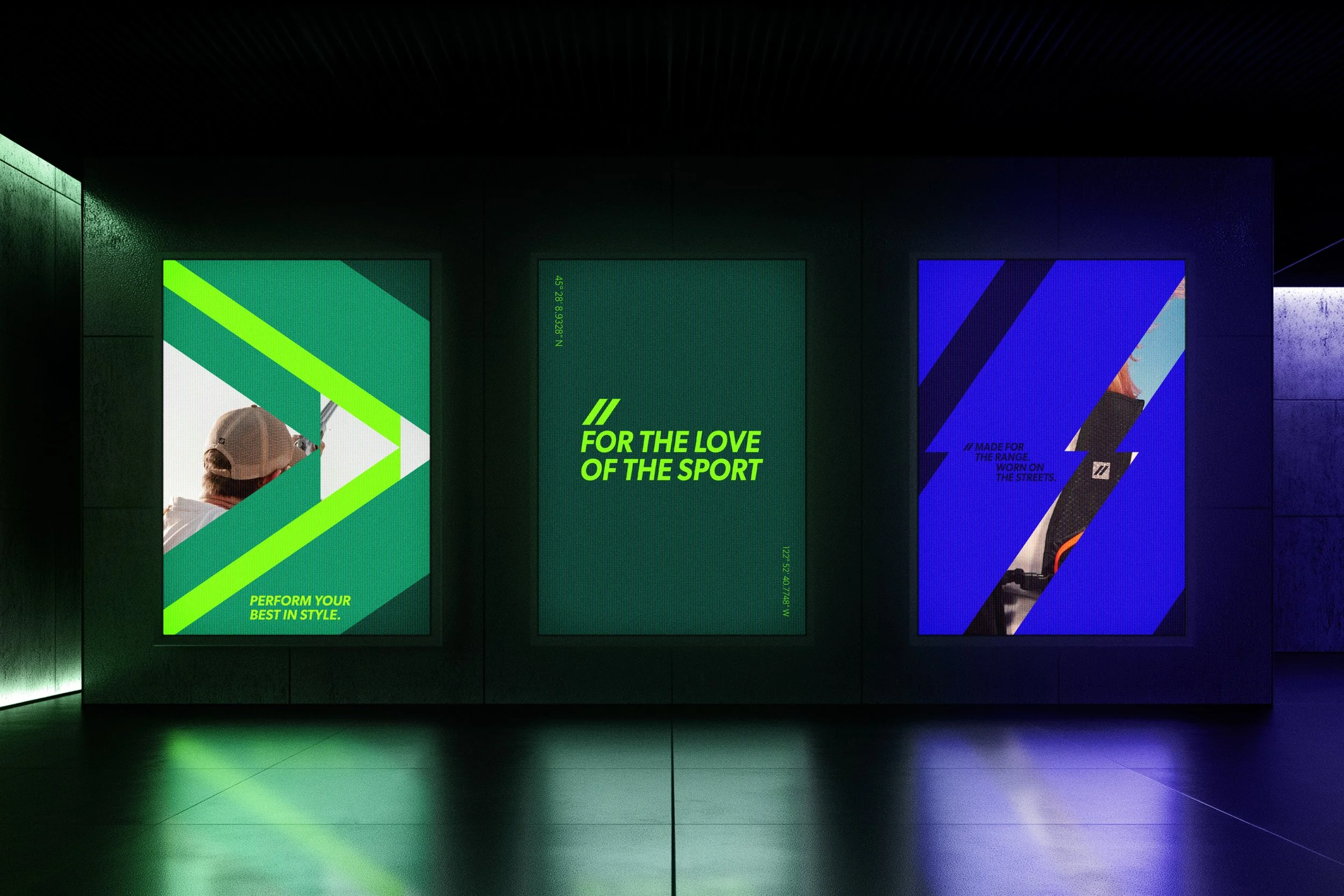
This extends into social, where the logo is deconstructed into bold, dynamic compositions. Graphic elements shift, scale and interact to create a system that feels energetic and constantly evolving.
The result is a flexible identity that adapts across apparel, content and digital, maintaining a confident, modern voice while staying unmistakably Pair Dead.
Made for the range. Worn on the streets.
Pair Dead redefines clay shooting apparel. Shifting it from heritage tradition to a bold, contemporary expression.
Fragmentation becomes a core visual language, echoing the moment a clay shatters mid-air and capturing the intensity of the sport.