Aeste
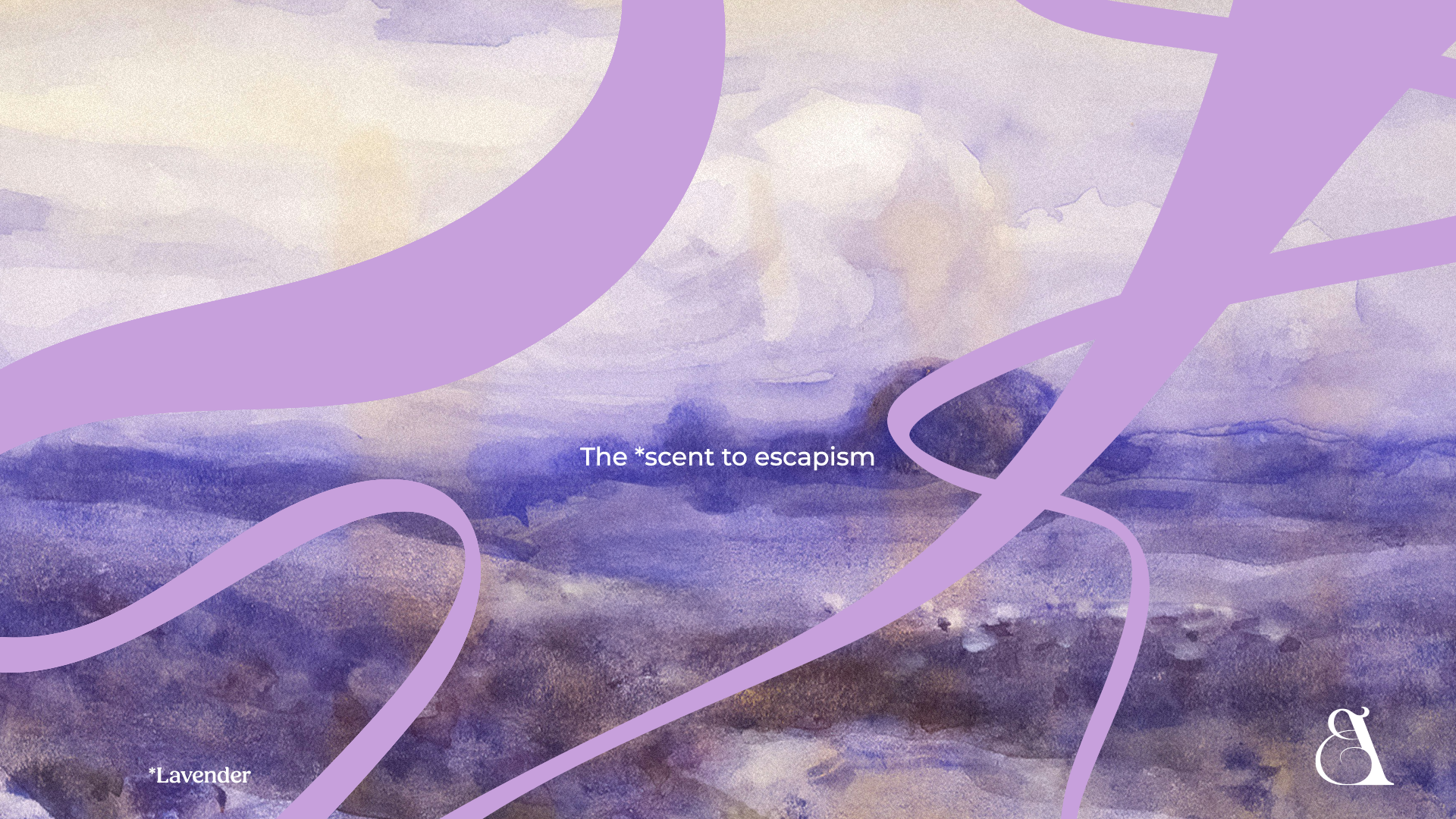
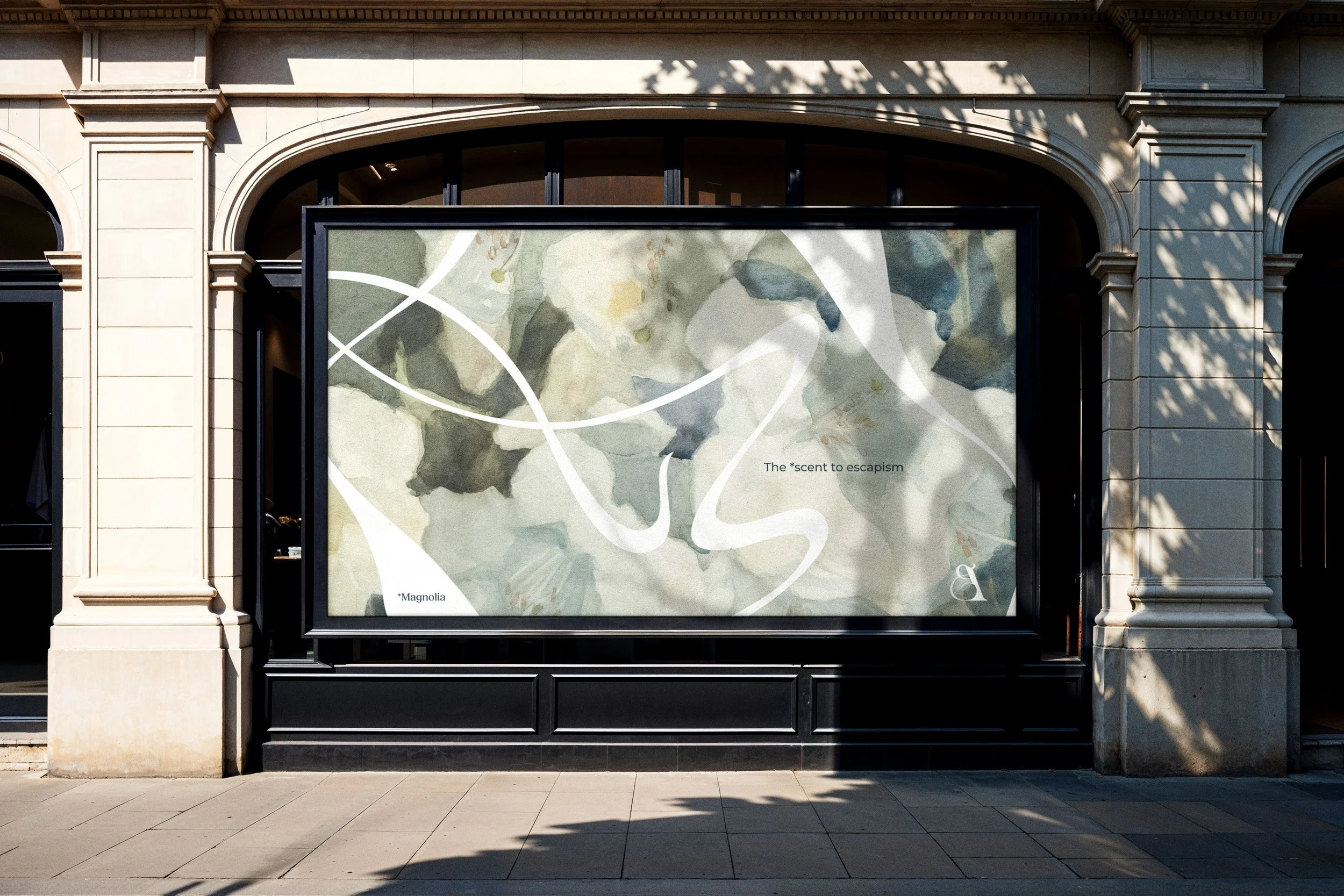
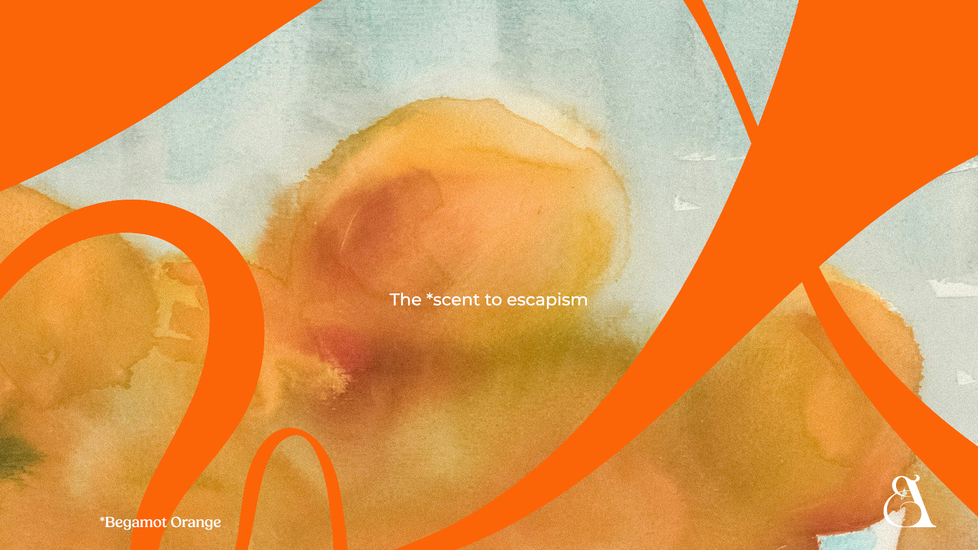
Aeste offers premium aromatherapy and home fragrance products, including oils, diffusers, and candles. These are designed to create a soothing atmosphere, offering an escape from the hustle and bustle of modern life. Aeste high-quality scents, inspired by an English country garden and featuring notes of Lavender, Magnolia, and Bergamot Orange, are perfect for transforming any space into a tranquil sanctuary.
Brand identity
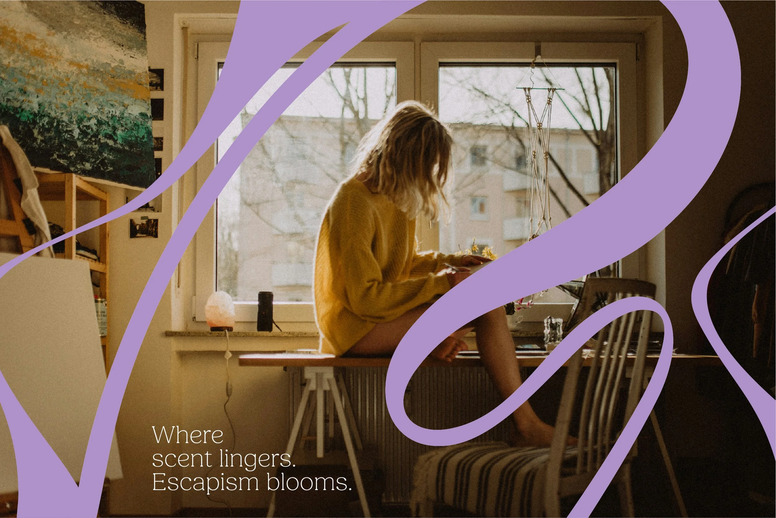
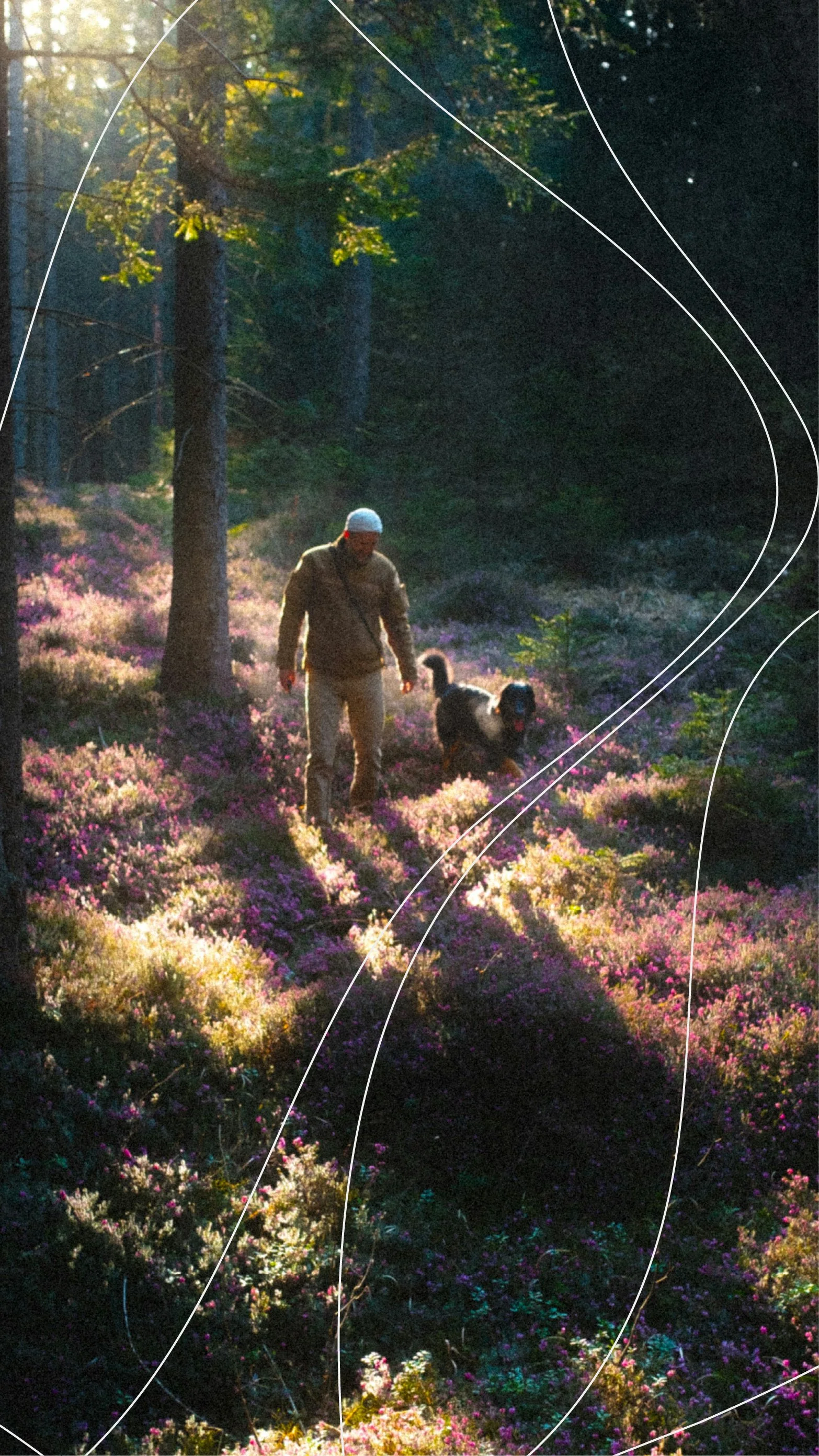
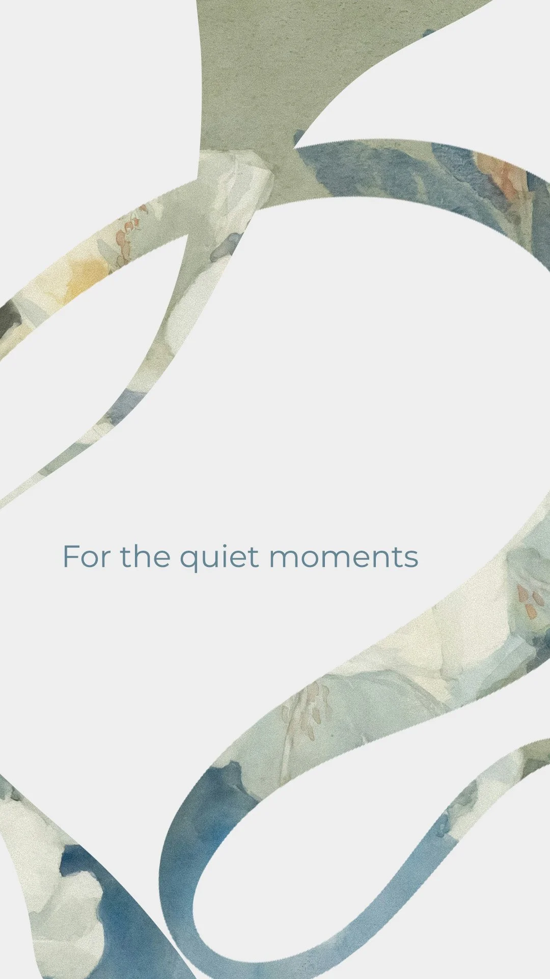
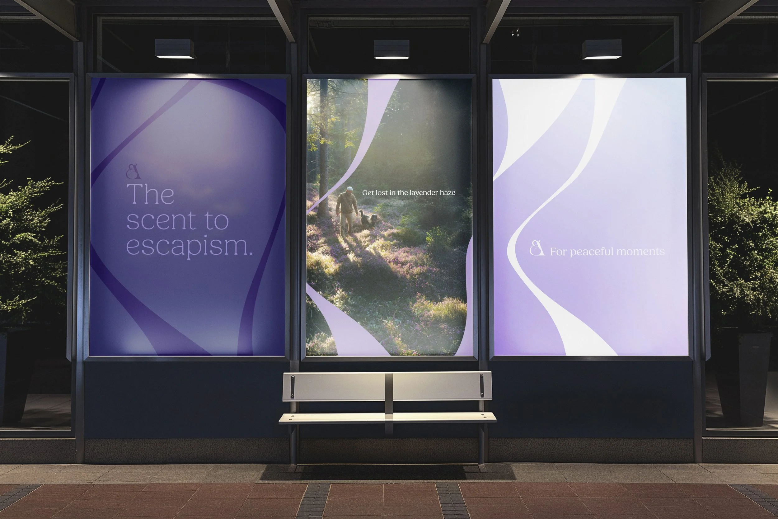
At the heart of the brand lies the transformative power of scent, with each aroma designed to whisk you away to a tranquil, zen-like space. This concept blossoms visually into 'scent trails' – graphic elements woven throughout the brand identity. These graphic elements establish a cohesive aesthetic, capturing the flowing, relaxed nature of Aeste's fragrances and underscoring the escapism they provide, inviting consumers to curate their own peaceful safe haven.
Year
2025
Conceptual
Design
Visual Identity
Branding
Packaging Design
Illustration
Art Direction
Copy writing
Motion
Logo
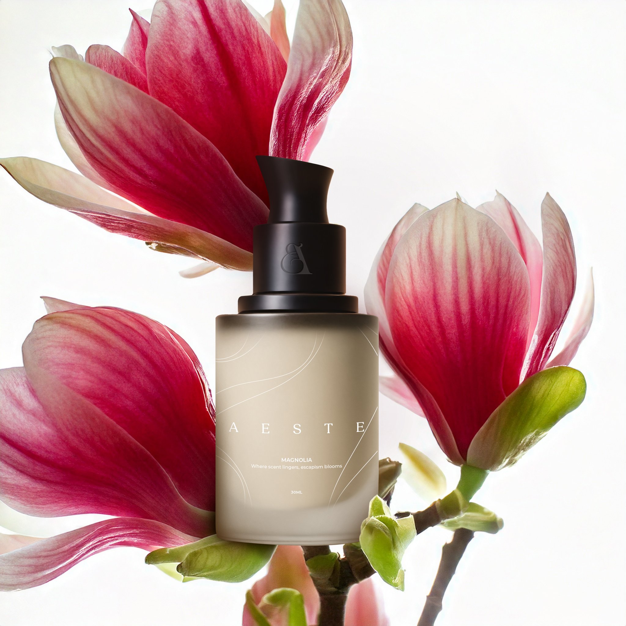
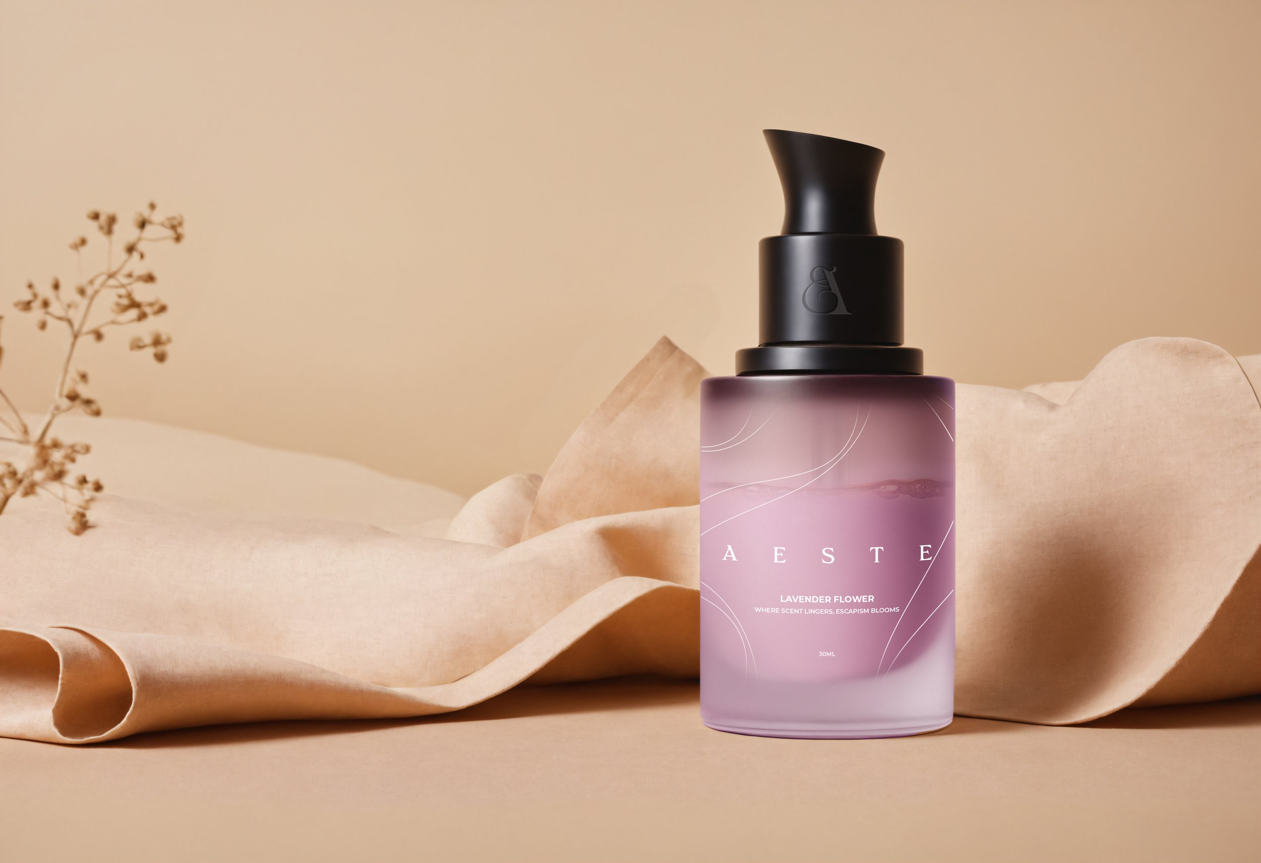
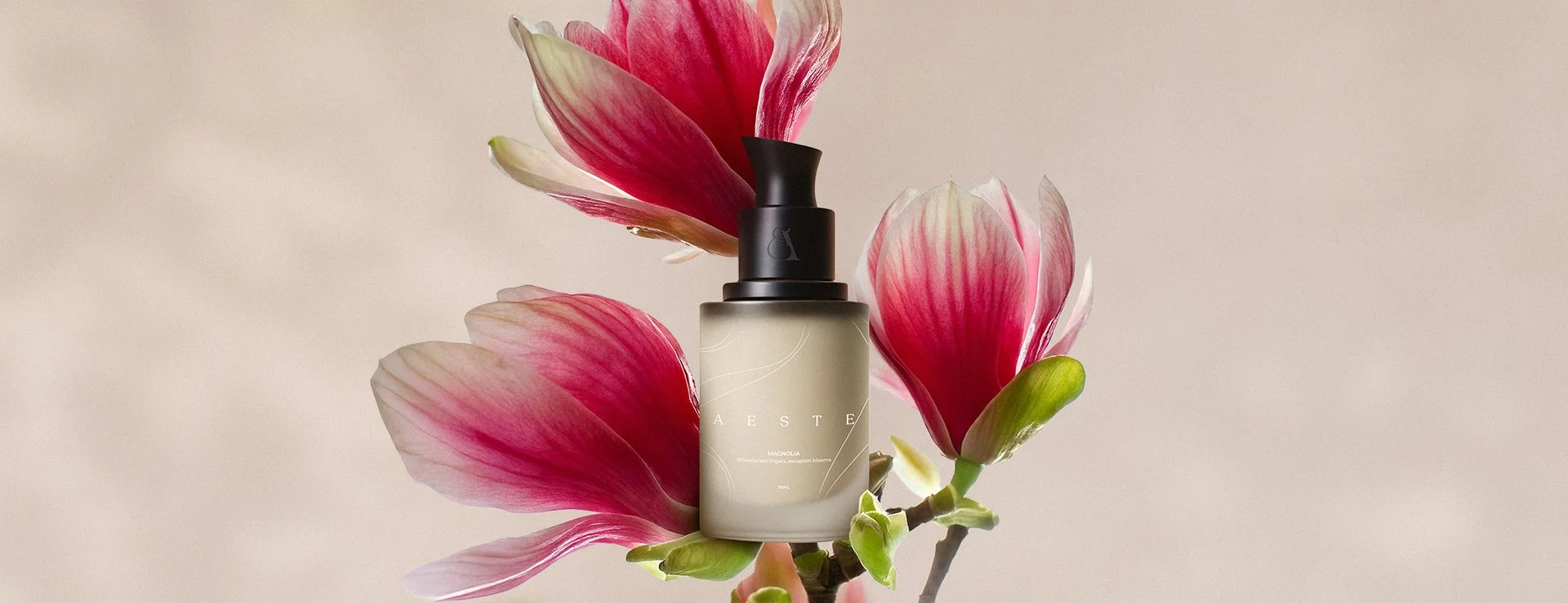
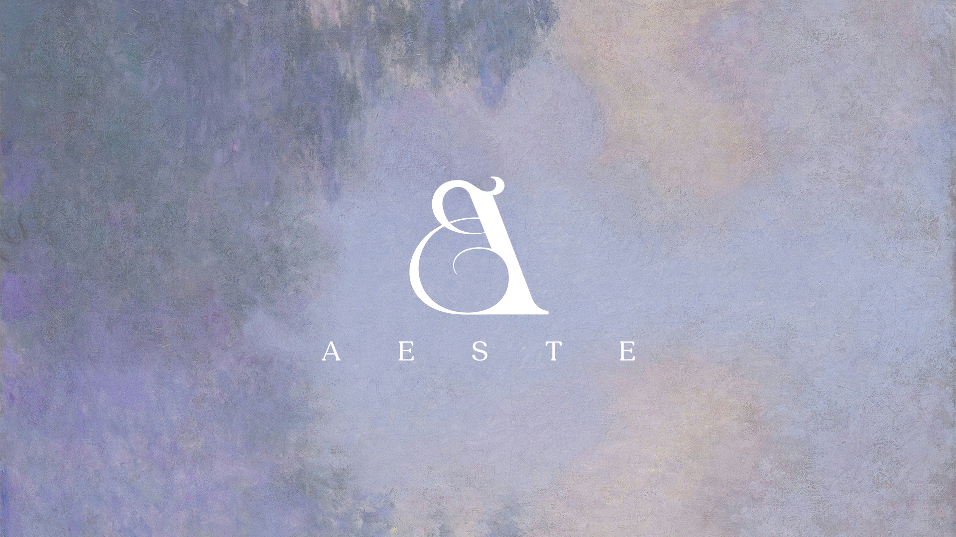
Inspired by the lingering scent trails of burning incense, the logo was crafted to evoke the fluid movement of fragrance through a space. By deconstructing the serif 'A' of the brand name, this created a flowing design that embodies the brand's essence and reflects its premium and elegant quality.
Tone of voice
The brand voice of Aeste establishes a stillness that draws people into the brand experience, and the design visually reinforces this calm. To articulate this modern yet elegant tone without sacrificing its premium feel, the typography combines a clean sans-serif (Field) with a contemporary serif (Montserrat).
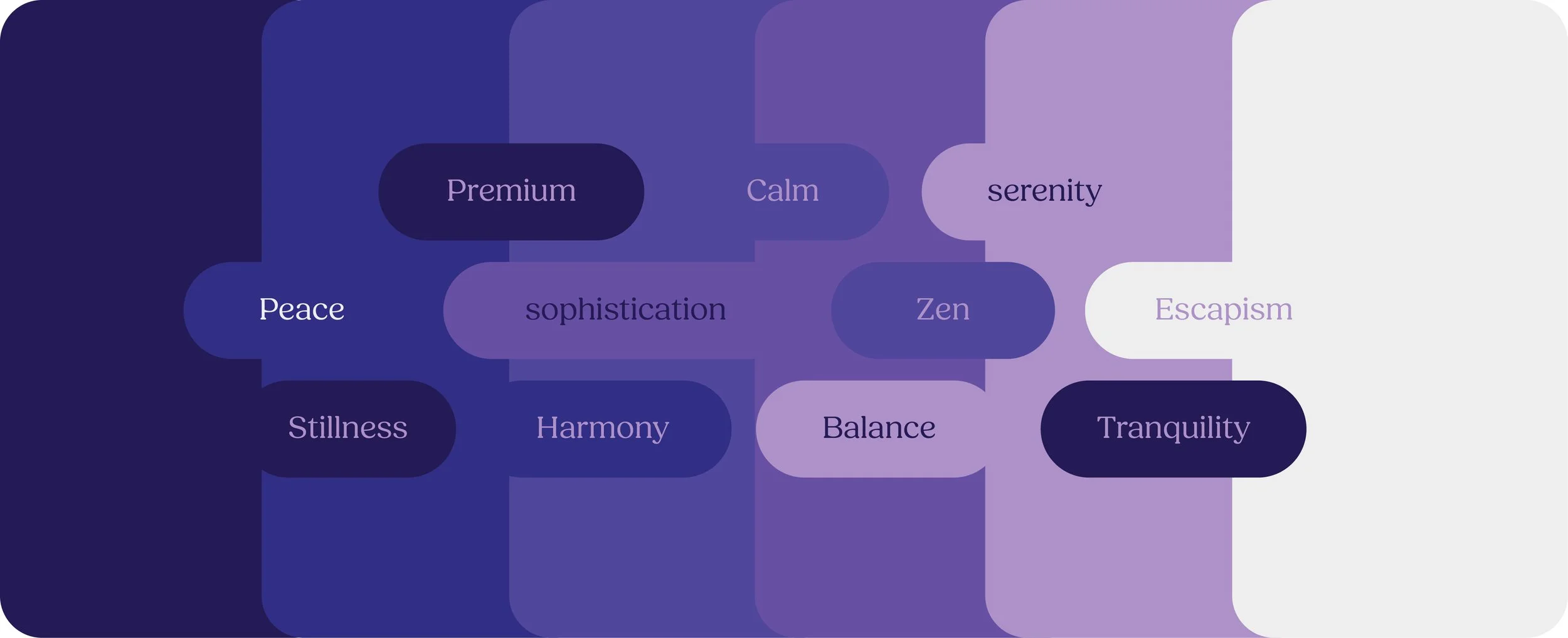
Colour palette
The colour palette deepens the feeling of calmness, peace, and spirituality. Immersing customers in a state of relaxation, aligning perfectly with the brand's mission of creating tranquil spaces.
Balancing premium with serenity the colour palette ranges from a deep indigo to soft lavender and finally to a near-white. This was to help reflect a journey towards lightness and peace. Visually representing the process of unwinding and finding inner calm through aromatherapy.
Beyond the main colour palette, individual scents inspire secondary hues. These derived colours can then enrich advertising and other branding materials.
Advertising
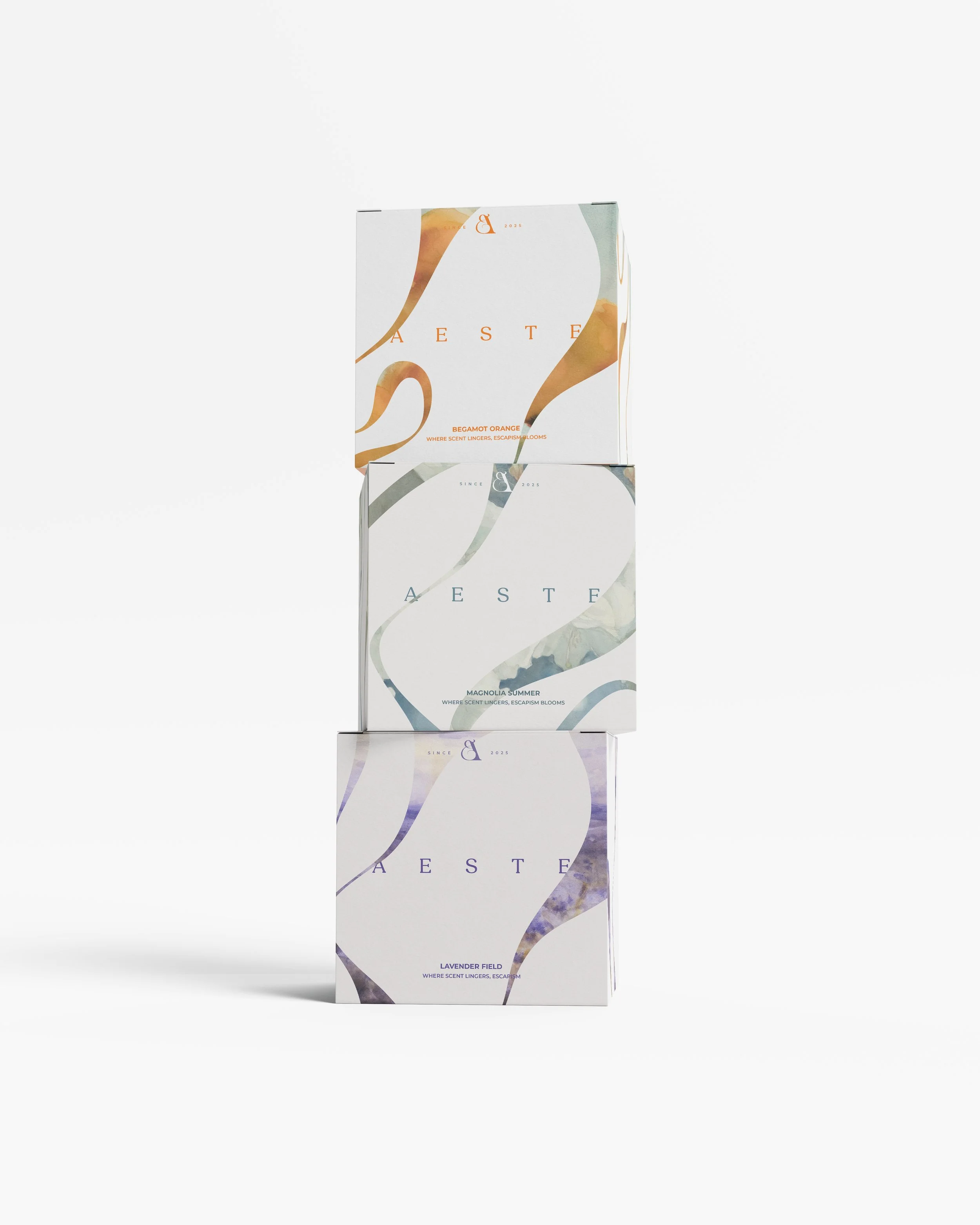
Aeste's design harmoniously blends art and graphic elements to celebrate its aromas. Paintings, chosen to spotlight core scents and capture the essence of tranquil, otherworldly escapism, invite customers into serene environments. Supporting these are graphic scent trails, inspired by the fluid movement of incense smoke. These trails visually suggest scent and aroma, anchoring the brand's core message: ‘the scent to escapism.’ These graphic scent trails are integrated throughout the branding, appearing as solid shapes, linear strokes, or layered textures on photographs and solid brand colours.
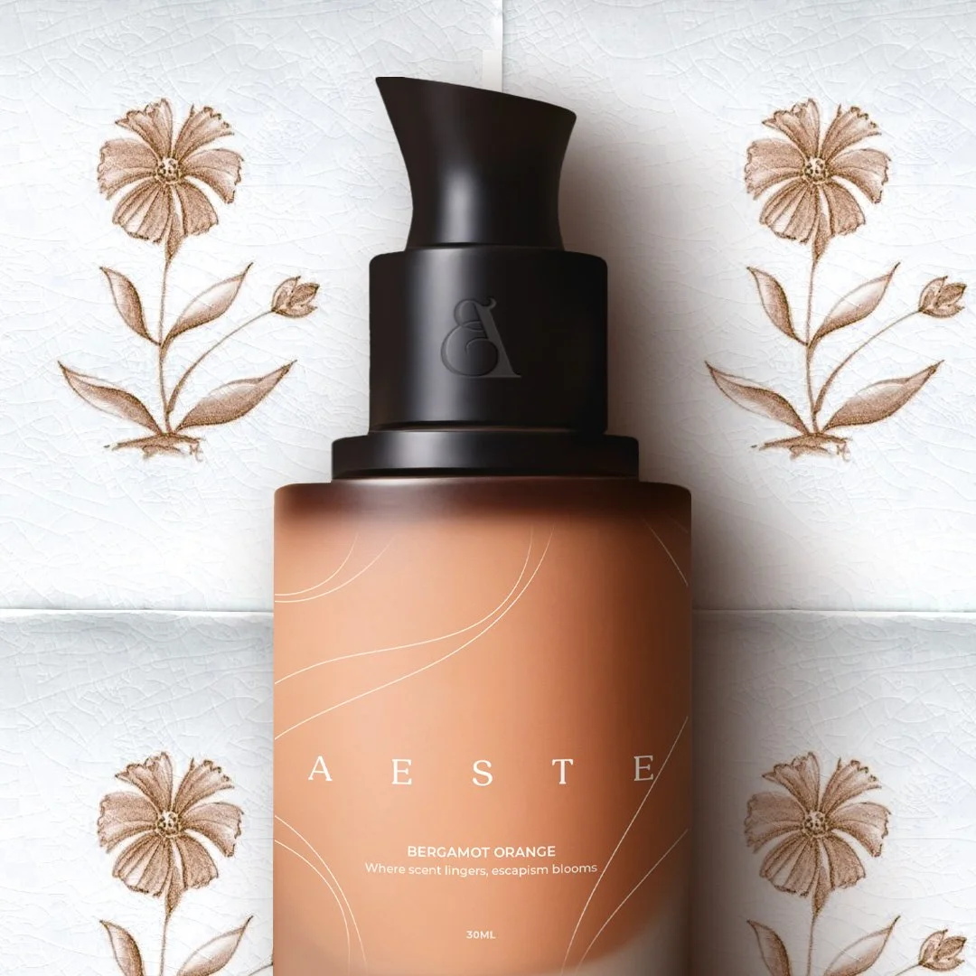
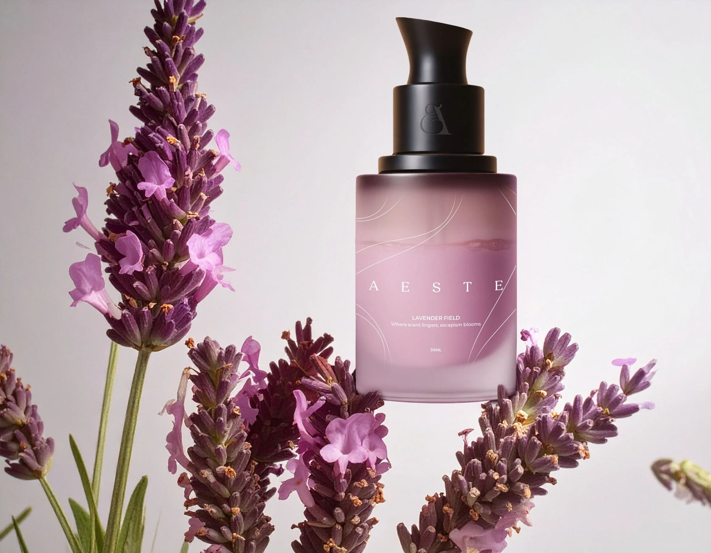
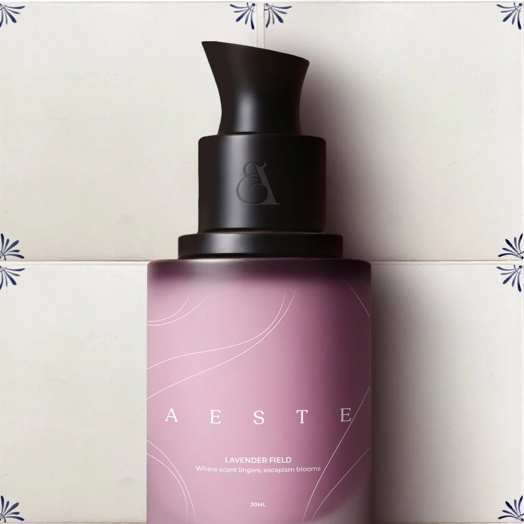
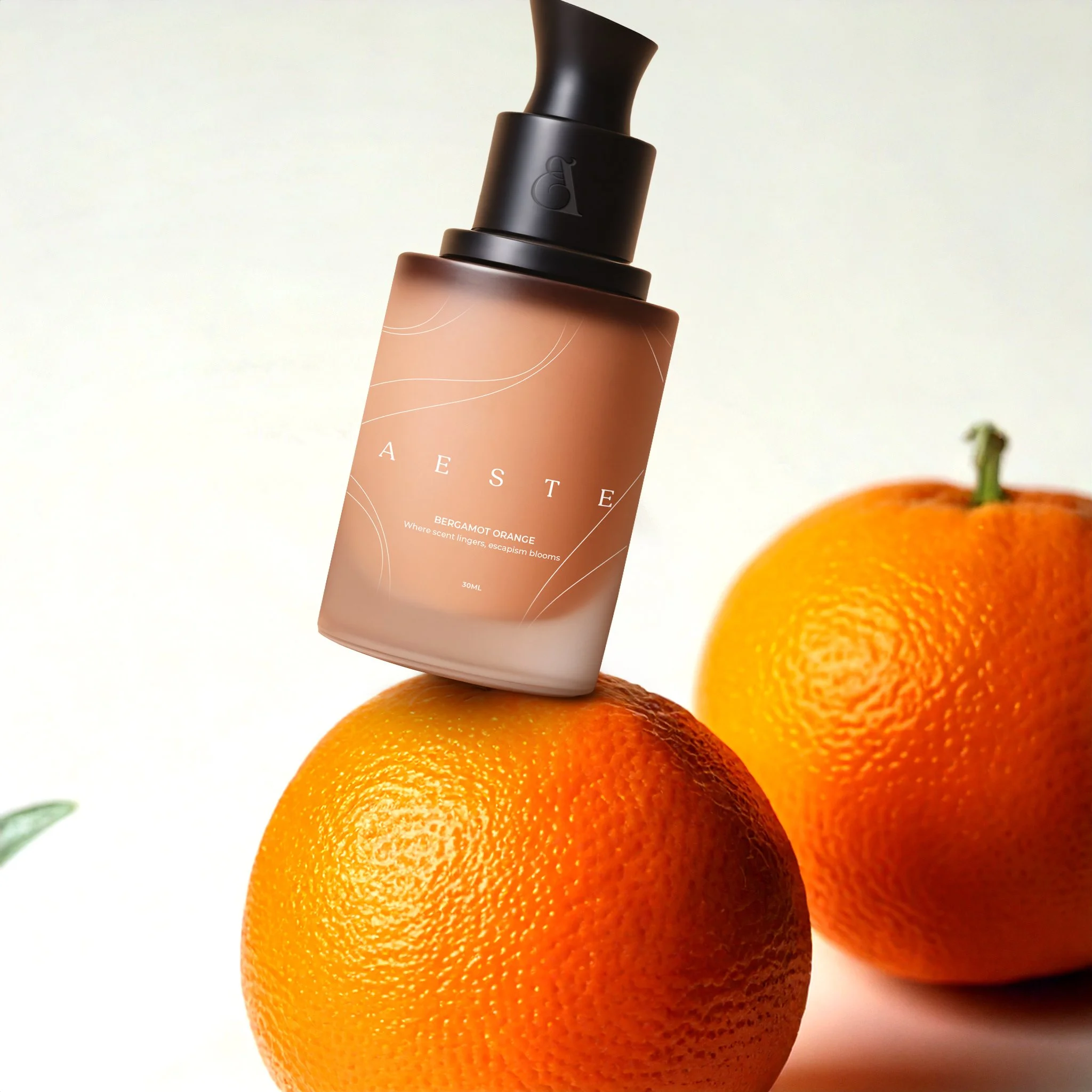
Packaging
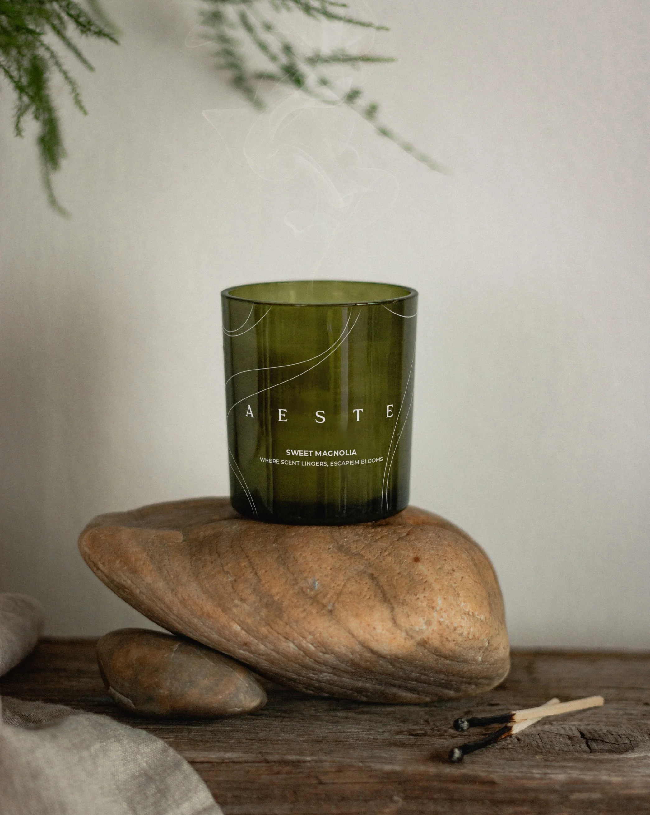
Aeste's packaging—from bottles to candles and exterior boxes visually communicates the aroma held within. Delicate linear scent trails are used to subtly define the shapes of bottles and candles, fostering a cohesive brand identity and resulting in an airy, aesthetically pleasing presence ideal for home display. For exterior packaging (boxes), the scent trails transform into solid frames that highlight the core scents. This minimalist approach provides negative space for the logo and information, preserving the brand's premium feel.