Bud’s Diner
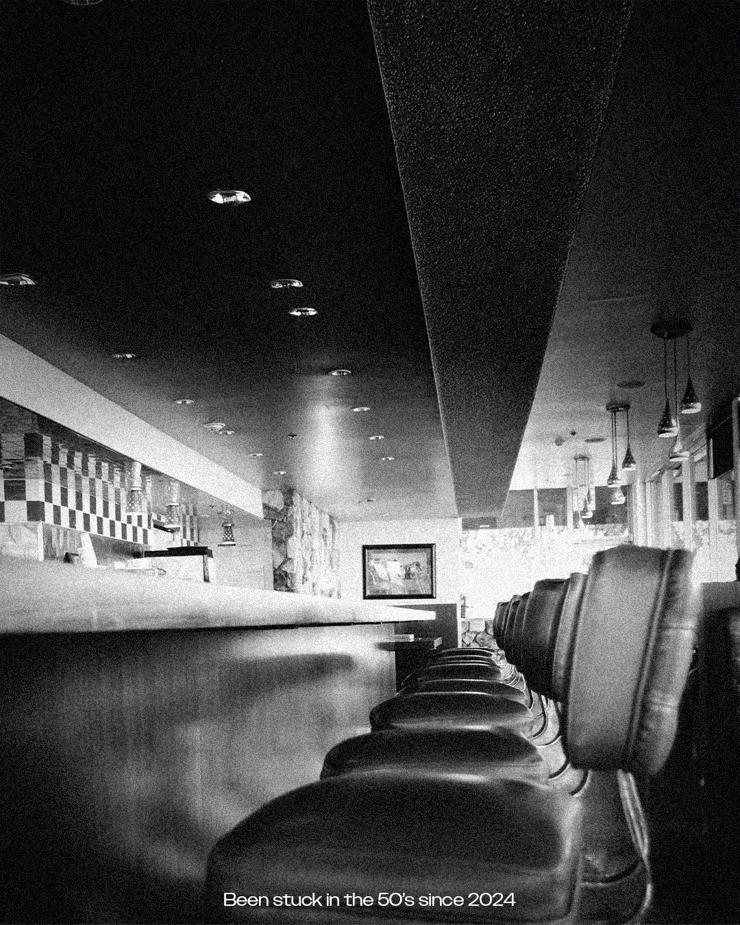
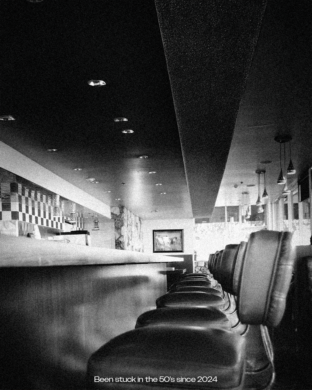
Bud's Diner: Stuck in the 50's Since 2024
Bud’s Diner reimagines mid-century Americana for a contemporary audience — blending nostalgia with a fresh, character-driven identity.
Inspired by the visual language of 1950s diners, the brand draws on Googie architecture, retro typography and pop culture references to create a world that feels both familiar and re-energised.
The identity balances classic and contemporary elements. Script typography nods to heritage, while a clean sans-serif introduces clarity and flexibility across modern applications.
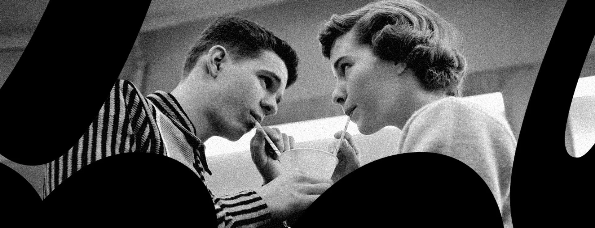
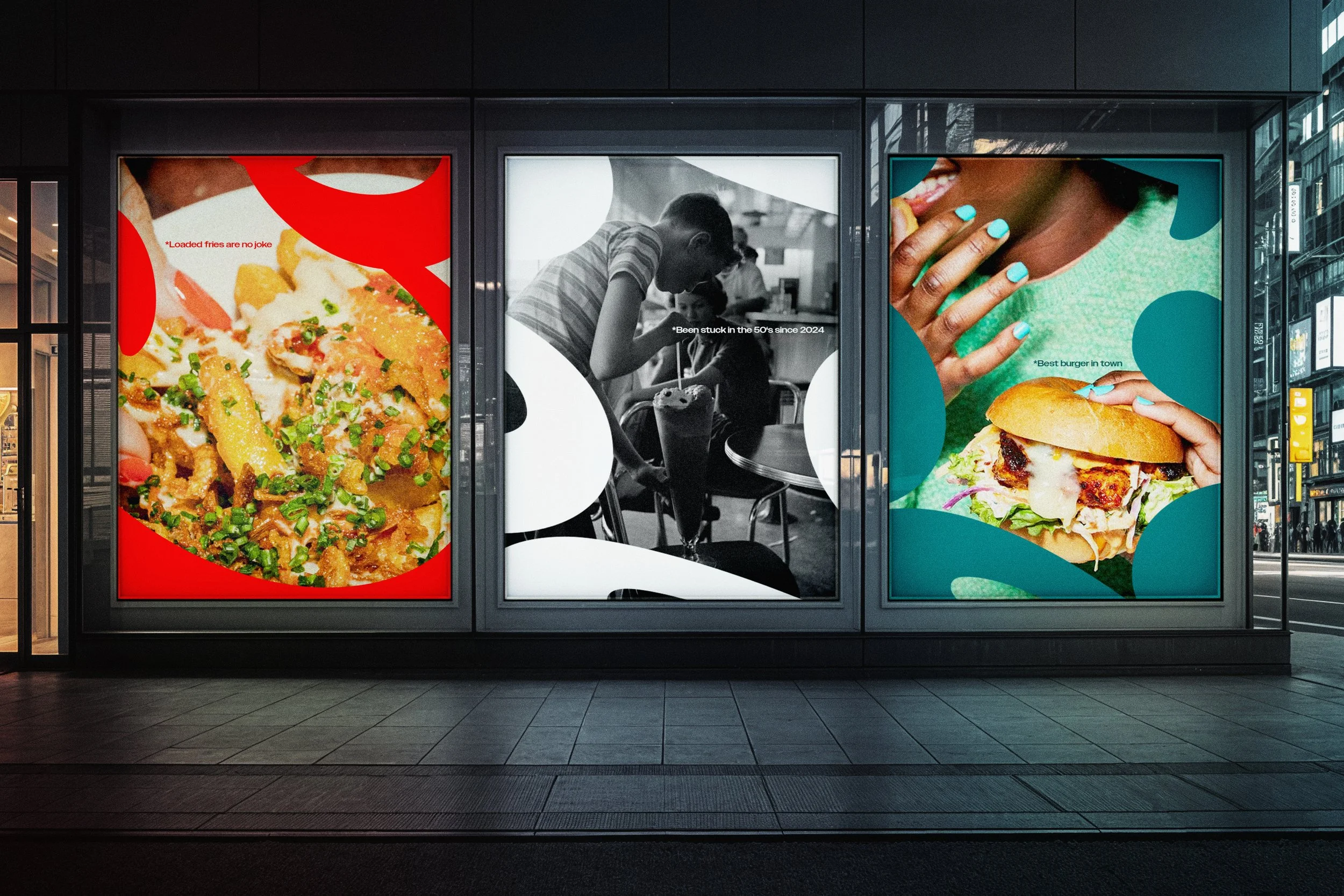
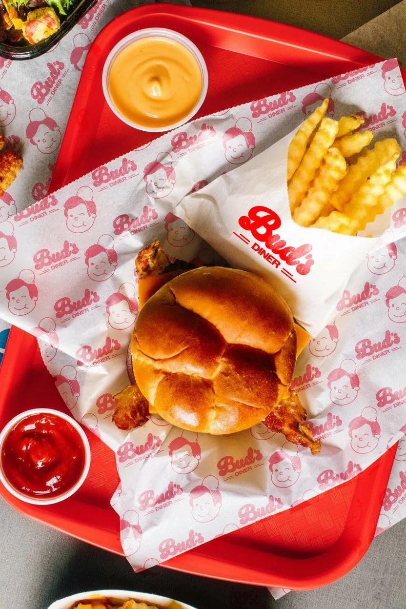
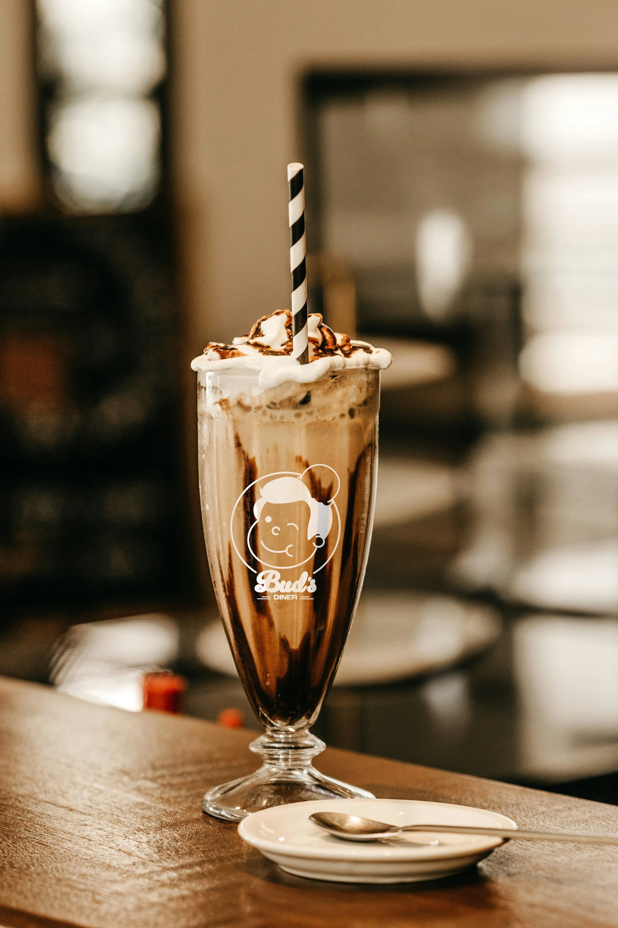
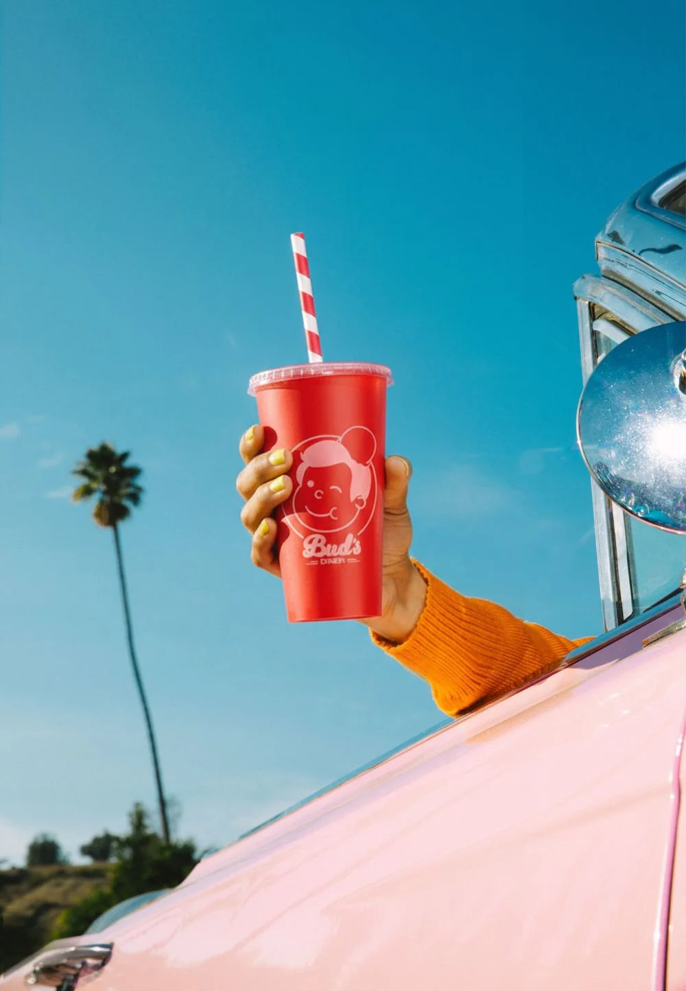
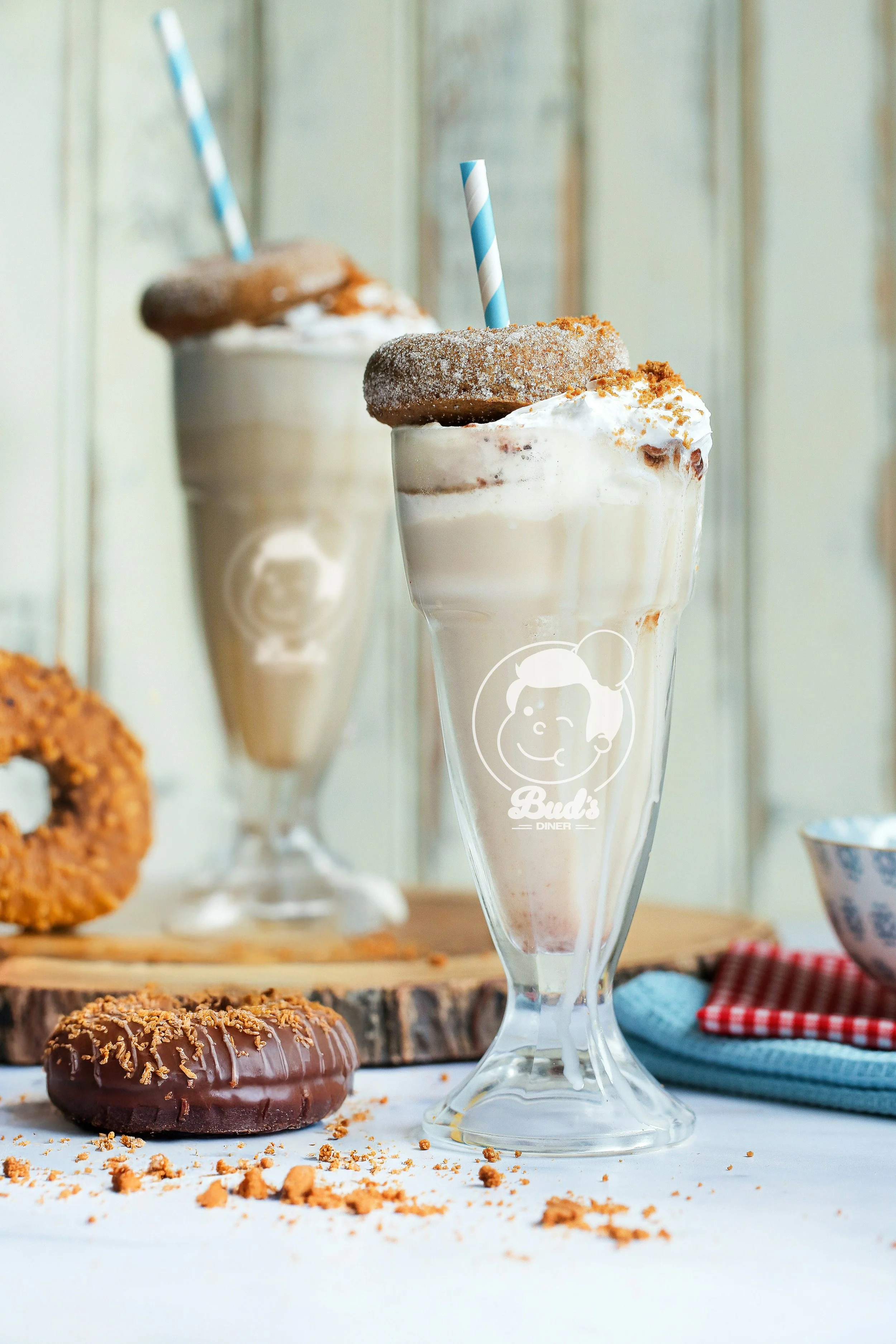
A vibrant colour palette and playful graphic elements bring energy to the system, while a mix of archival black-and-white imagery and contemporary photography bridges past and present.
The result is a brand that captures the charm of mid-century America while feeling relevant, distinctive and full of personality today.
Year
2024
Conceptual
Design
Visual Identity
Branding
Packaging Design
Illustration
Art Direction
Copy writing
Motion
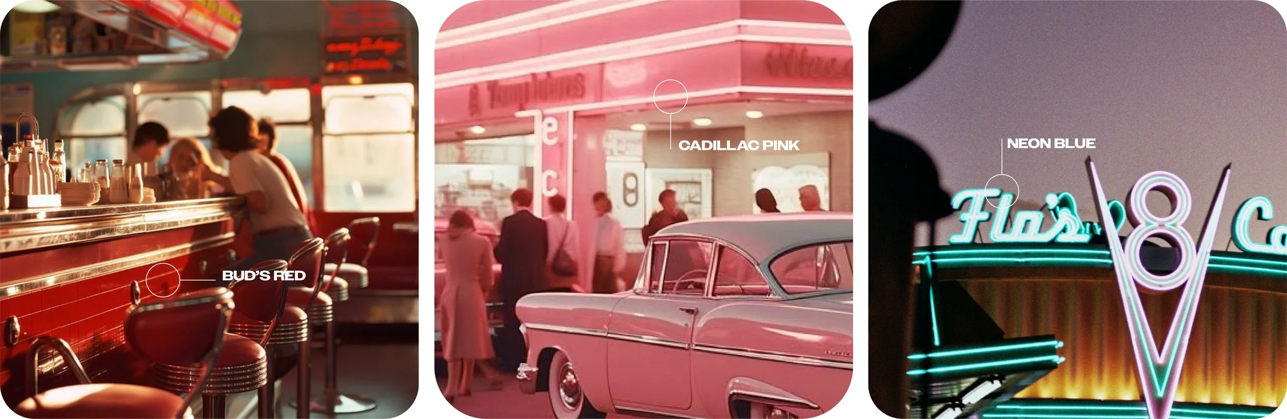
Colour’s of the era
Supporting colours introduce contrast and flexibility, allowing the identity to shift between playful and refined depending on context.
The result is a palette that feels nostalgic confident, recognisable and distinctly Bud’s.
Colour’s of the era
The colour palette draws from the bold hues of mid-century neon signage — reinterpreted to feel fresh and contemporary.
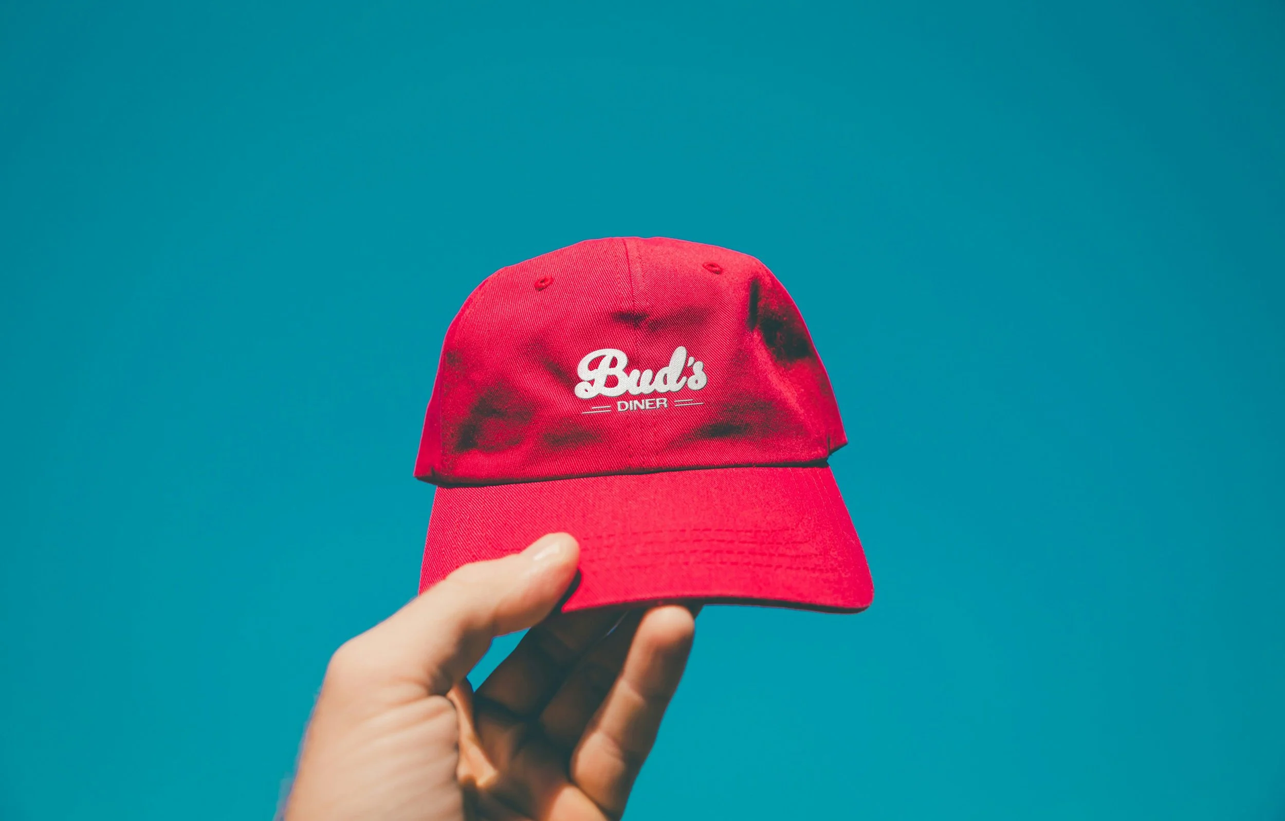
Bud’s Red leads the system, used to create strong, high-impact moments across packaging and interiors.
Tone of voice
Reflecting its roots, Bud's Diner exudes the lighthearted charm of the 1950s and 60s. The brand voice is welcoming and modern, infused with wit and relatability. Bold sans-serif typography paired with abstract British cityscapes delivers messaging with confidence and personality, injecting a vital dose of character into the world of food and drink.
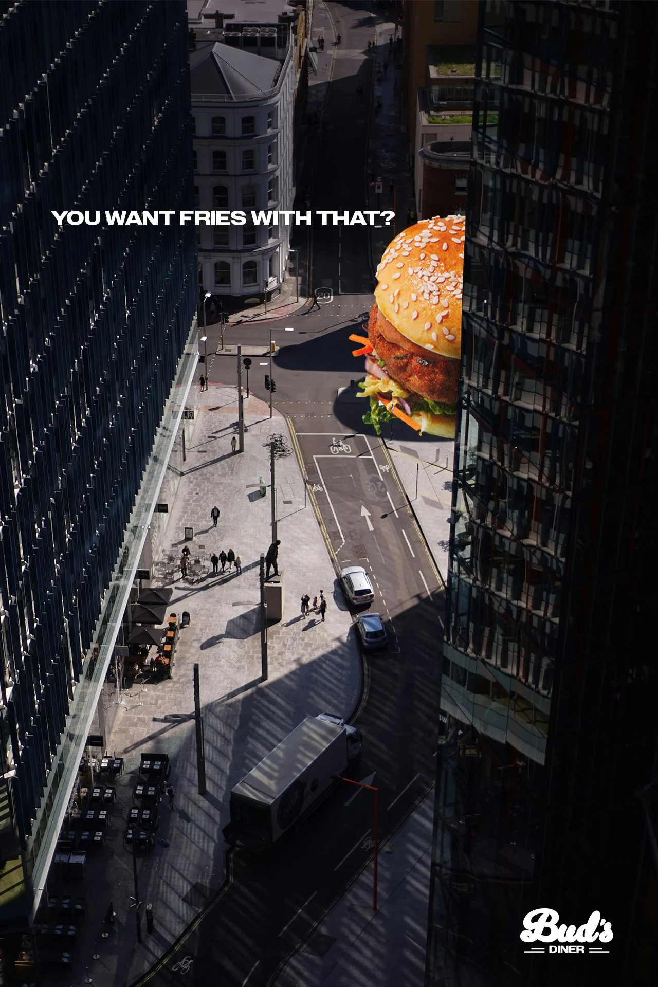
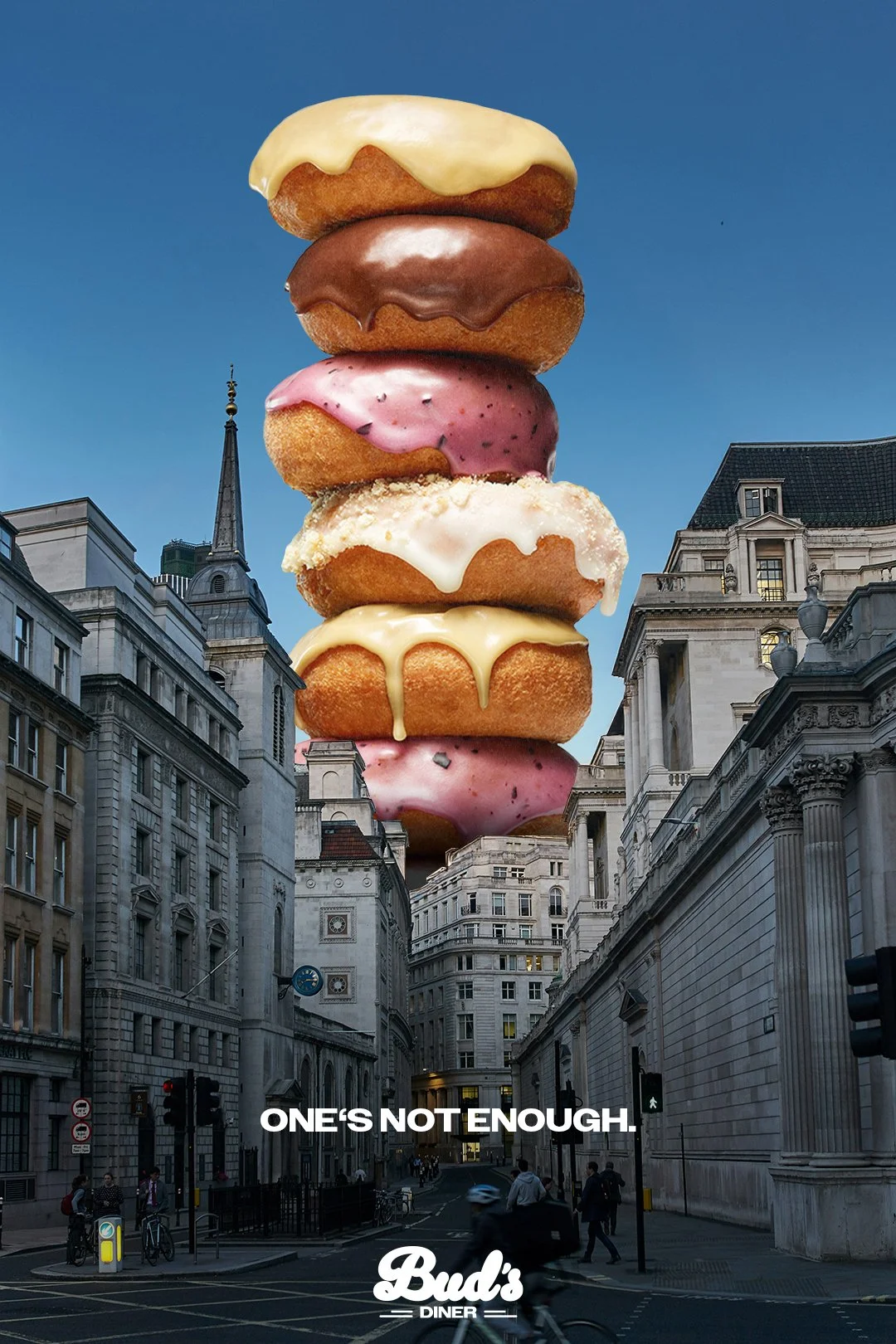
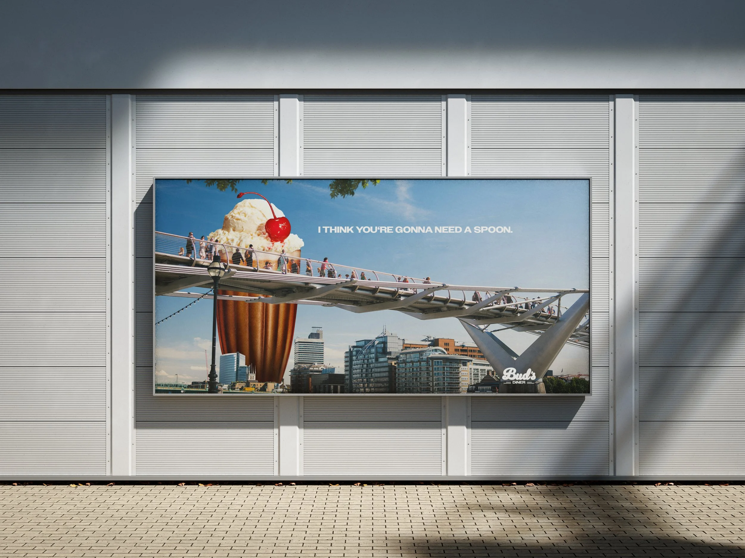
Advertisement
The design employs exaggeration to visually support the copy, conveying a sense of exuberant arrival. This "invasion" symbolises the emergence of a new culinary destination brimming with vibrant flavours, exciting experiences, and an infectious energy. It's an invitation to step into a world where food and drink come alive.
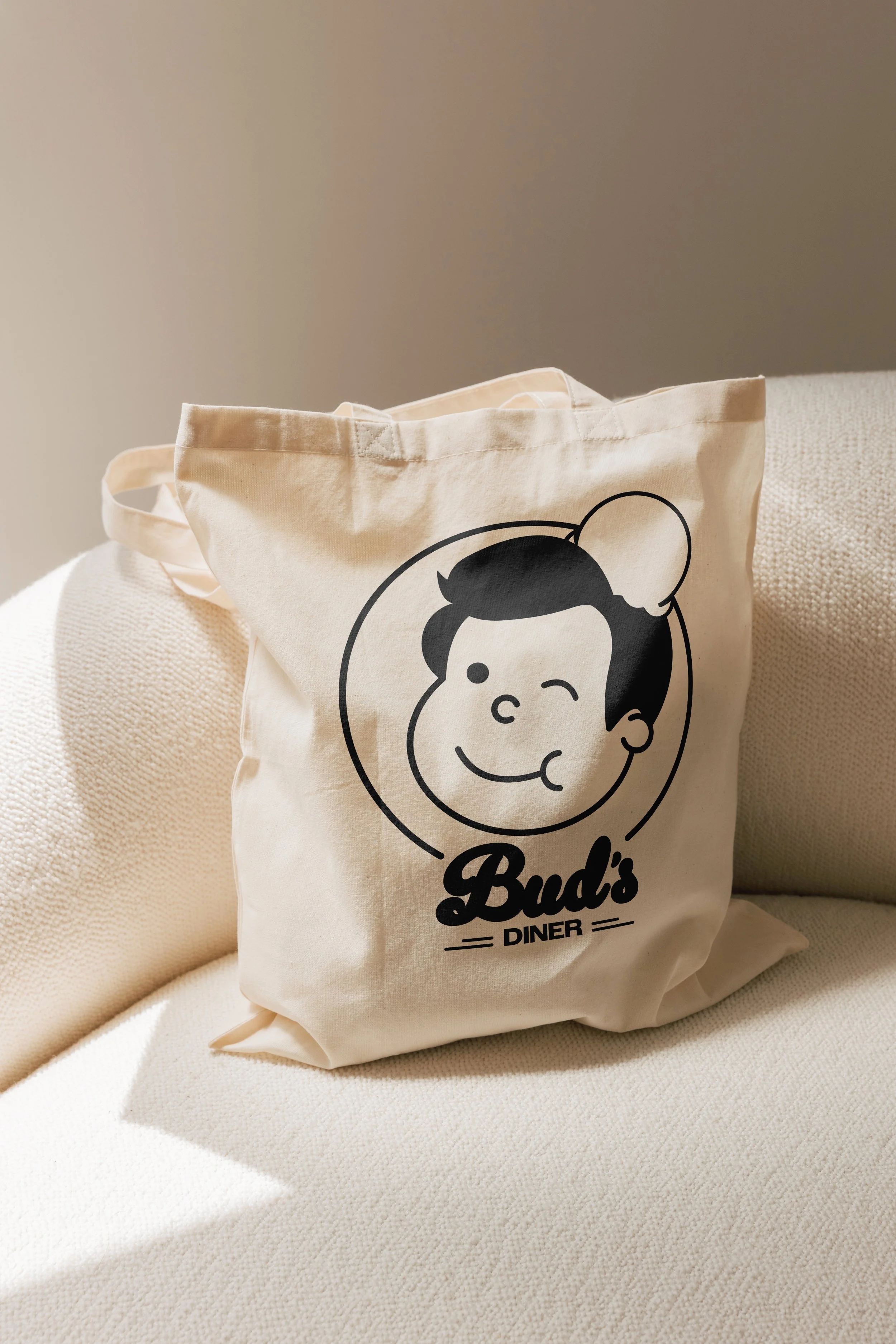

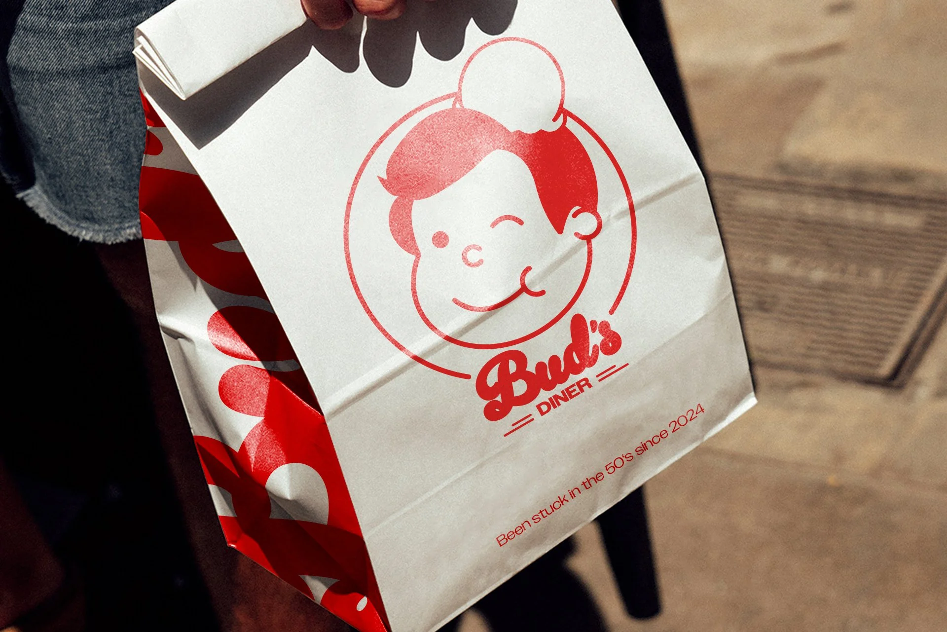
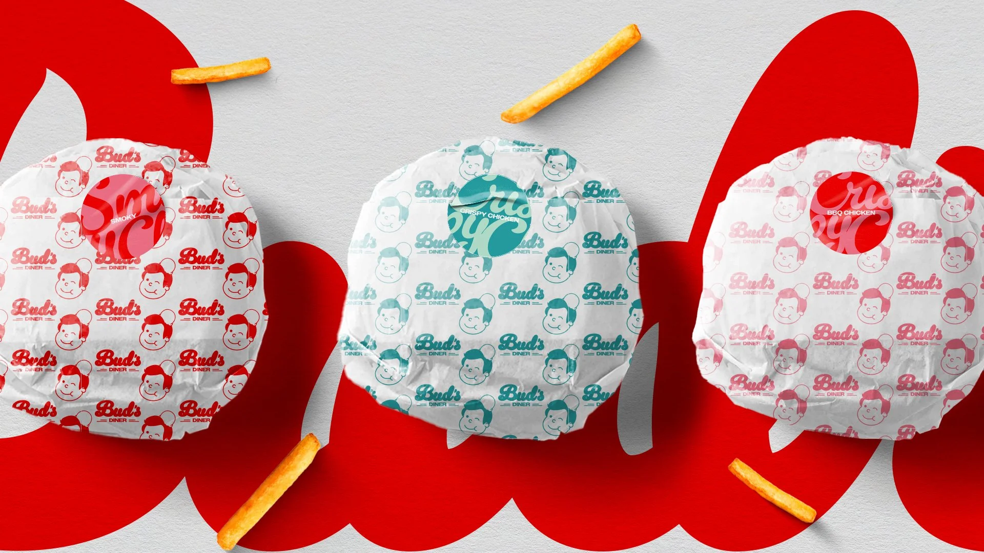

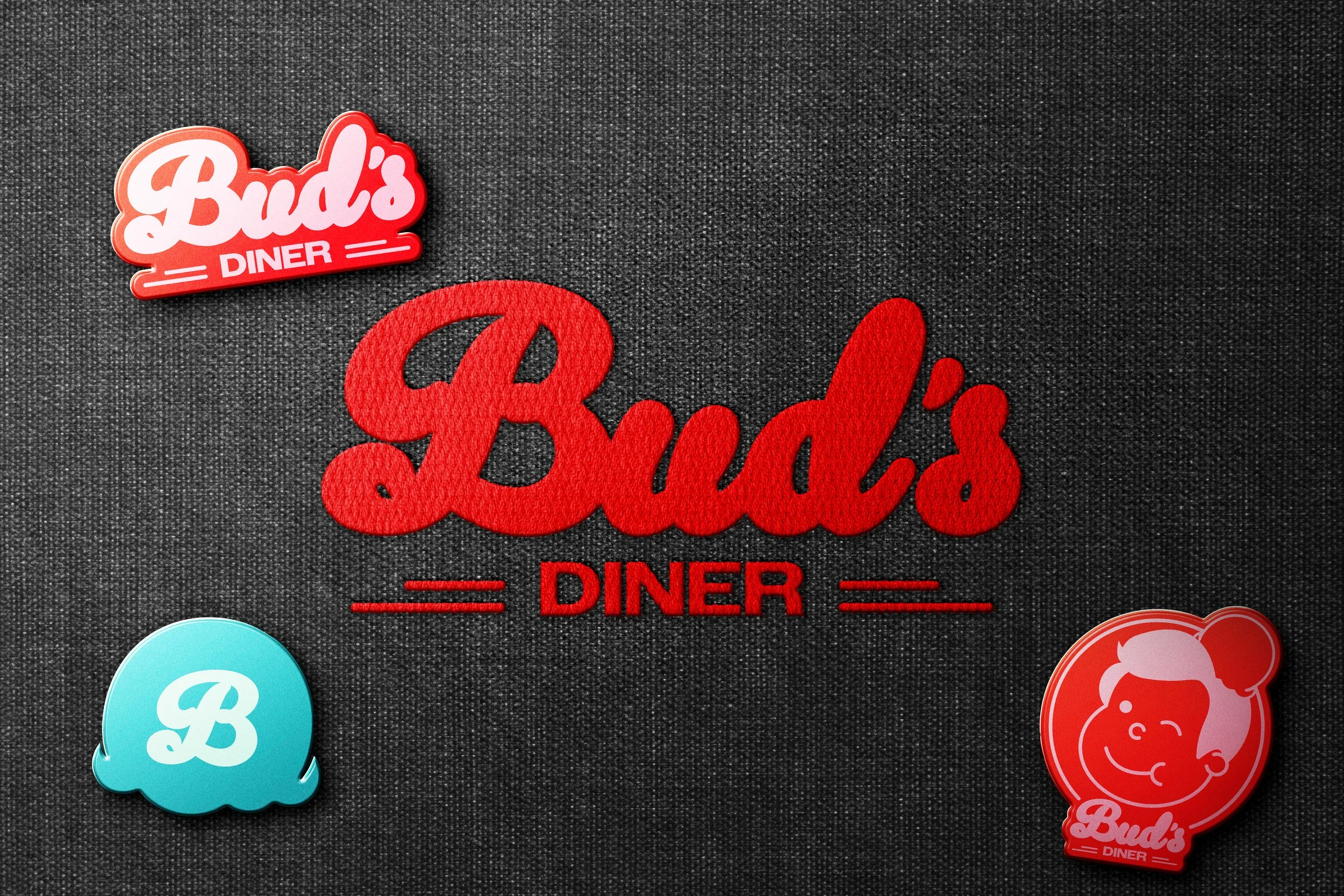
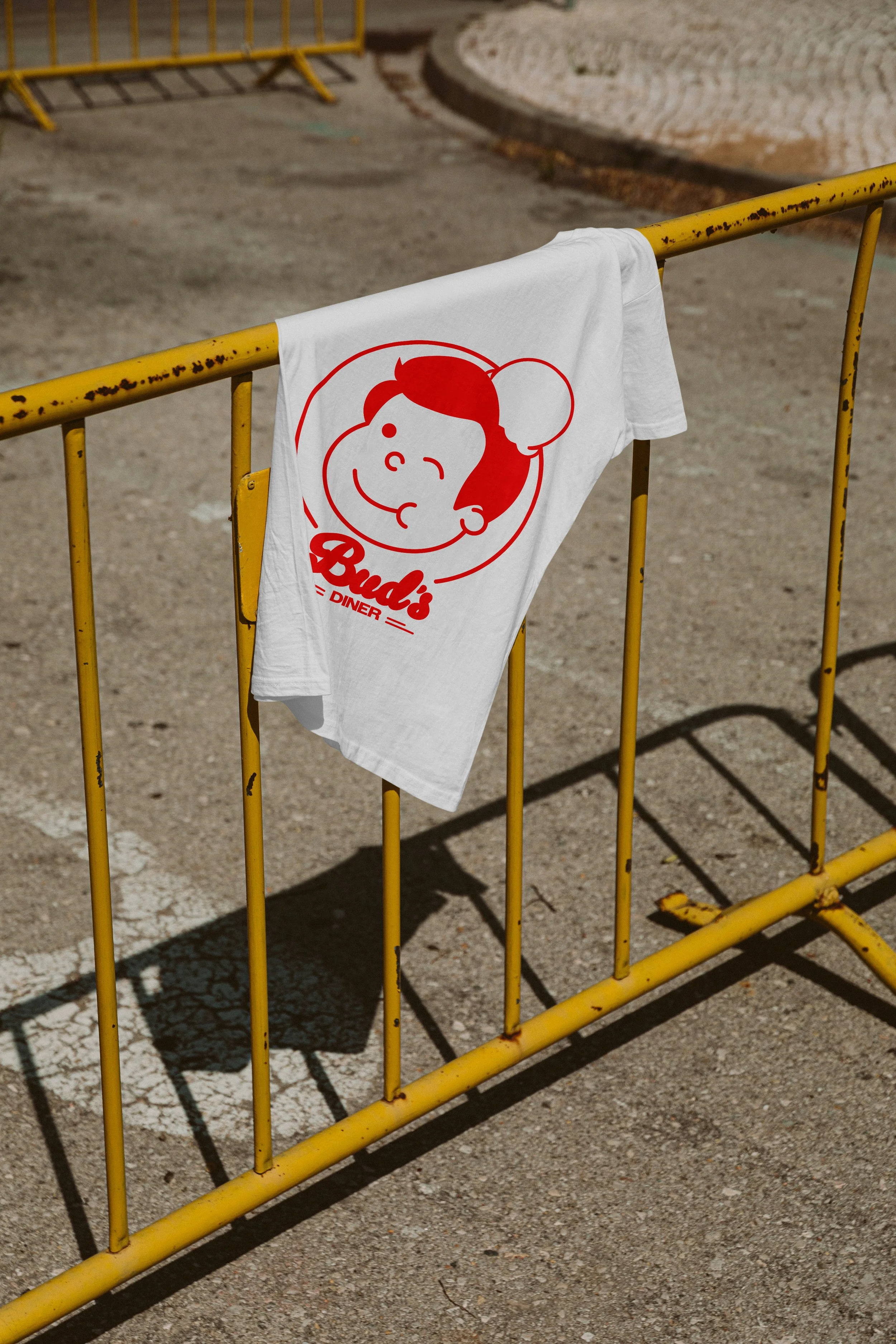
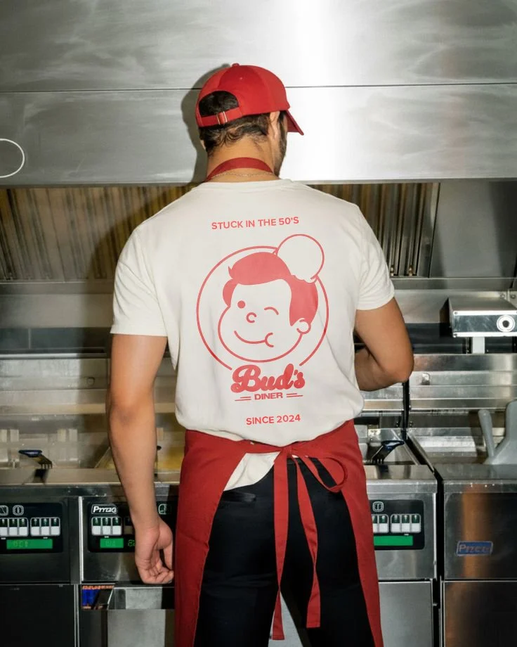
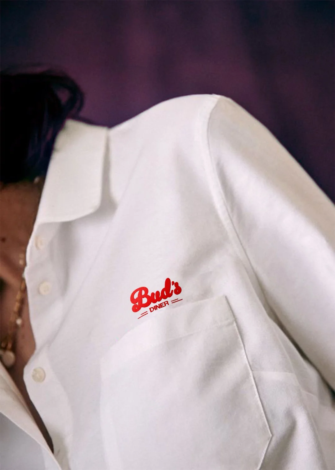
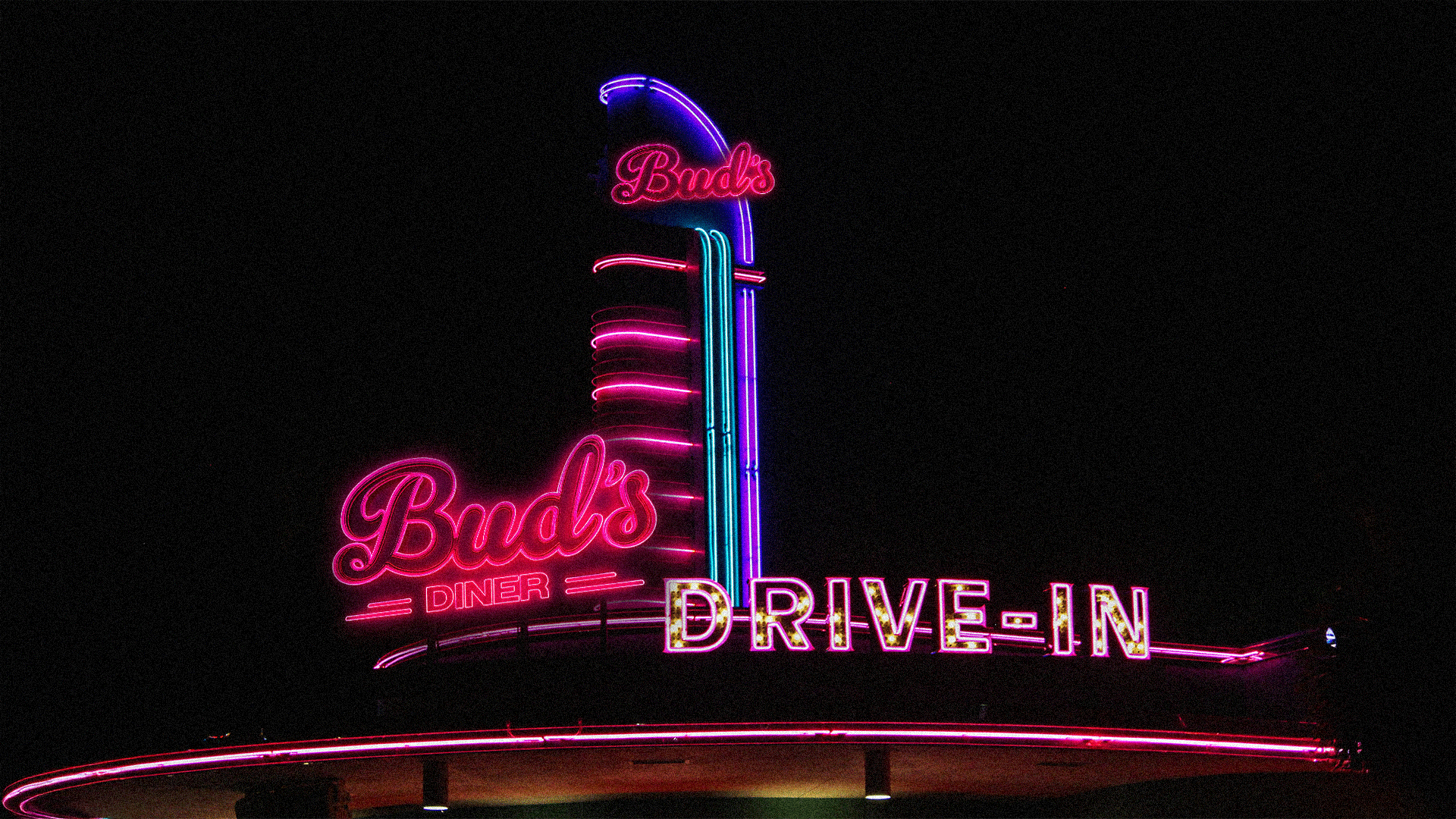
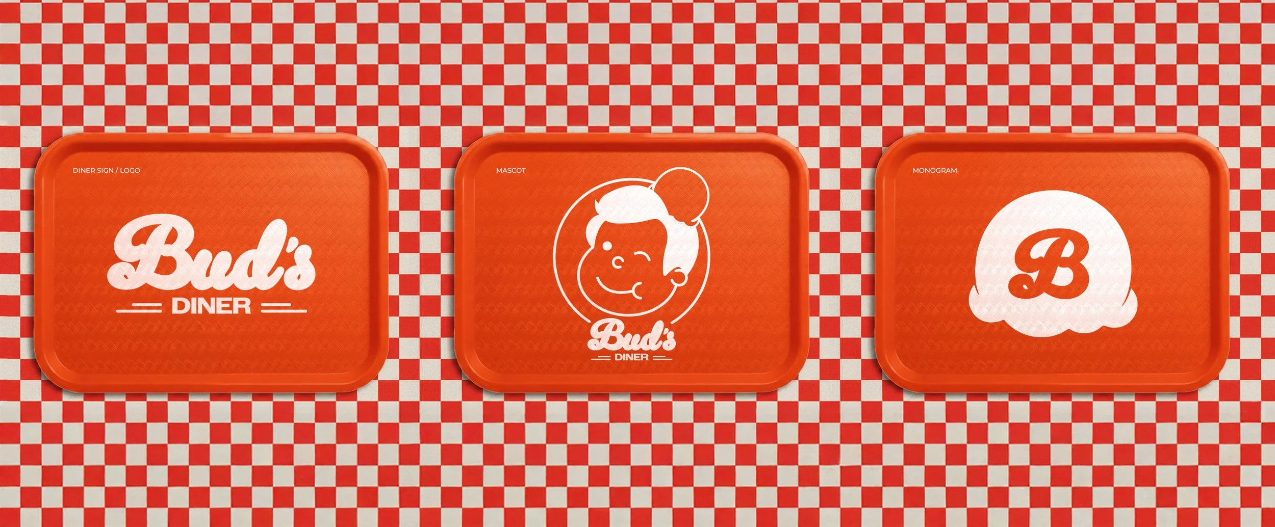
Logo’s to mascots
The Bud’s Diner identity draws from mid-century architecture and iconic neon signage reinterpreted through a contemporary lens.
The logo combines classic script with a clean sans-serif, balancing nostalgia with clarity. Two minimal stripes anchor the wordmark, introducing a subtle geometric structure that grounds the identity.
At the heart of the brand is Bud — a friendly mascot inspired by the character-led design of mid-century America. Used across packaging, signage and merchandise, Bud creates a consistent and recognisable presence. A secondary monogram, derived from the diner’s signature ice cream floats, is used more sparingly across social and campaign, adding flexibility while reinforcing the brand world.