San Pellegrino
A brand refresh, it was time for San Pellegrino to elevate its image with a bold, distinctive identity. For 125 years, the brand has been renowned as an elegant icon at the table. With its deep Italian heritage, it was time to enhance its unique sparkle and style to ensure consistent, cohesive branding across all touch-points.
Brand Identity
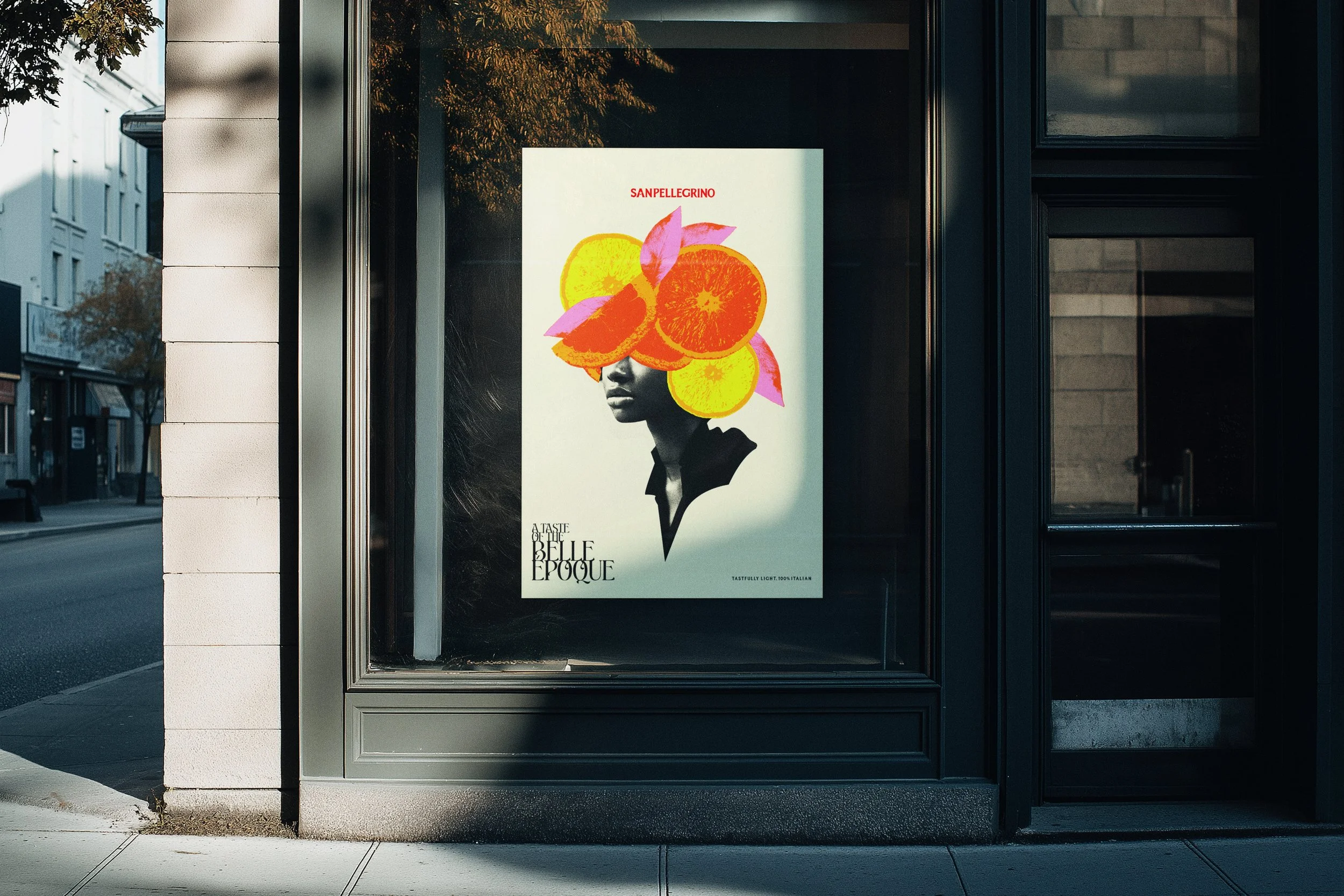
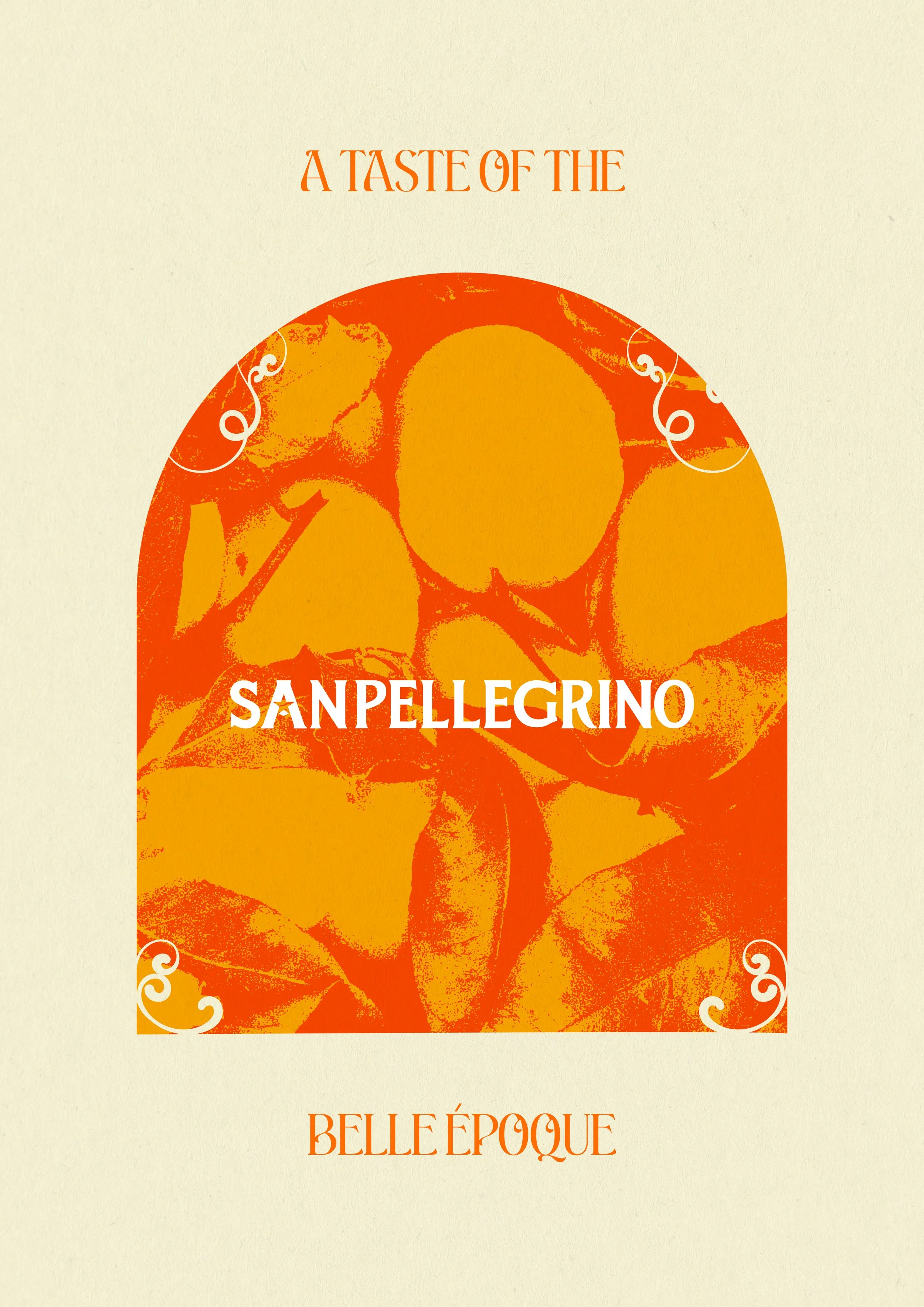
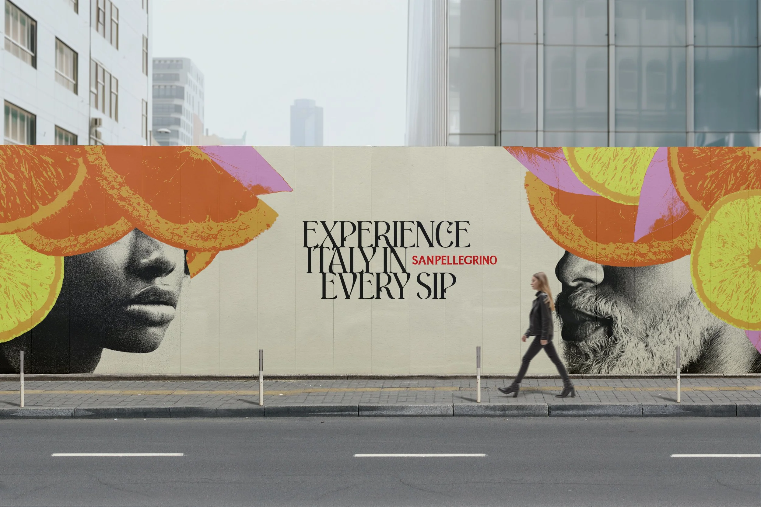
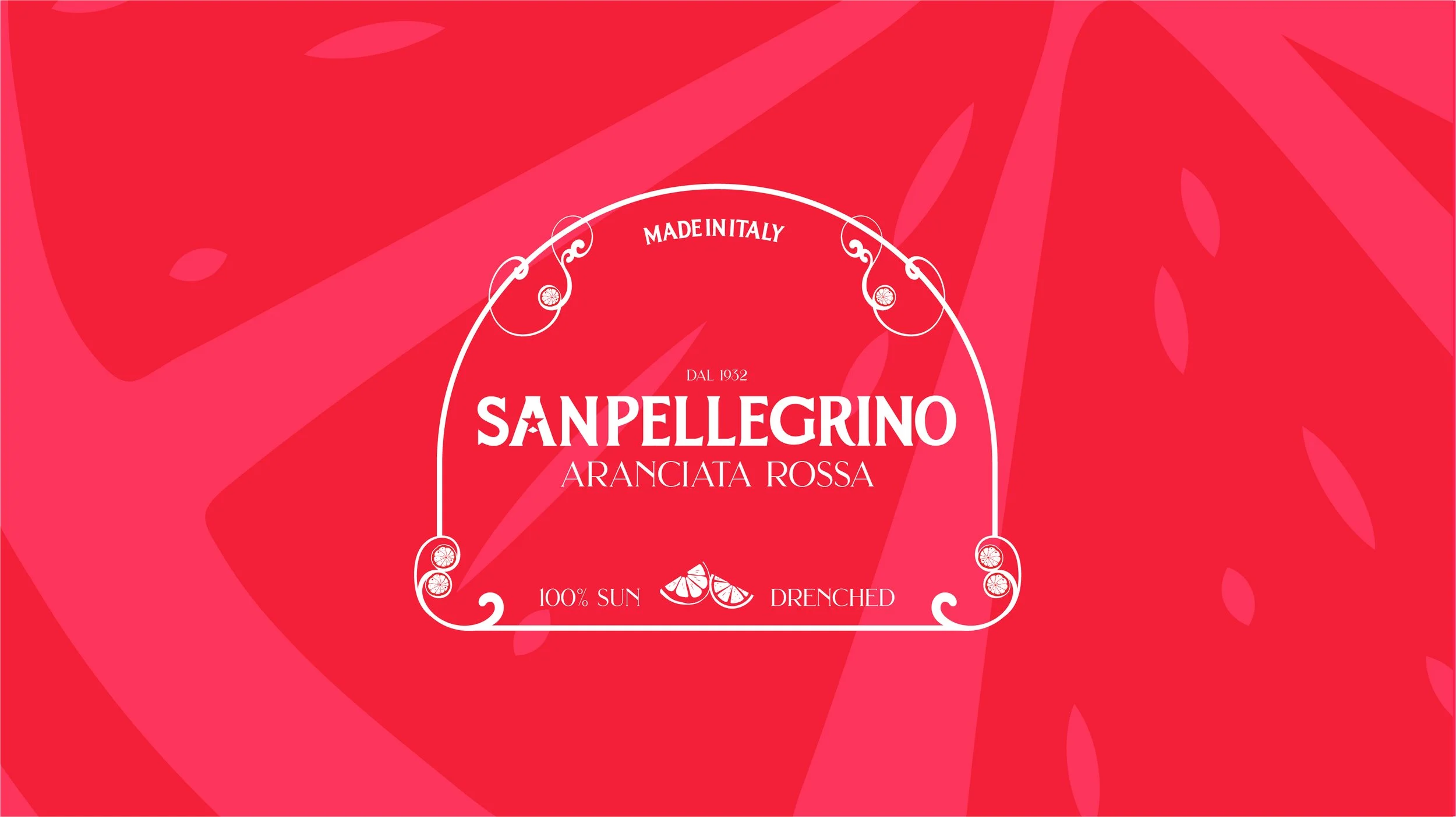
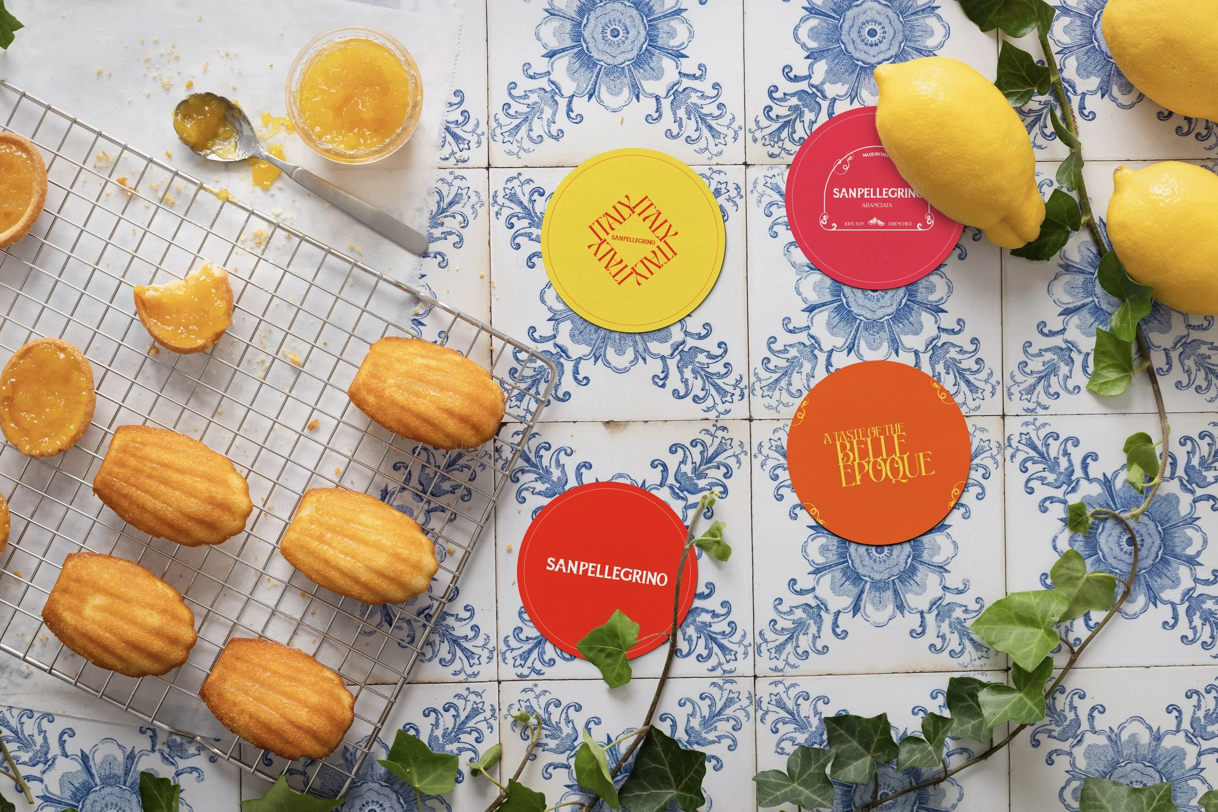
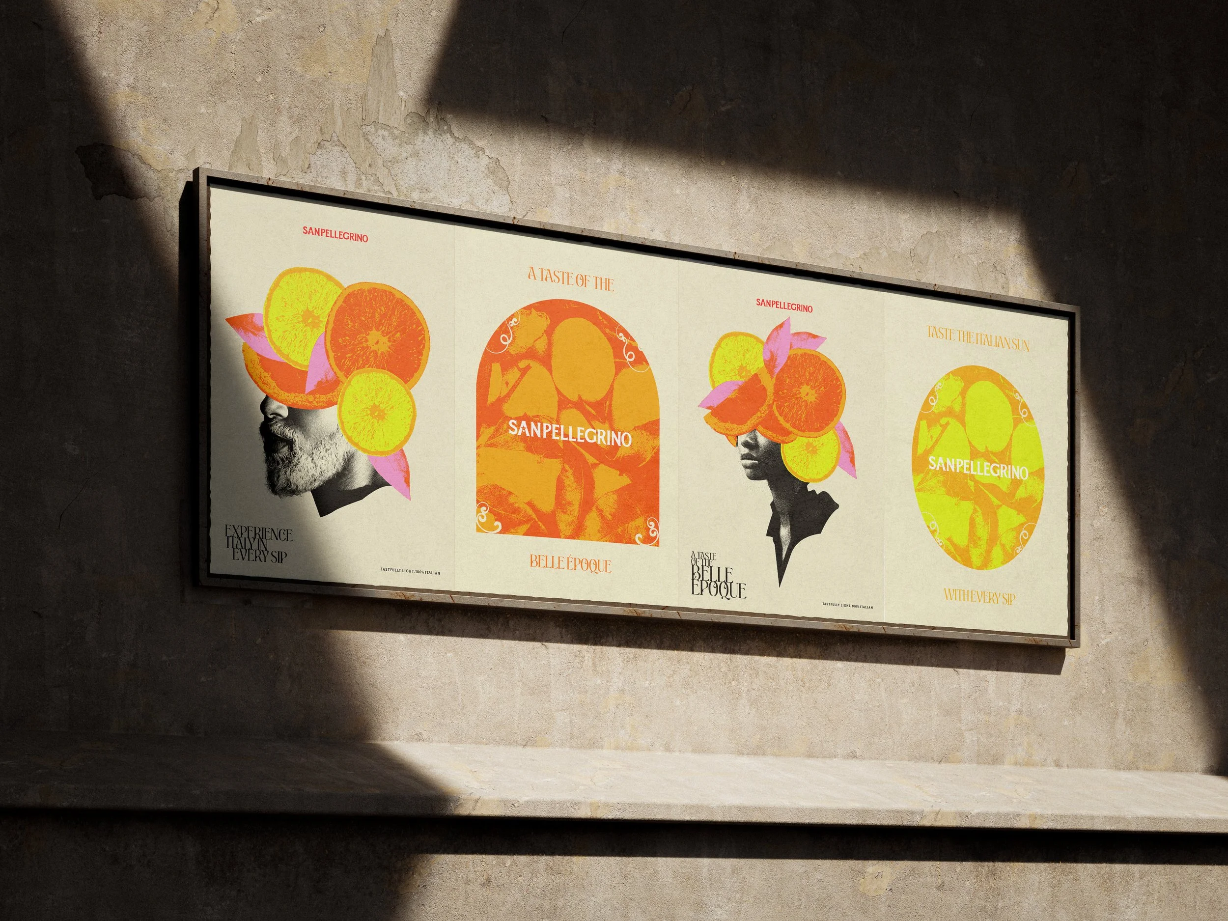
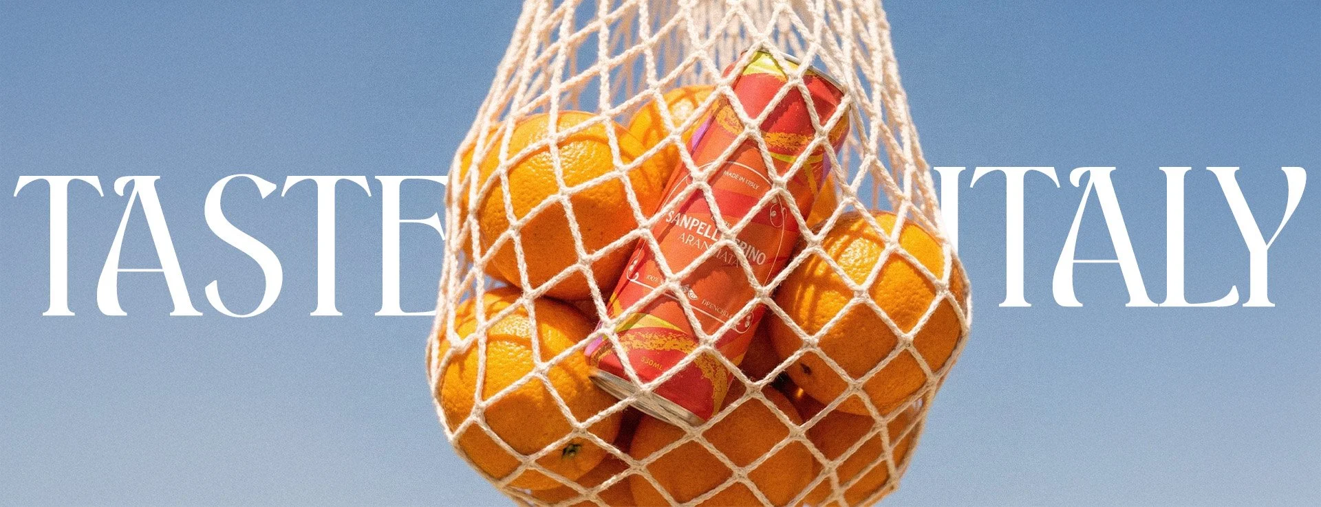
The new identity, centred around the iconic star motif, expands into an elegant, tactile system that engages every audience. It balances San Pellegrino's elegance and vibrancy with a warm, approachable aesthetic, using bold, tactile colours that depart from the typical hues of drink brands. Every interaction is designed to evoke the experience of the Belle Époque.
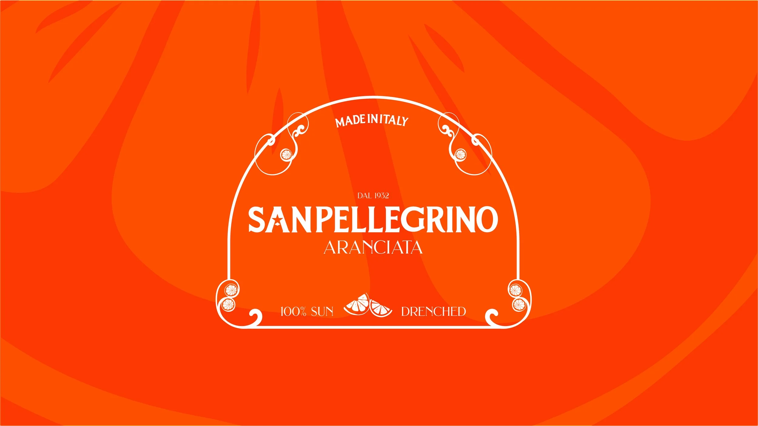
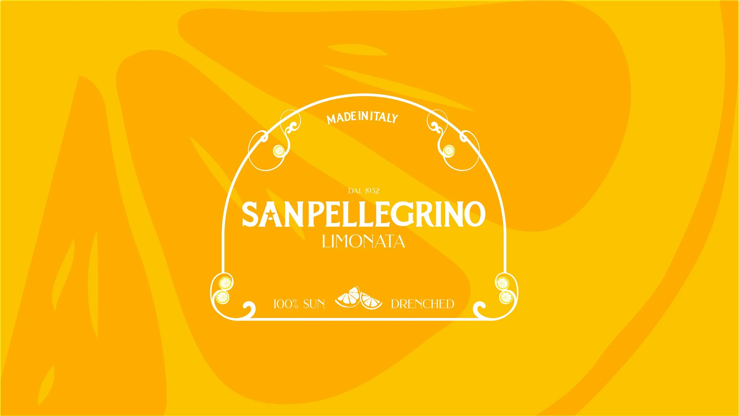
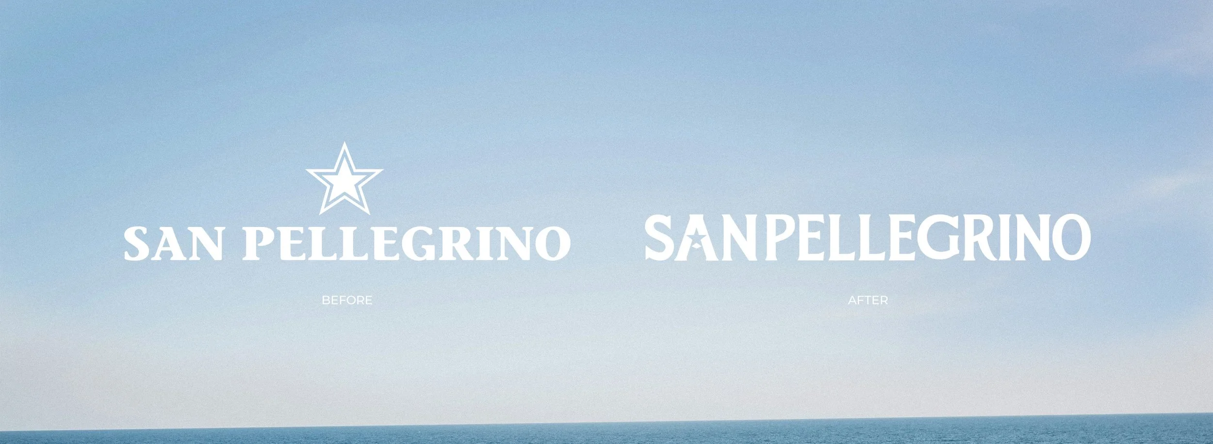
Inspired by the Art Nouveau movement and Grand Hotel and Casino of San Pellegrino, the new logo is elegant and modern. The star, a symbol of quality and luxury during the early 20th century, is now integrated into the brand, reflecting San Pellegrino's status as the star of the show.
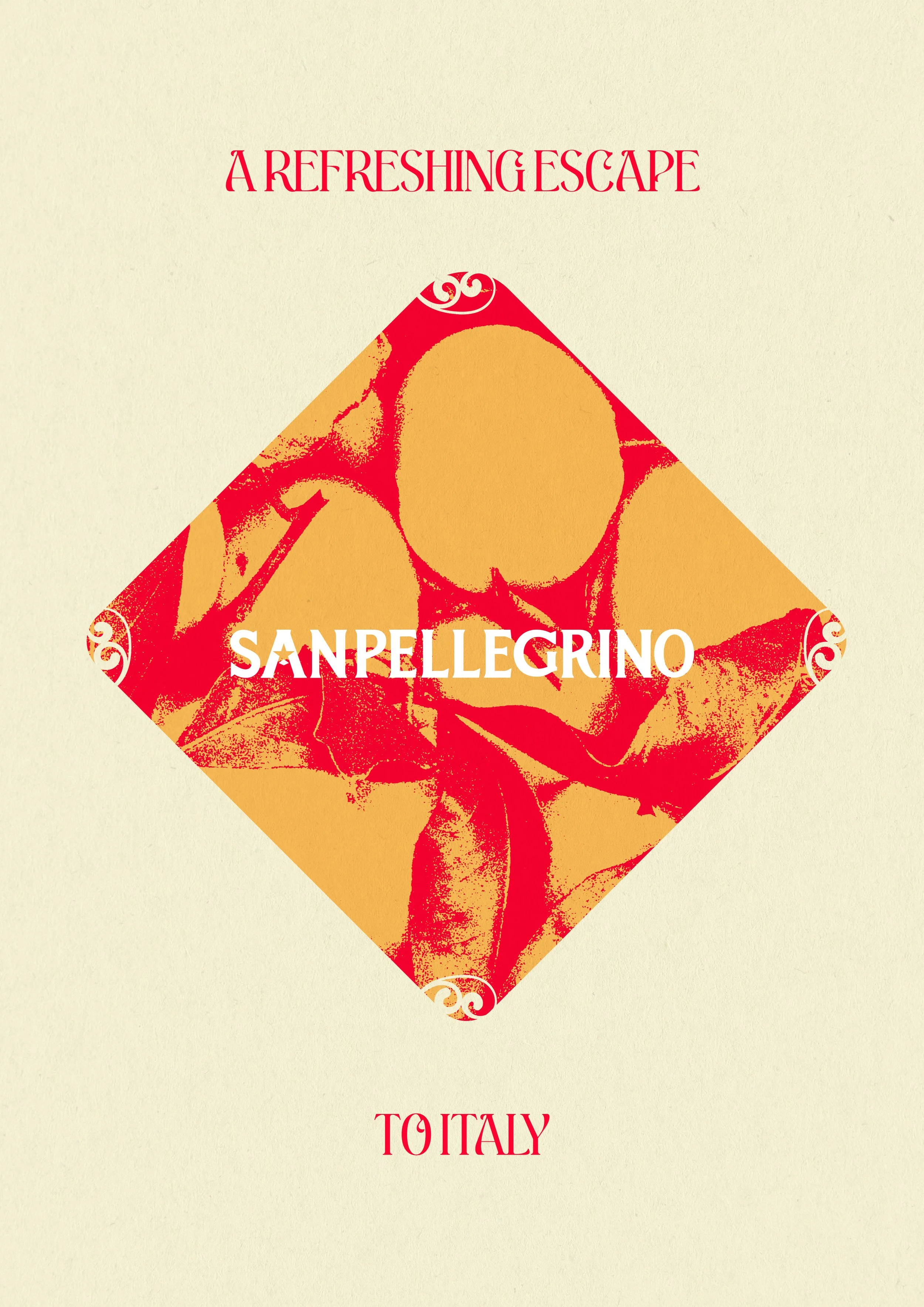
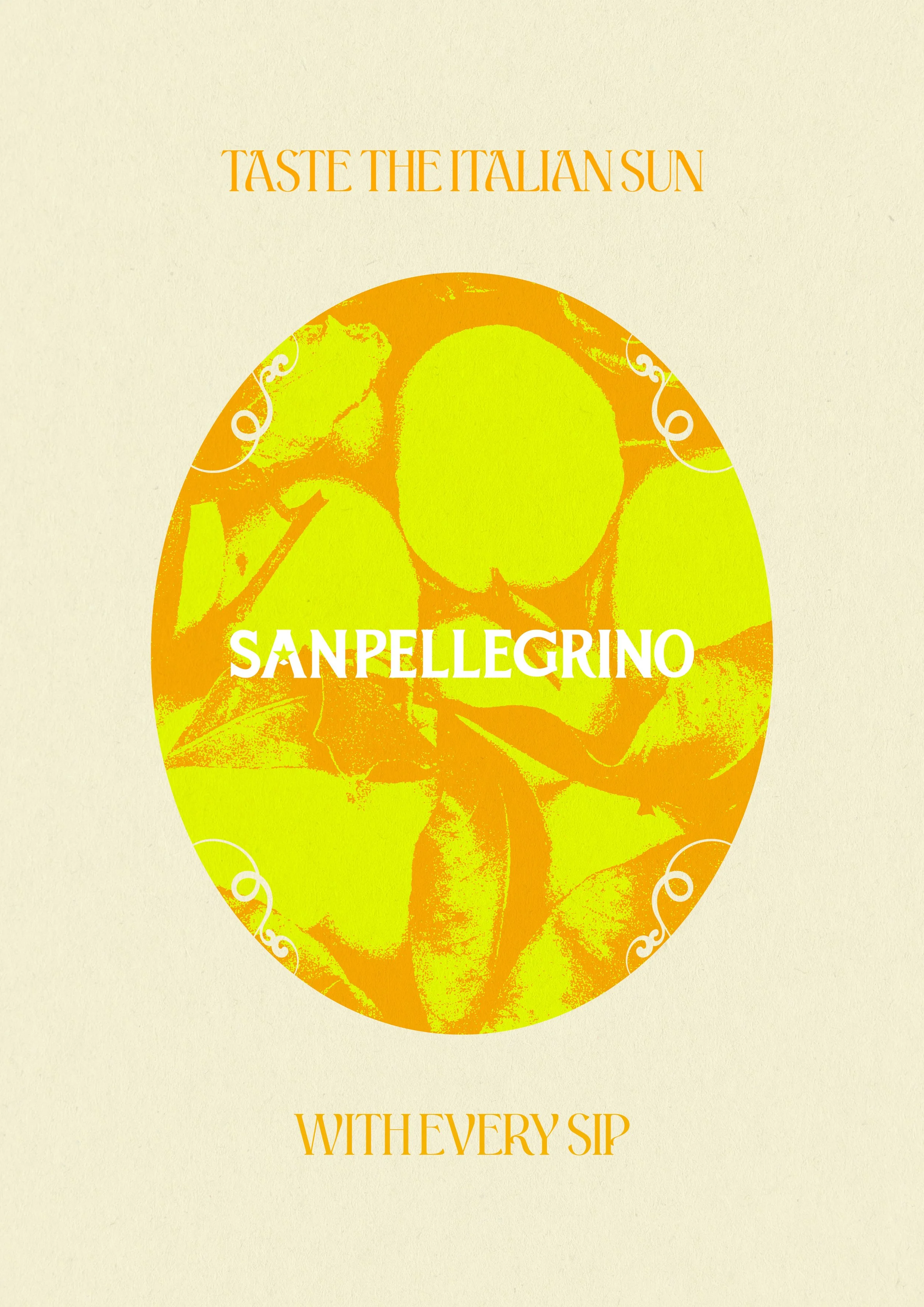
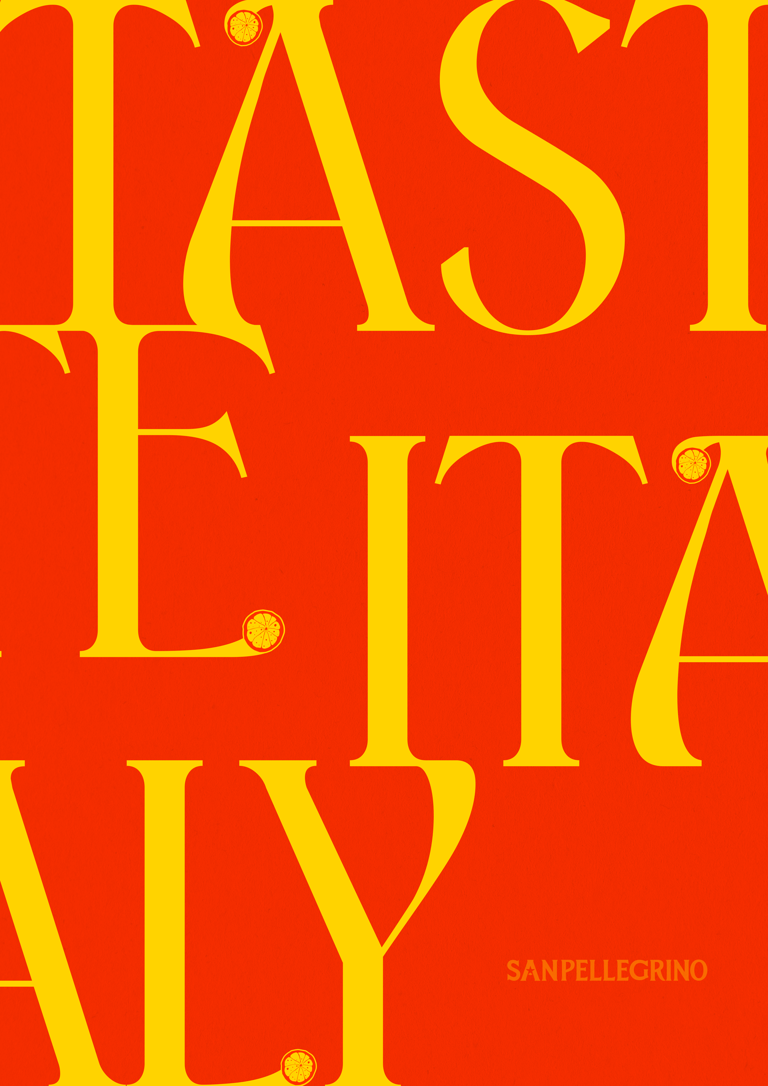
This brand refresh celebrates San Pellegrino's legacy by creating a brand style that embodies the Belle Époque and Art Nouveau era. Art Nouveau-inspired fonts and colours, including the core red from the original star symbol, complement modern graphics and reflect the popular flavours of the drinks.
Year
2024
Branding
Conceptual
Design
Visual Identity
Packaging Design
Art Direction
Typography
Copy Writing

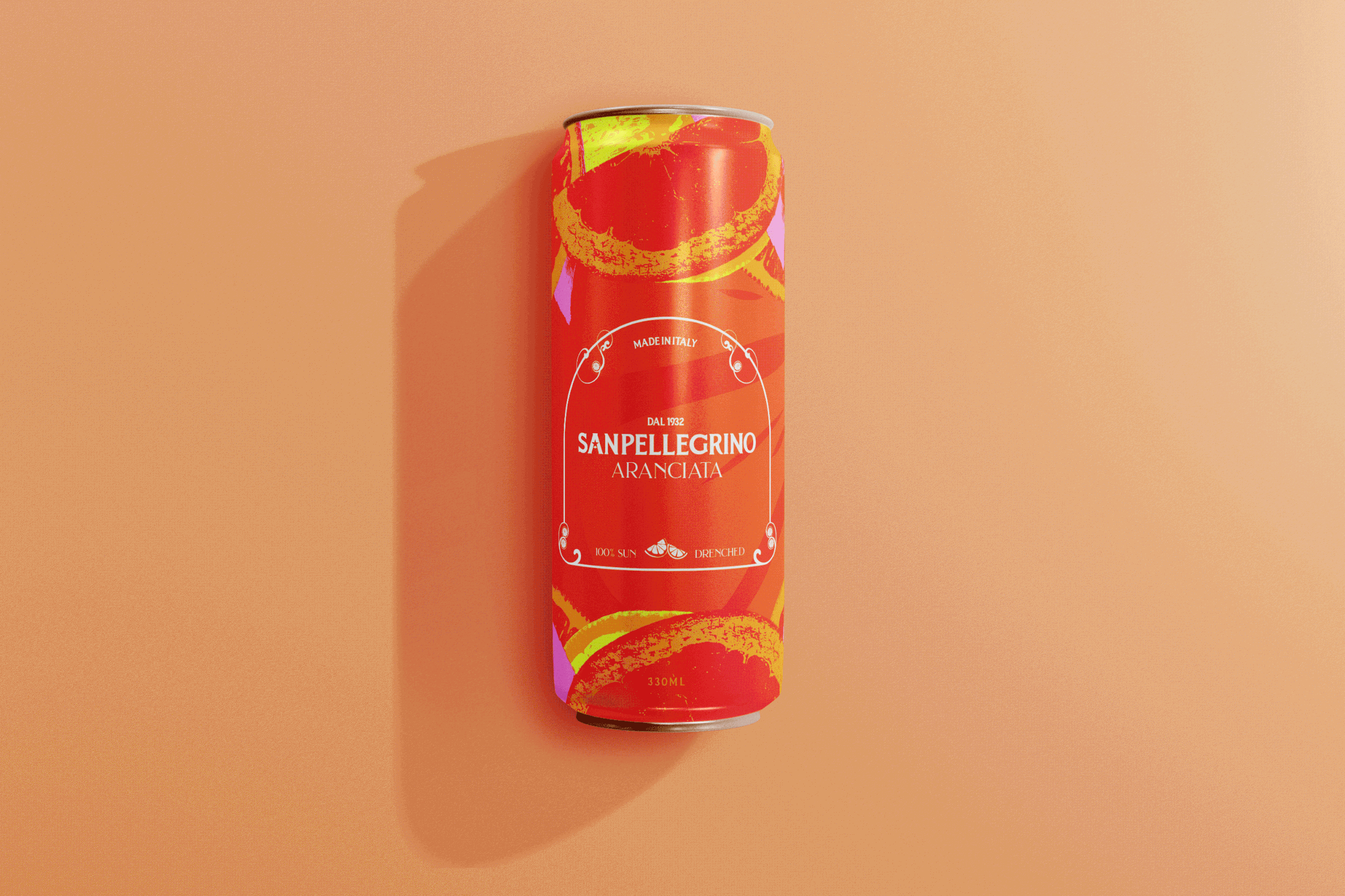
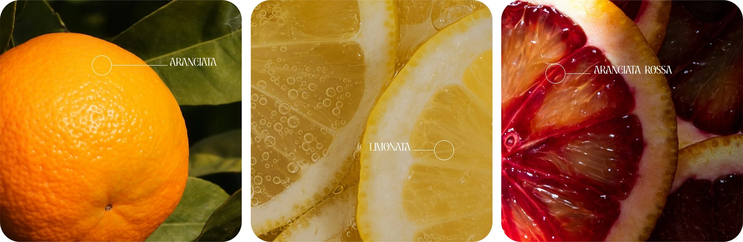
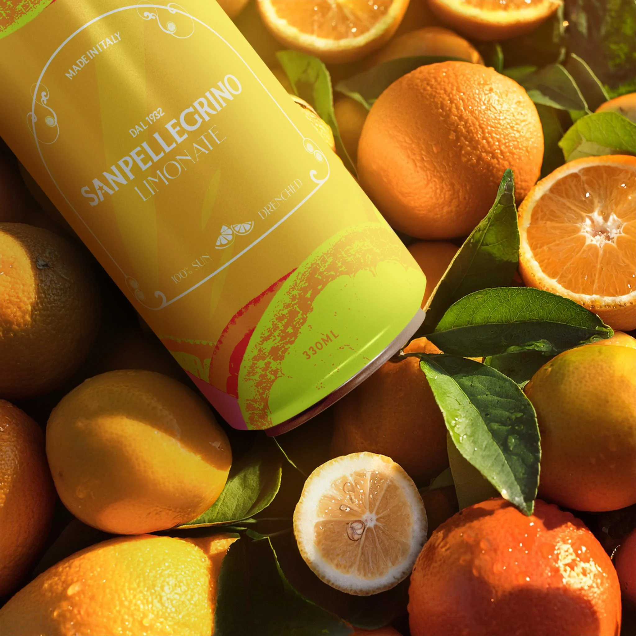
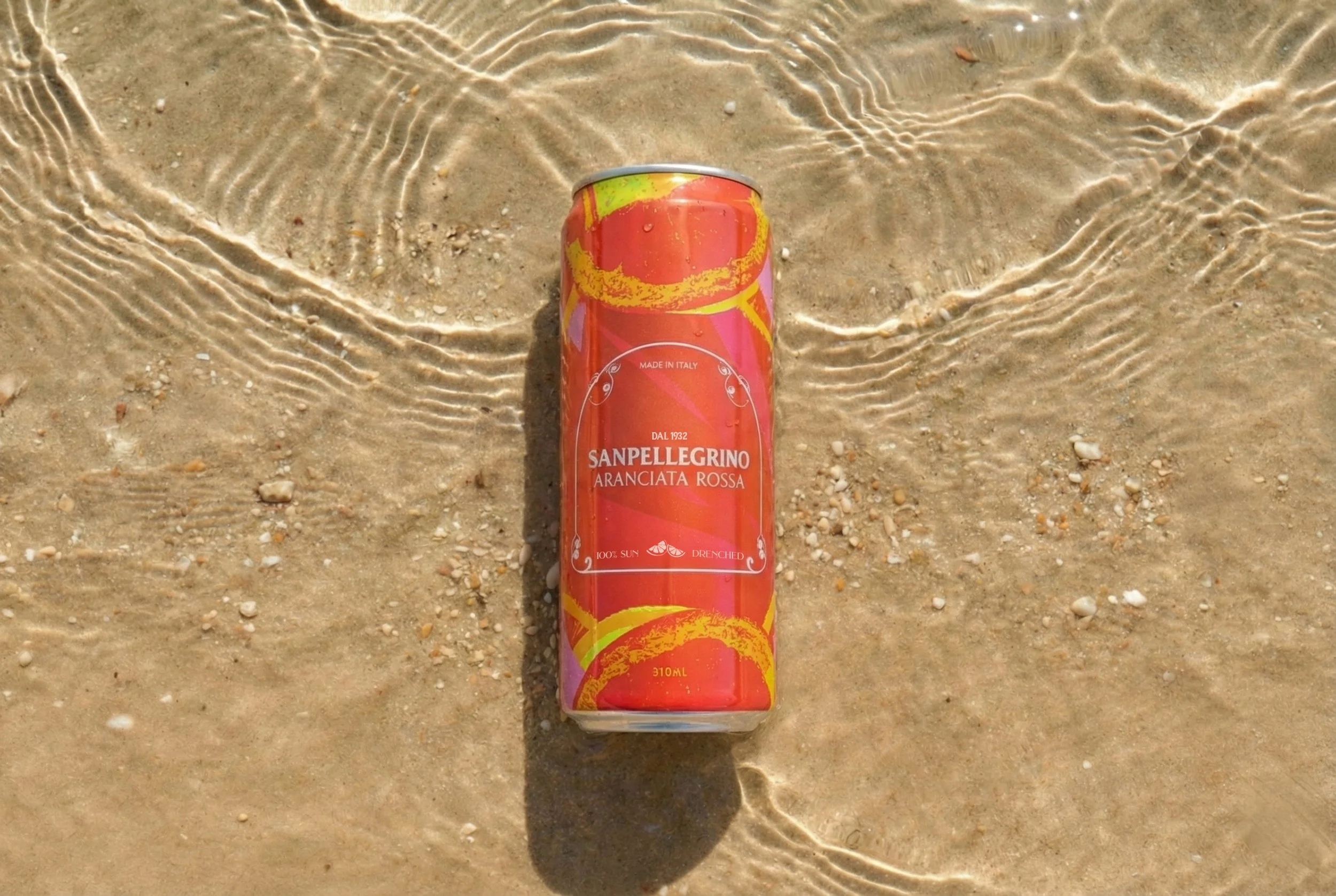
To enhance the sensory experience of SanPellegrino's fresh ingredients, the brand's colour palette was crafted from the very hues of the fruits themselves, bringing their vibrant colours to life on packaging and branding.