
Daily Yolk
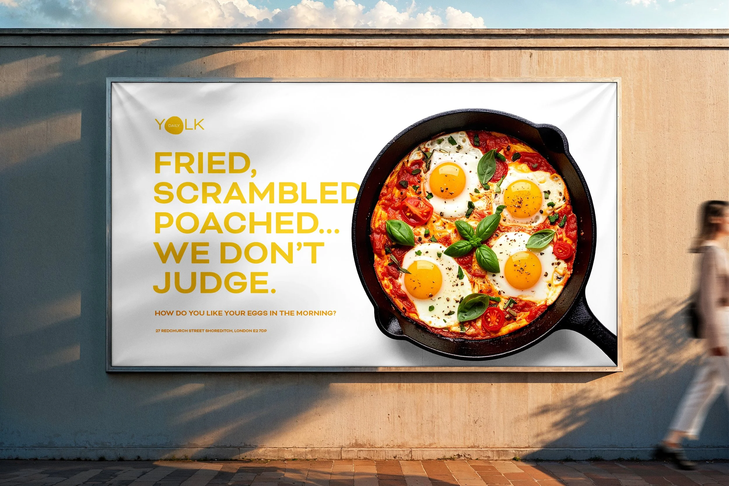
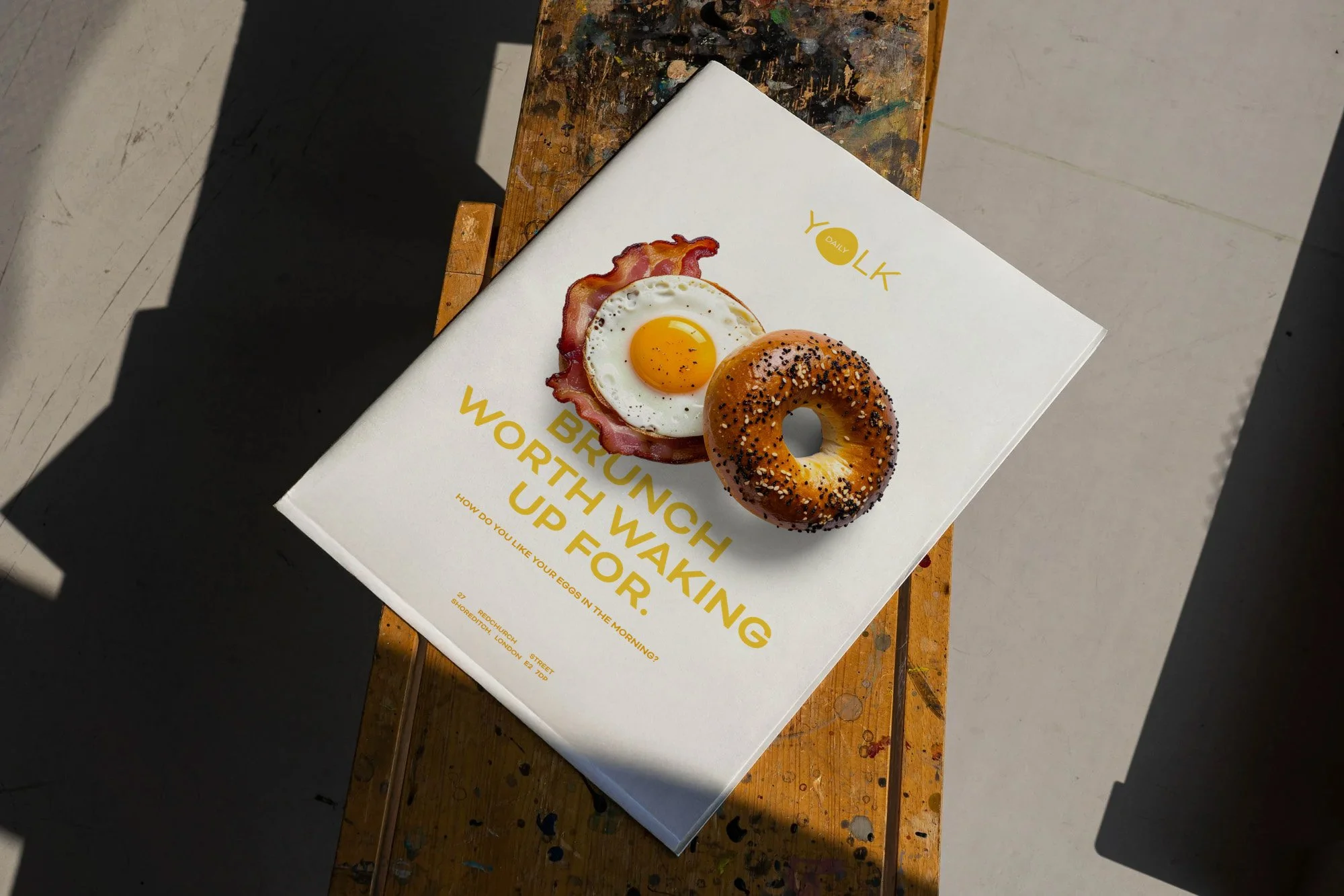
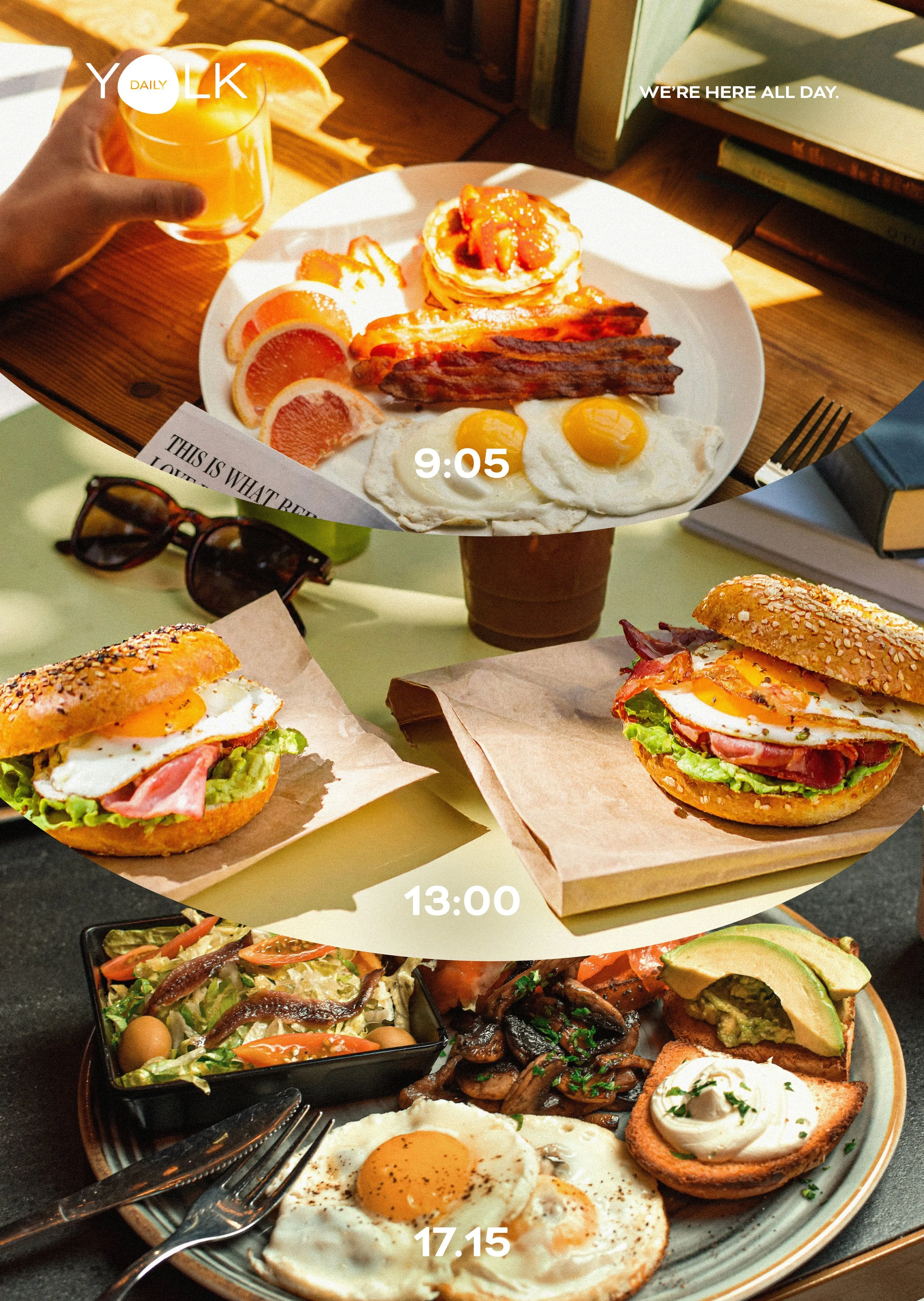
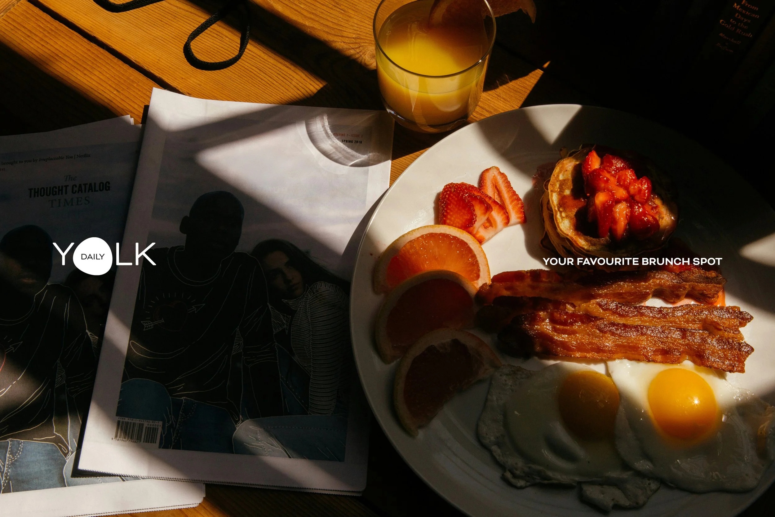
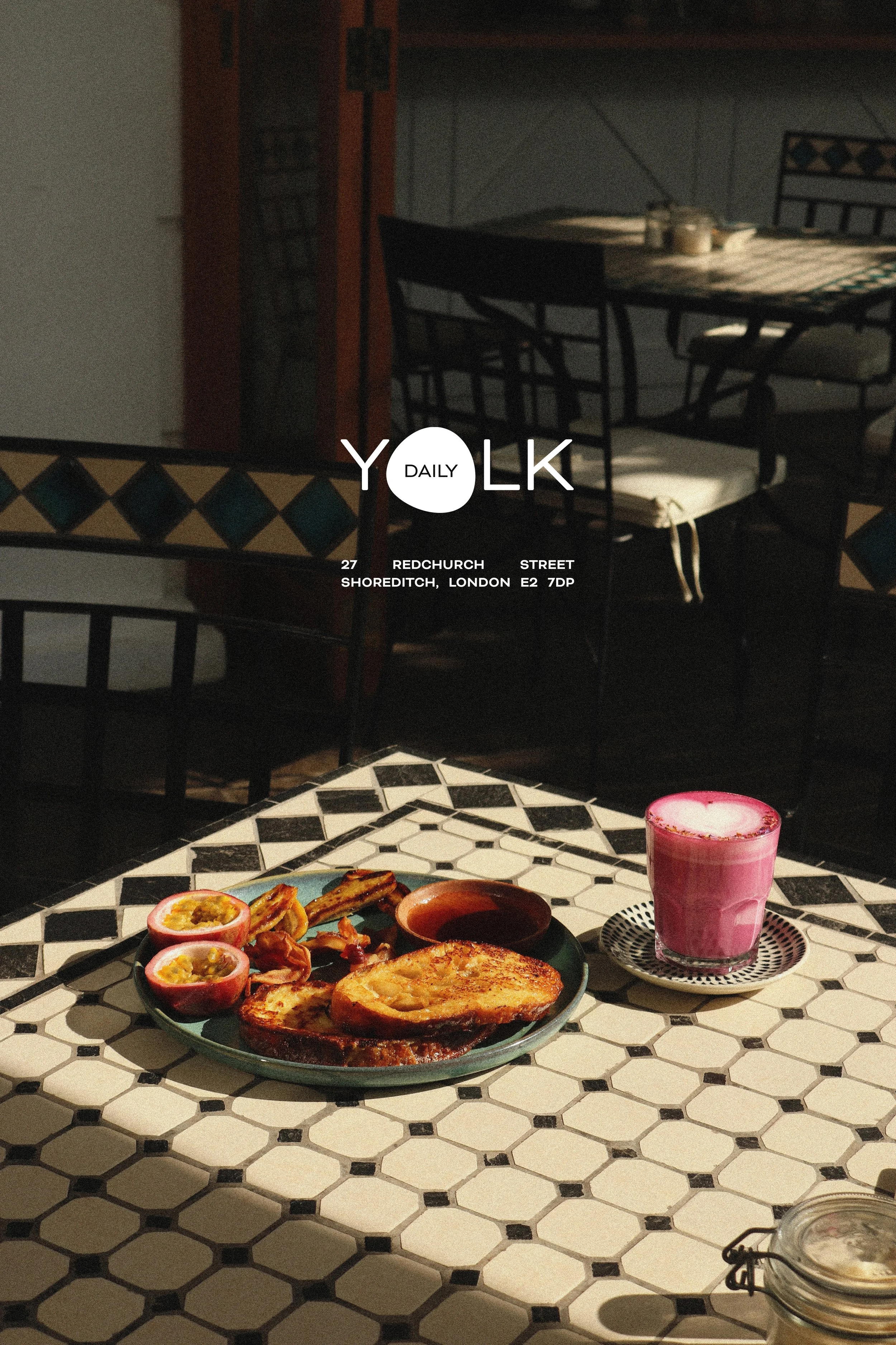
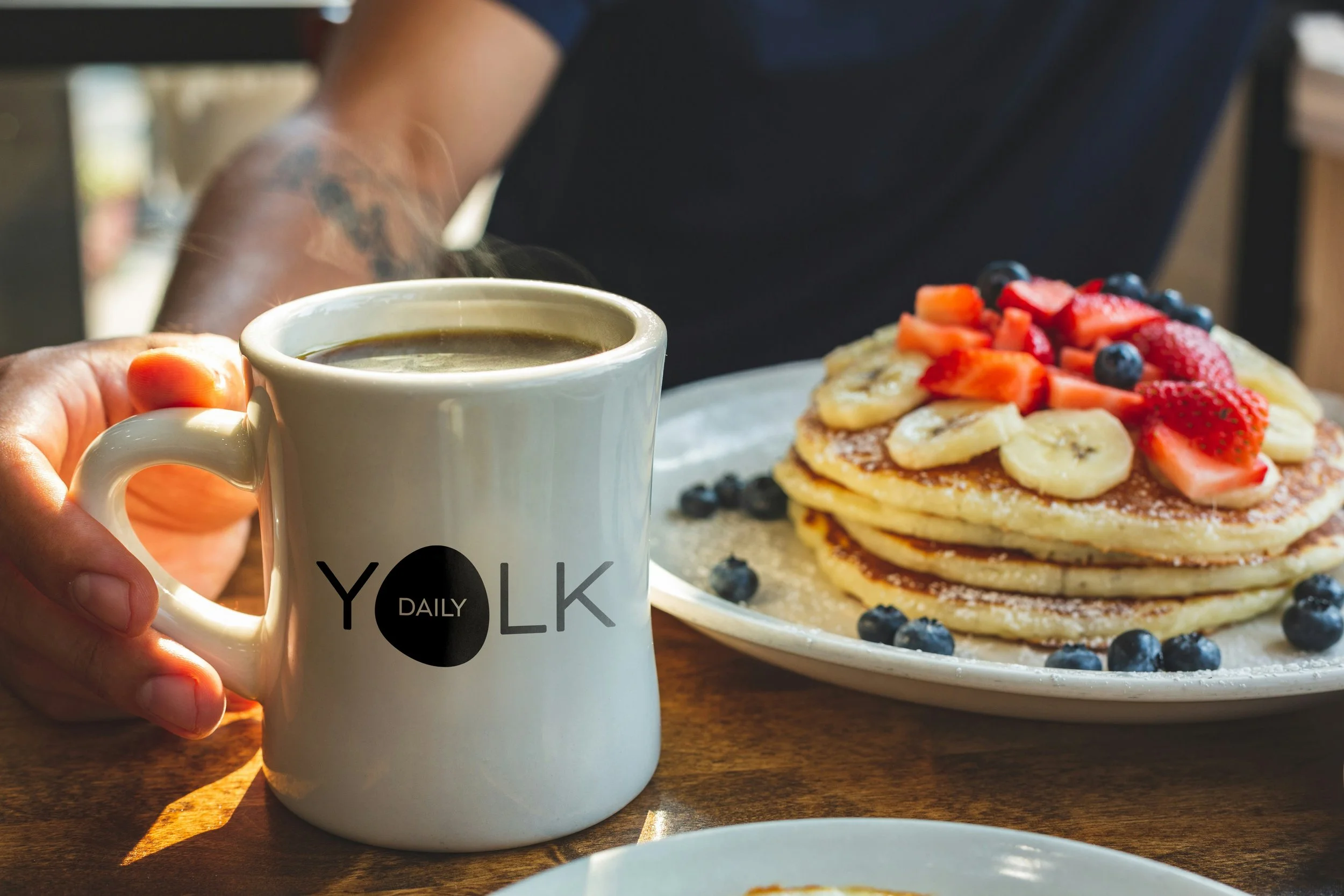
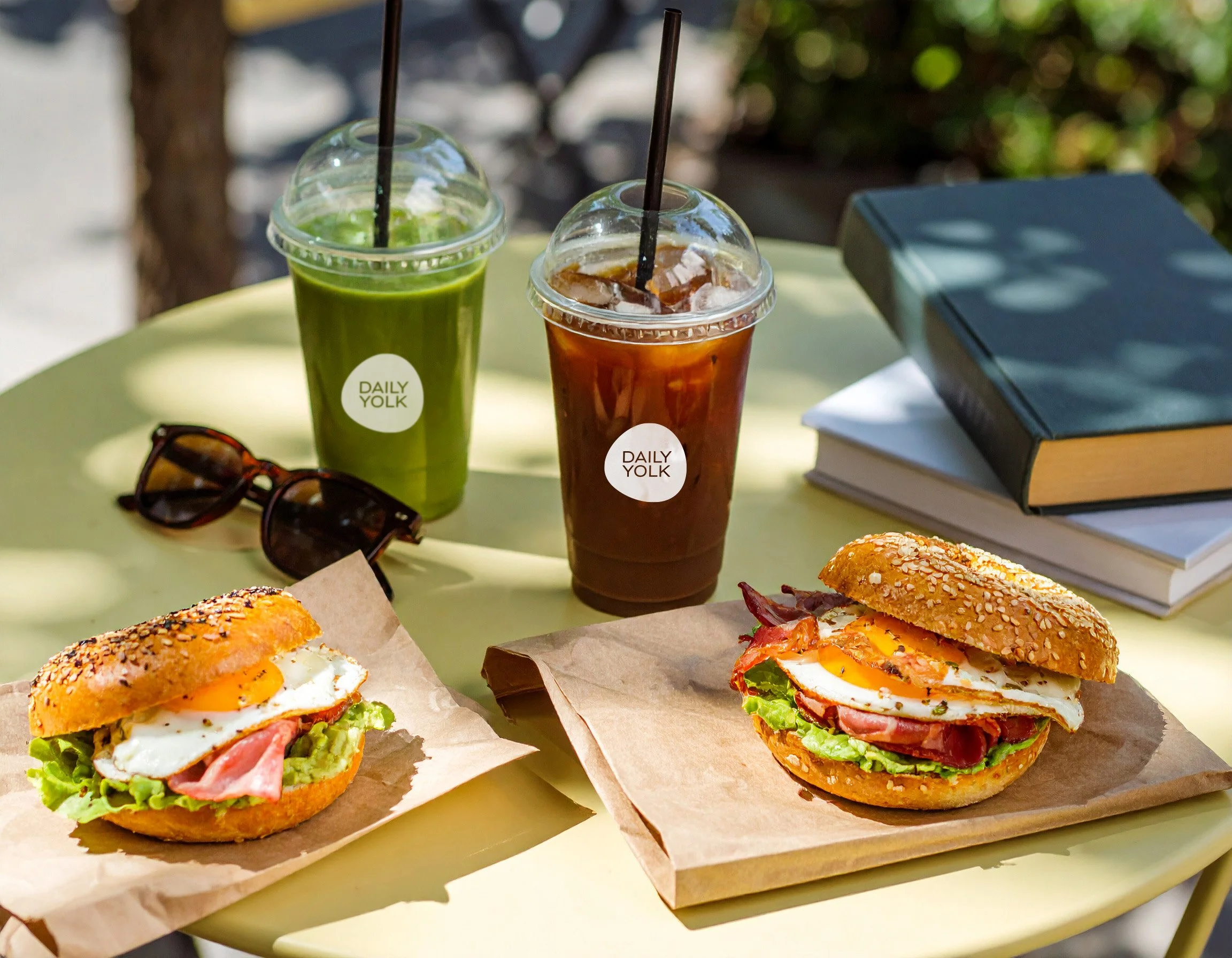
The Daily Yolk is a modern, all-day breakfast club designed for slow mornings, golden yolks, and good vibes. It’s a go-to spot for brunch lovers craving comfort from greasy spoon classics to that cozy, first-bite feeling whether it’s 9AM or 3 in the afternoon.
At its core, Daily Yolk is about bringing people together through wholesome, feel-good food. The dishes themselves are the heroes of the brand, anchoring the visual identity and communicating warmth, simplicity, and satisfaction.
As an all-day breakfast destination, the visual style had to feel both bright and modern. Drawing inspiration from the rich yellows and warm oranges of farm-fresh eggs and morning sunshine, the palette creates an inviting, optimistic atmosphere that feels unmistakably Daily Yolk.
This warmth carries across all brand elements from advertising to photography with a style that’s light, high-contrast, and vibrantly fresh. Every detail is crafted to reflect the brand’s sunny spirit and easygoing energy.
Year
2025
Conceptual
Design
Visual Identity
Branding
Packaging Design
Illustration
Art Direction
Copy writing
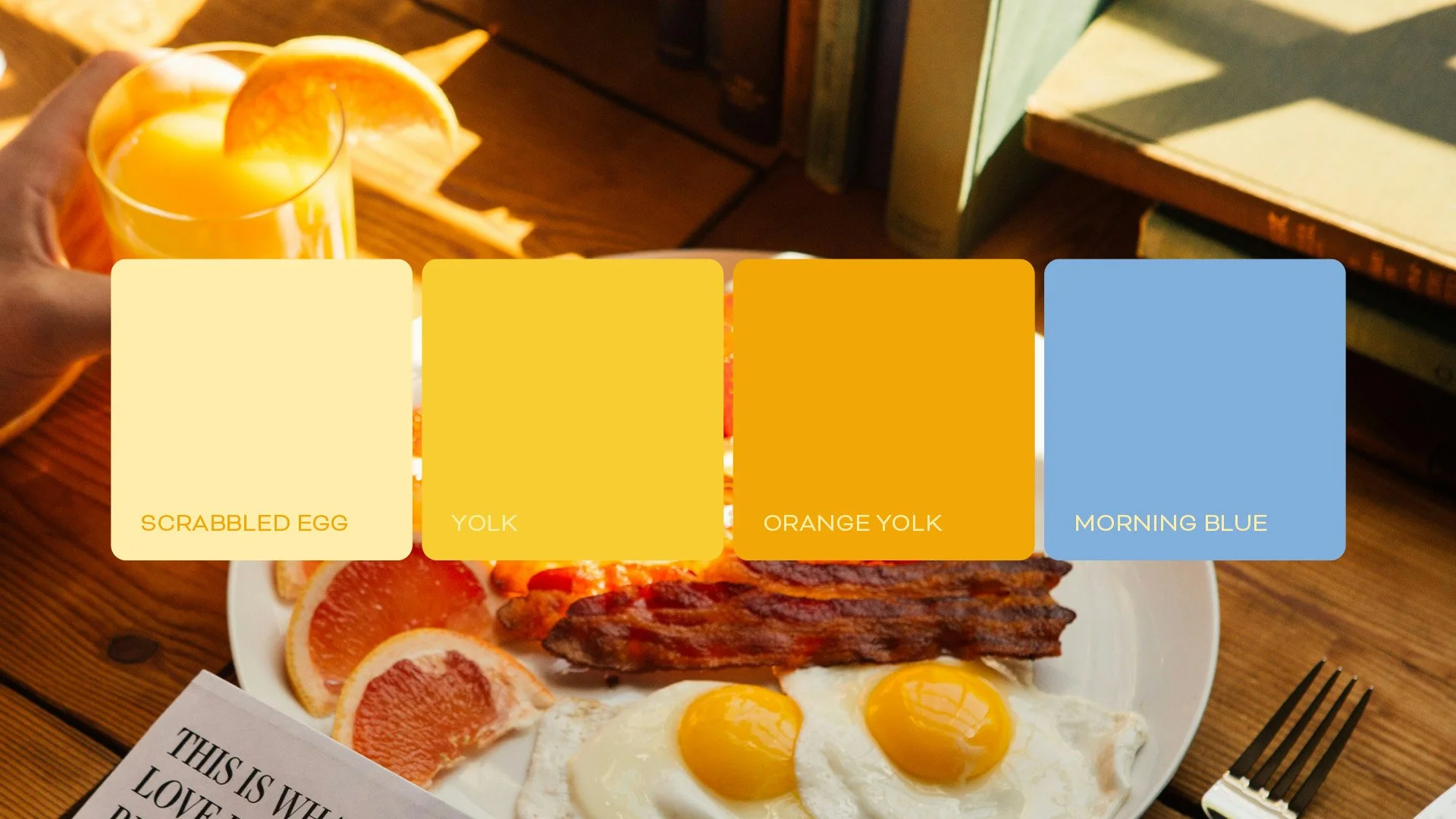
Colour’s of the era
These are paired with Morning Blue, a calm and subtle accent that evokes early skies and slow, easy starts to the day. Together, these colours create a visual identity that feels both energising and approachable — just like brunch should be.
Colour’s for brunch
Daily Yolk colour palette captures the fresh, cozy feeling of that perfect first bite of breakfast. Inspired by the heart of every dish, the humble egg where the palette draws from its warm, natural tones.
Rich yolk yellows and soft, golden oranges echo the warmth of farm-fresh eggs, bringing a sense of comfort and optimism.
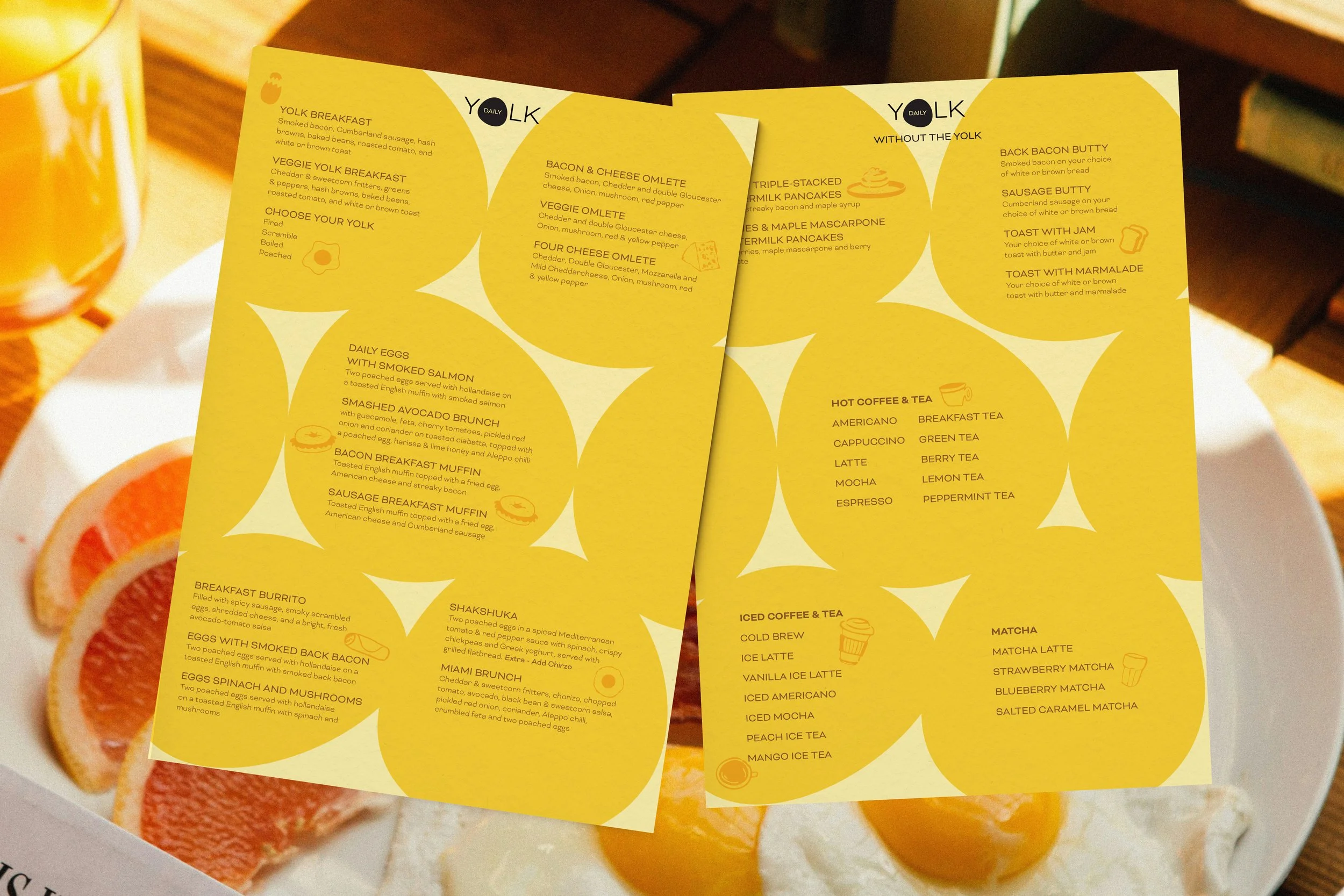
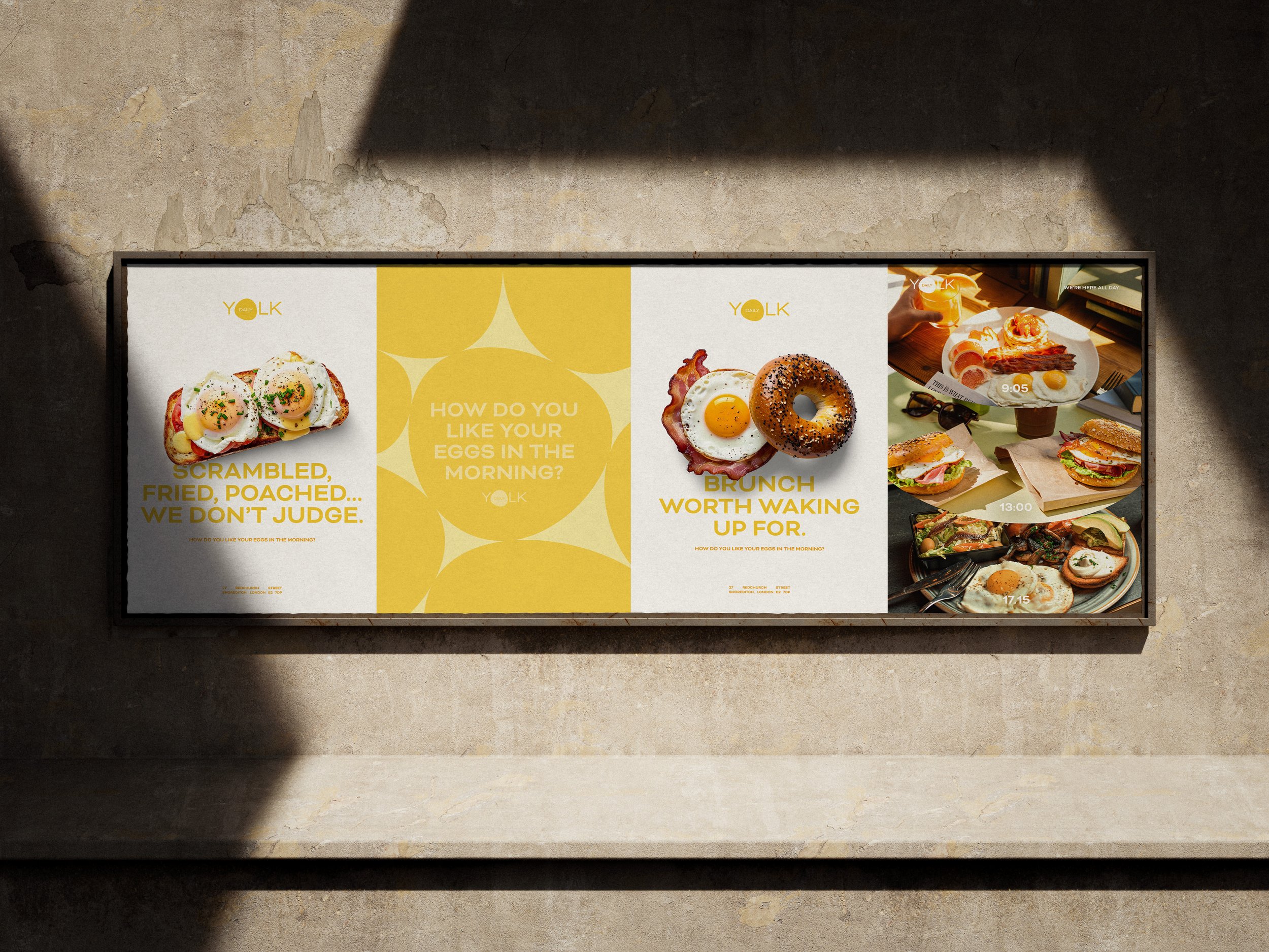
Tone of Voice & Visual Style
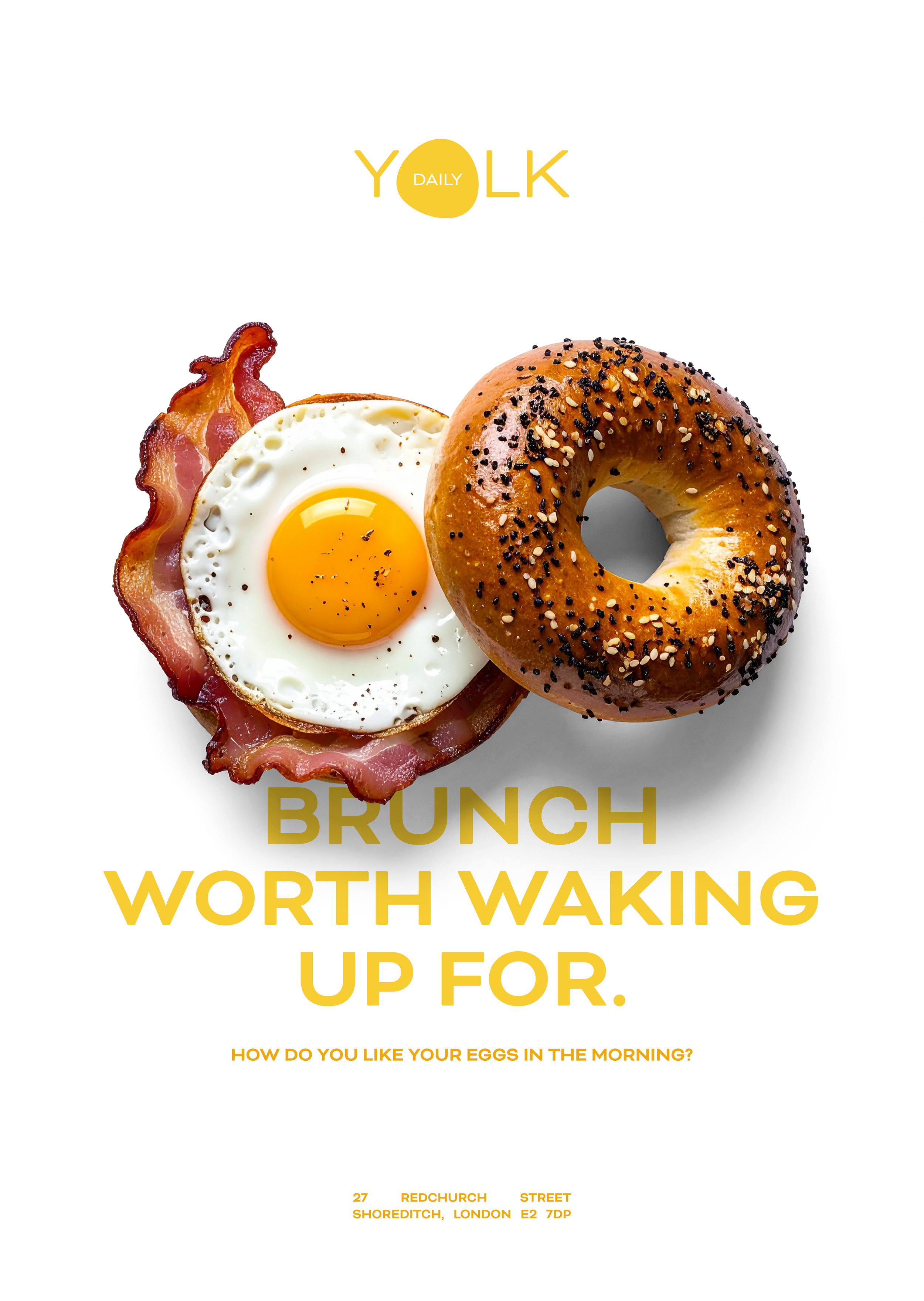
The visual style puts food front and centre, especially the breakfast staples that everyone loves. This focus is paired with a witty, warm tone of voice that feels friendly and uplifting, creating a bright start to the day for anyone who encounters the brand.
A clean, minimal design approach allows key brand elements to shine, especially the signature yellow and bold, graphic photography style. This simplicity ensures the food takes the spotlight, while reinforcing a fresh, modern feel.
From this core concept, the brand’s visual language has evolved organically. Whether through striking typographic compositions or all-photographic layouts, every expression of Daily Yolk feels cohesive, confident, and unmistakably sunny.

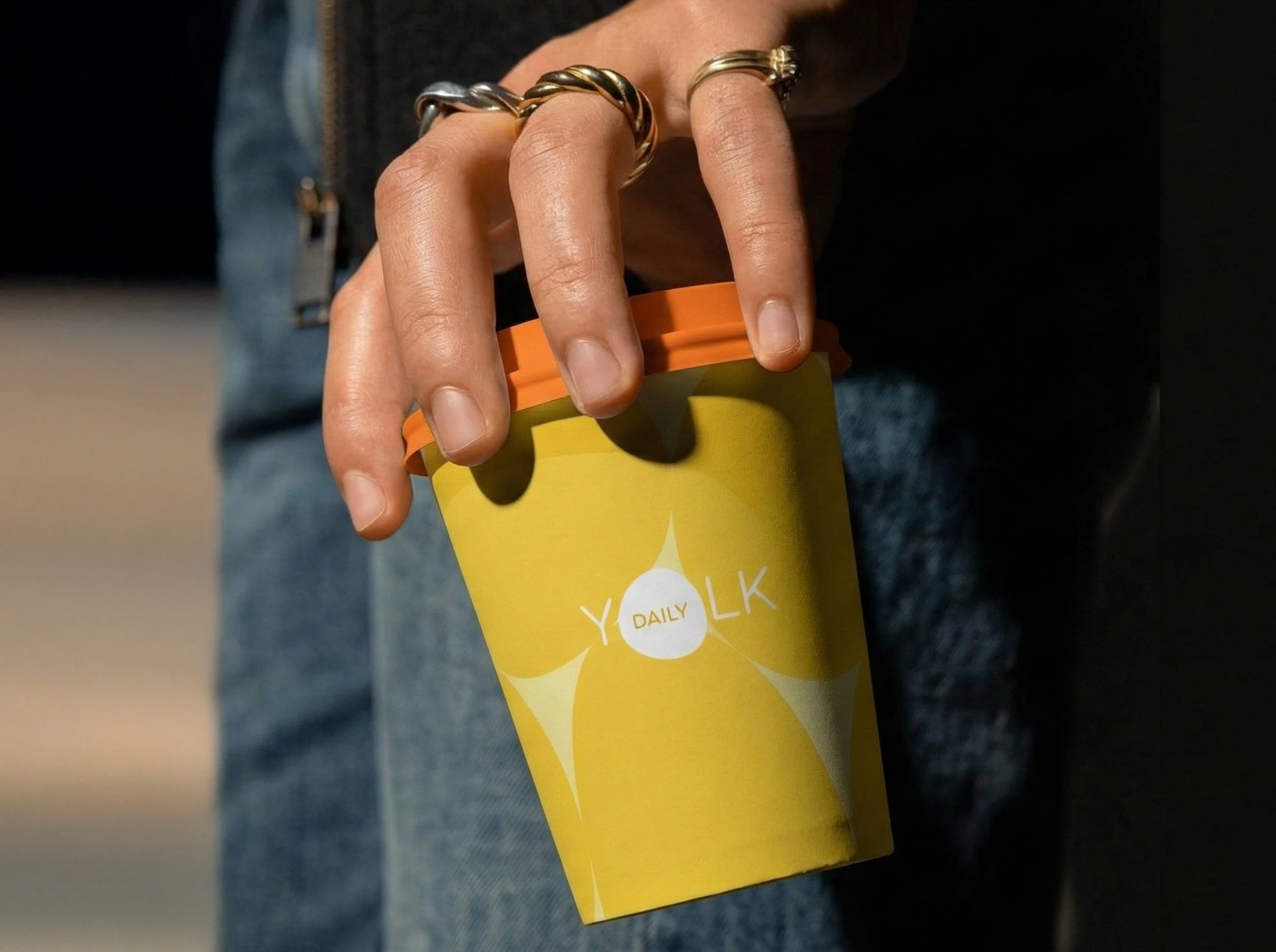
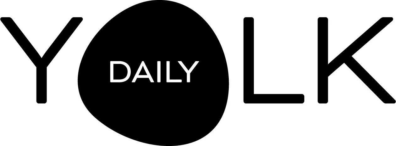
Logo
Inspired by the organic form of an egg yolk, The Daily Yolk logo blends the softness of a cracked egg with the clean structure of modern letterforms. The result is a logo that feels both contemporary and inviting — a perfect reflection of the brand’s fresh, playful identity.
Designed as a cohesive unit, the yolk-inspired shape contains the word “Daily”, creating a distinctive mark that serves as both a wordmark and a visual icon.
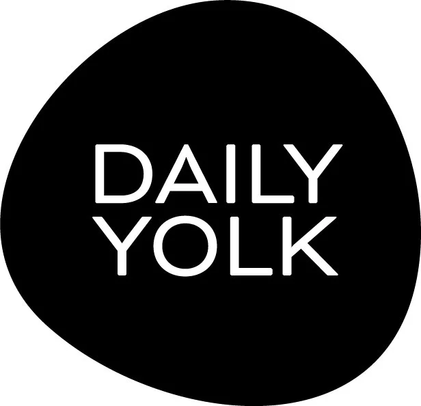
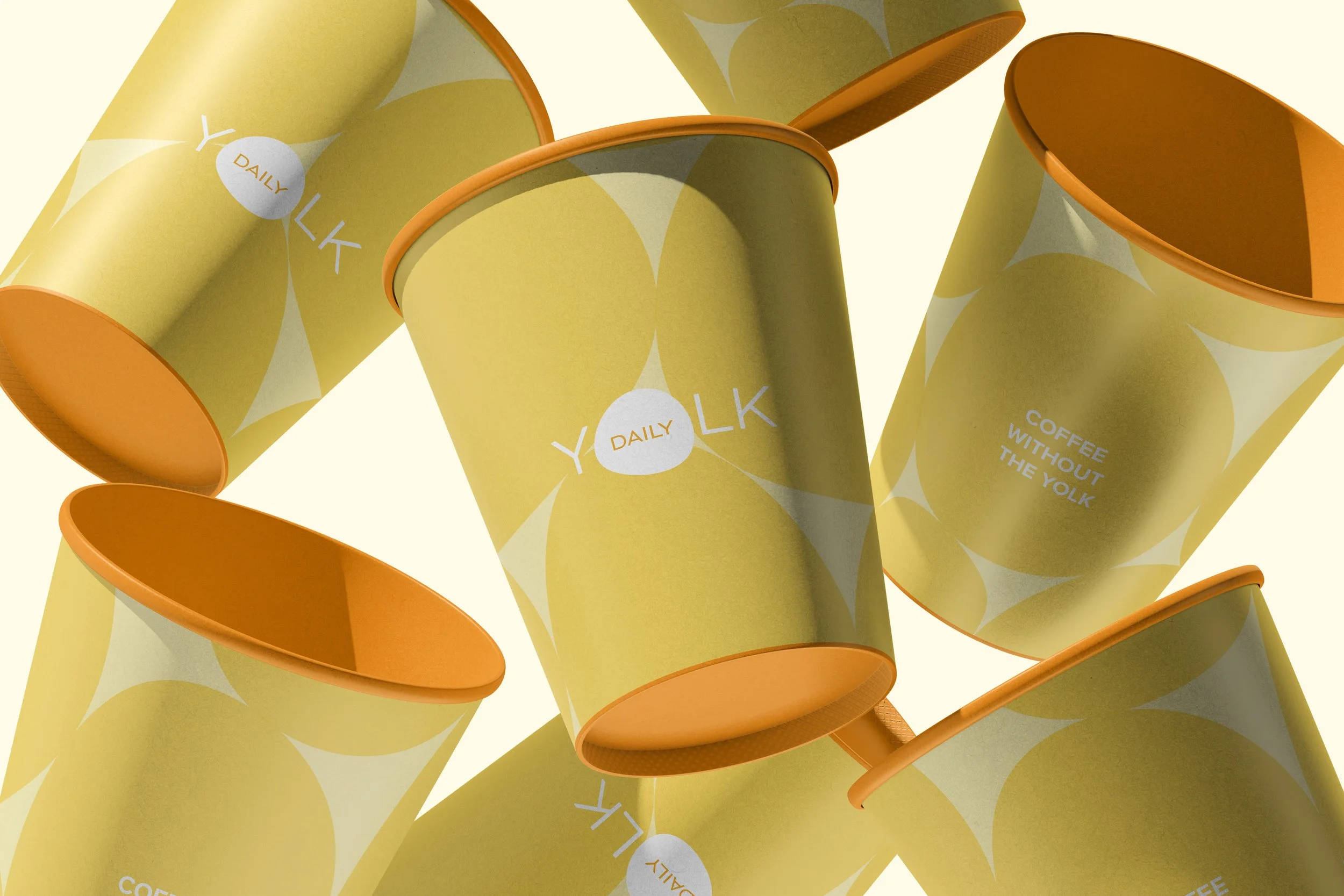
Logo to monograms
This versatile shape also extends beyond the logo itself, influencing patterns, framing elements, and other brand visuals to ensure a consistent and memorable presence.
For smaller applications, such as takeaway cups, bags, and social media profiles, a smaller iteration was developed. This compact version retains the yolk-inspired form, reinforcing brand recognition even in tight spaces and helping build a strong visual identity across both digital and physical touchpoints.