Mountpark
Mountpark, a leading provider of warehousing solutions for businesses like Amazon, wanted a brand refresh to solidify its presence in the digital age. The goal was to modernise their image and become more digitally compatible.
My role throughout the project was leading the conceptualisation, crafting the brand identity through to art direction.
Brief: Modernise Mountpark’s identity to compete in a digital-first world.
Goal: Strengthen brand recognition and communicate customer-first values.
Problem: Existing identity felt outdated, lacked flexibility for digital.
Year
2023
Conceptual
Design
Visual Identity
Art Direction
Layout
Typography
Motion
Identity System
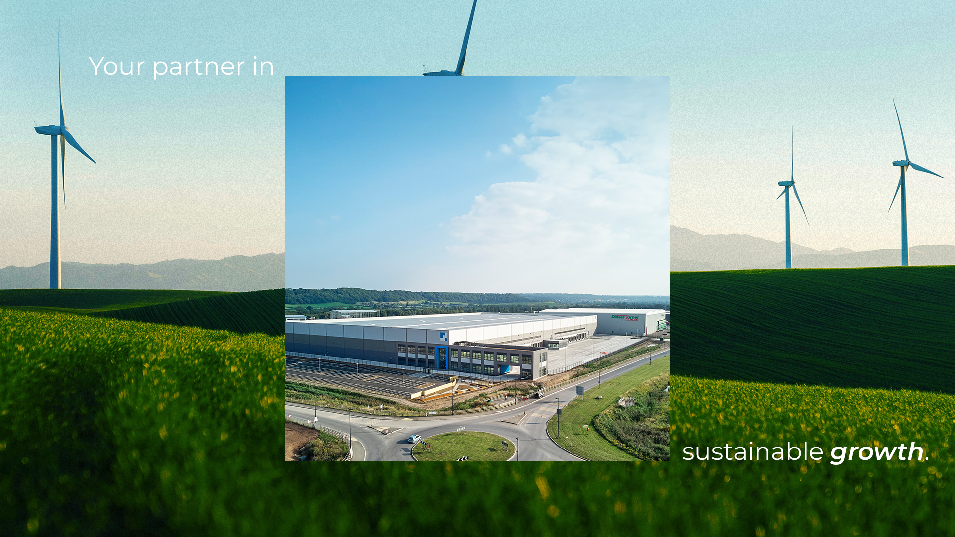
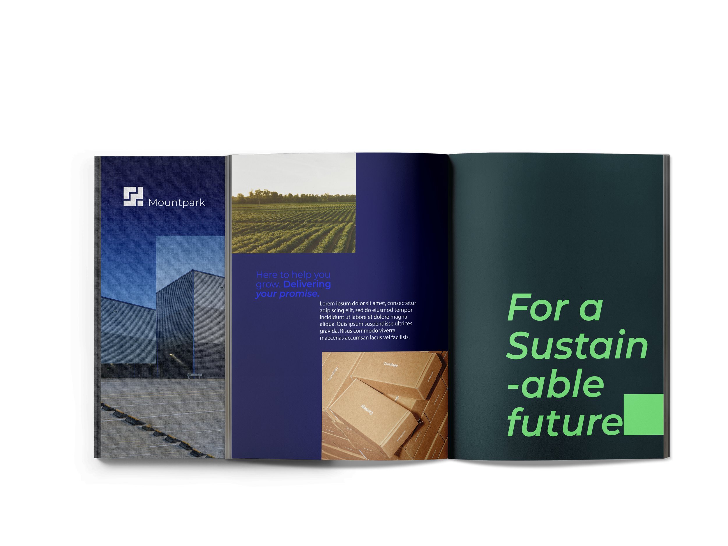
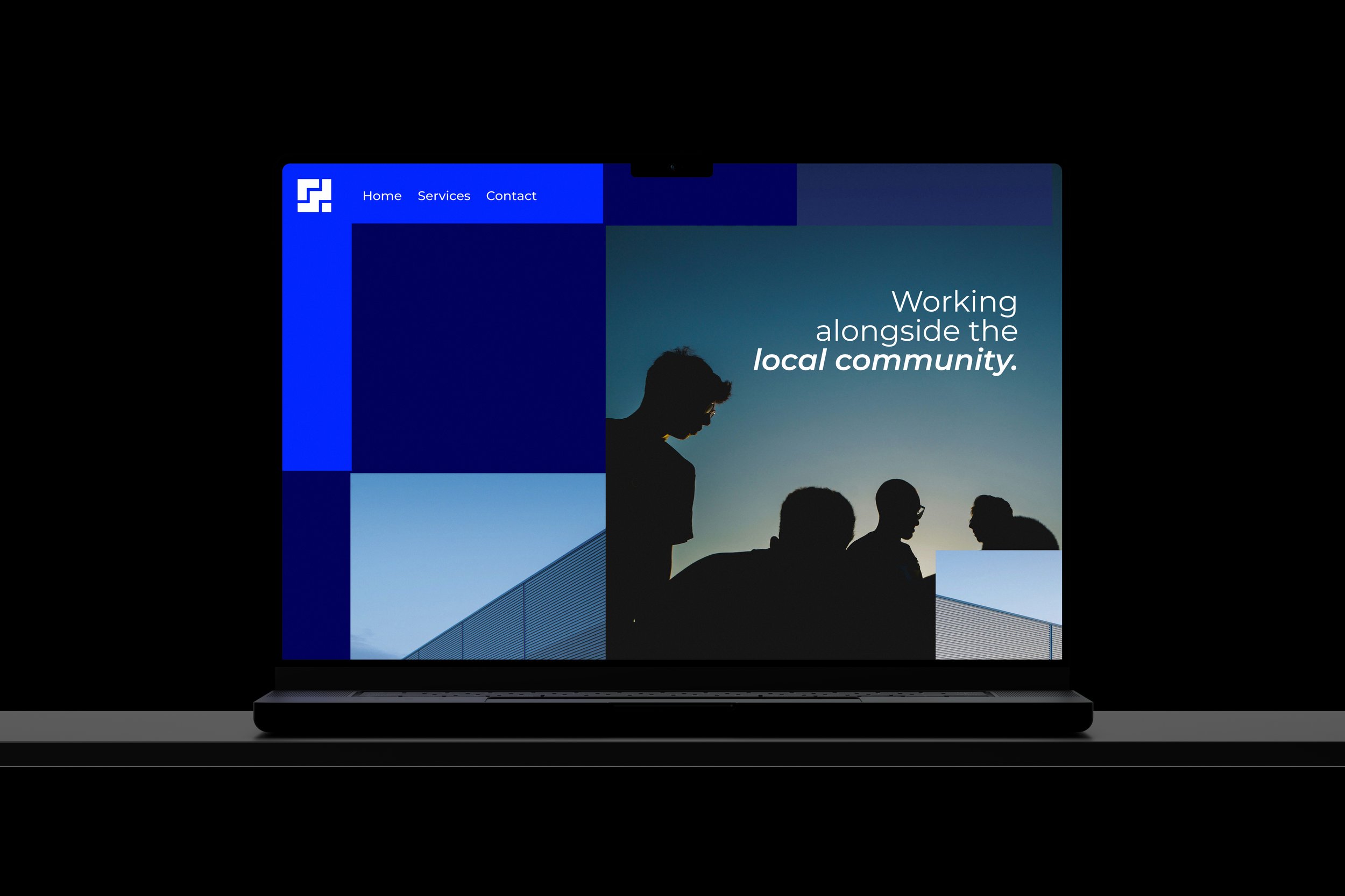
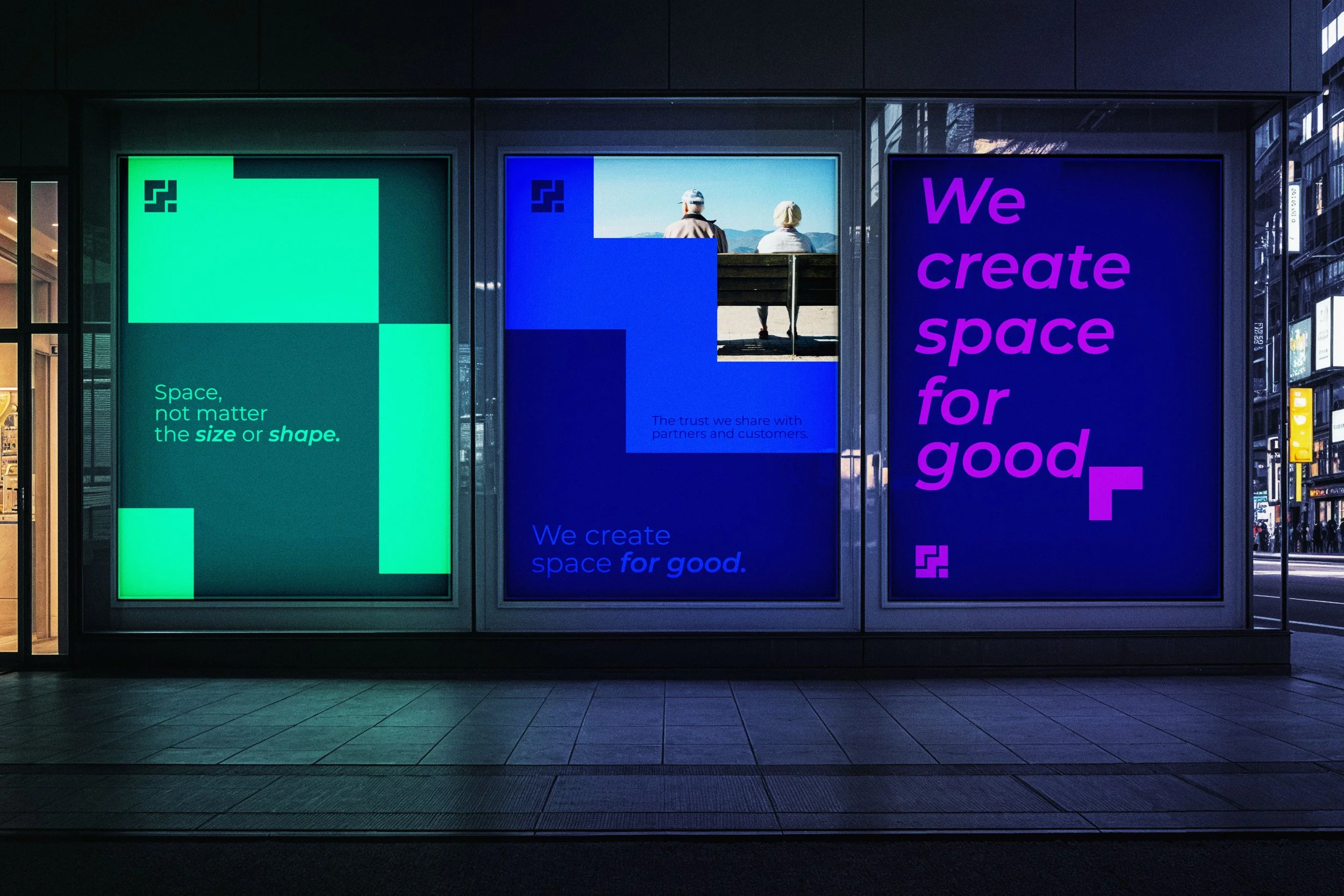
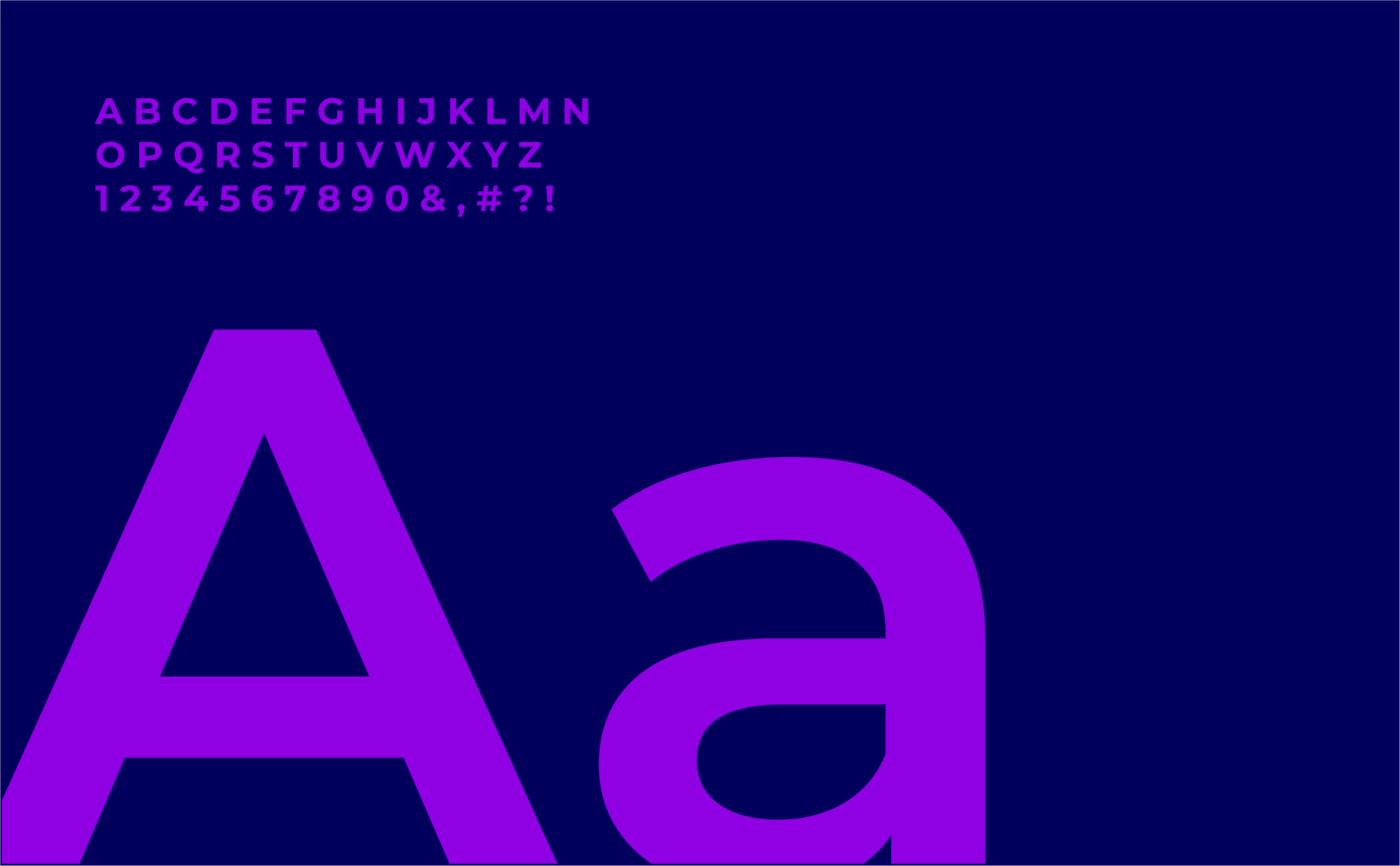
The refresh centred on deconstructing the existing logo to reflect the brand’s mission of putting customers, people, and communities first. This approach created a more flexible and dynamic identity, where logo elements evolve into geometric shapes that form bold layouts and compositions. Inspired by the very boxes customers use with Montserrat, a geometric sans-serif typeface, now anchoring the brand’s visuals. This choice conveys a sense of strength and modernity, with a wide range of weights offering flexibility across various digital applications.
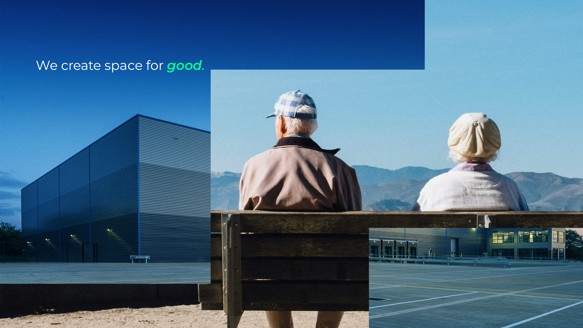
A new colour palette has been created to convey a bold and strong, digital-ready identity. Helping Mountpark stand out in a crowded marketplace and effectively communicate their brand message.
Brand in Action
Tagline: “Customers. People. Communities.”
Optimised for digital-first communication, the identity extends seamlessly into physical environments, campaigns, and corporate materials. Messaging and visuals work hand-in-hand across every touchpoint, reinforcing the brand’s commitment to putting people and communities first.