Trigger
Trigger is a wellness shot brand built around energy, movement and reaction. Created to disrupt a category dominated by safe, product-led wellness branding.
Challenge: Most wellness shot brands communicate through functional claims, muted palettes and ingredient-led messaging, making the category feel visually interchangeable. The challenge was to create a brand that felt energetic and distinctive while retaining credibility within the health and wellness space.
Insight: Consumers don’t just buy wellness shots for health benefits, they buy them for the feeling of activation. The opportunity was to build a brand around that emotional moment of energy, movement and reaction rather than around ingredients alone.
Strategy: Trigger was positioned as a lifestyle-first wellness brand that captures energy and movement through bold visual cues, dynamic composition and confident communication. This approach allows the brand to stand out within a crowded market while remaining clear, credible and commercially relevant.
Year
2024
Branding
Conceptual
Design
Visual Identity
Packaging Design
Art Direction
Typography
Motion
Brand System
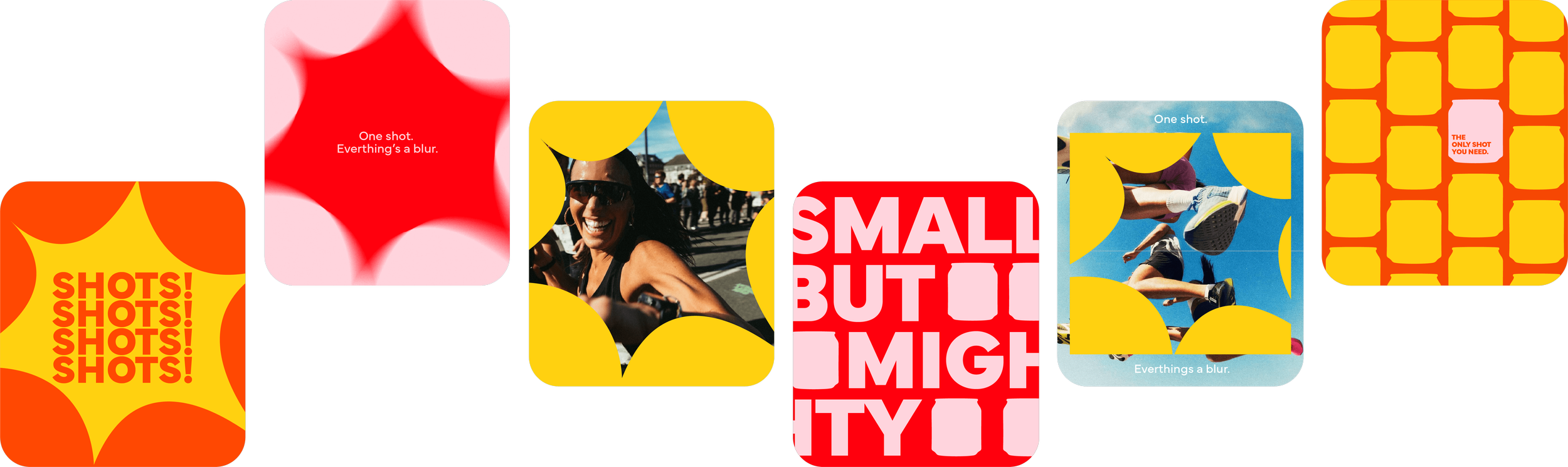
The identity translates the idea of activation into a flexible visual system, capturing the moment where energy is released and momentum begins. Rather than communicating wellness through ingredients alone, the system expresses the feeling of movement and reaction that sits at the heart of the brand.
Inspired by pop art culture and active lifestyle brands, bold forms, graphic bursts and amplified scale create a dynamic, high-impact visual language. A vibrant palette references the warmth and energy of turmeric and ginger while introducing strong contrast that helps Trigger stand apart within a visually saturated wellness category.
Mundial provides a strong, flexible typographic foundation, allowing the identity to scale across packaging, digital and campaign. Maintaining clarity while amplifying the brand’s energy.
Packaging
Packaging is treated as the brand's primary touchpoint. The logo is used at scale to create confident, shelf-ready compositions that prioritise instant recognition while balancing impact with clarity and trust, reinforcing Trigger's positioning as a bold yet credible wellness brand.

Campaign
“One shot. Everything’s a blur.”
The campaign shifts the conversation from product benefits to lived experience. Motion blur becomes a core communication device, conveying speed, momentum and sensory activation, transforming the brand from a functional wellness shot into a contemporary lifestyle experience built for movement.