The Mailbox
Reimagining a historic sorting office as a contemporary destination for culture, retail and experiences.
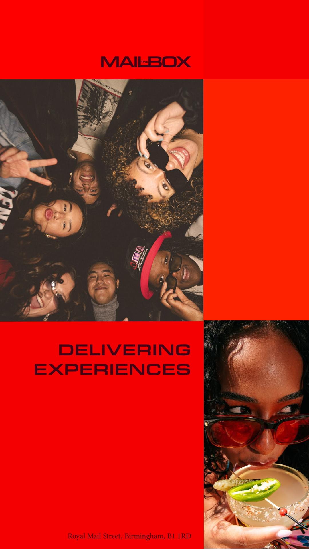
Situated in the heart of Birmingham, The Mailbox was reimagined as a brand that balances its rich postal heritage with its present-day role as a destination for retail, dining, culture and entertainment. Rather than delivering letters and parcels, it now delivers experiences.
Challenge: Despite being one of Birmingham's most recognisable destinations, The Mailbox lacked a distinctive identity that reflected both its history and its evolving role. The opportunity was to create a brand that could celebrate its heritage while uniting the diverse mix of experiences it brings together.
Insight: Historically, The Mailbox was a place of movement, where letters and parcels were collected, sorted and distributed across the city. That idea of connection became the foundation of the new identity, reframing the building as a place where experiences are now collected, connected and shared.
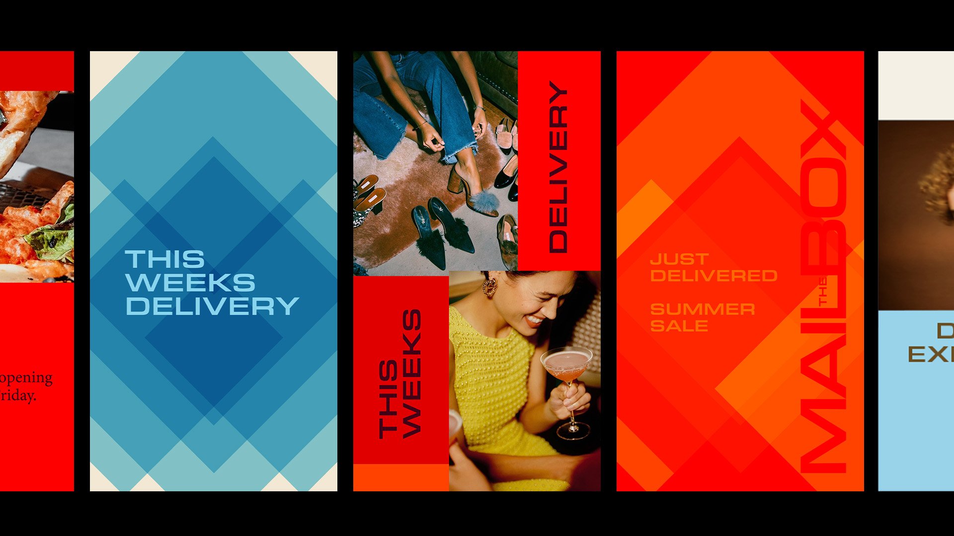
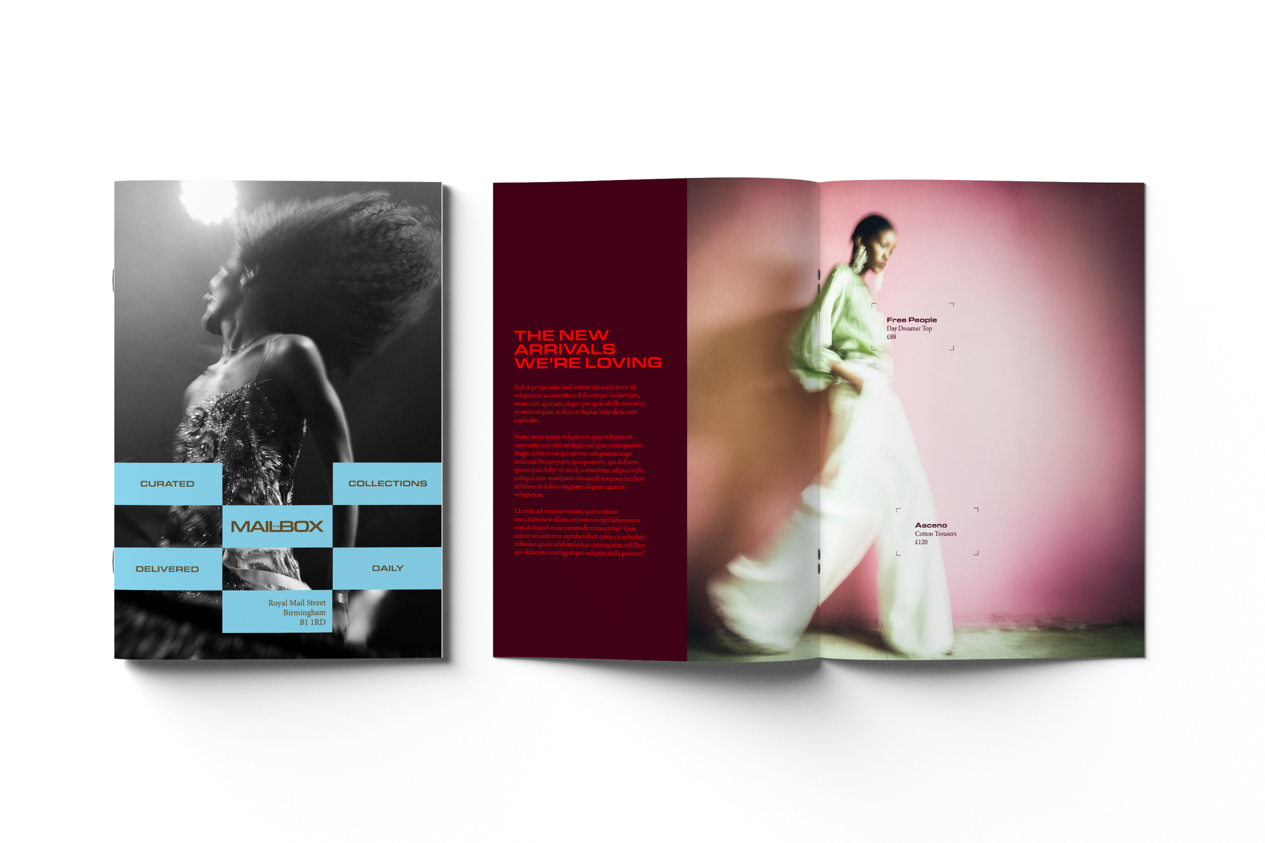
Strategy: Inspired by the modular structure of the original Royal Mail sorting shelves, the identity is built around a flexible system of square forms and grid structures. Rather than acting as decorative elements, these modules organise, frame and connect content across campaigns, communication, editorial, environmental graphics and digital applications, creating a scalable brand system rooted in the building's unique history.
Year
2026
Conceptual
Design
Visual Identity
Branding
Art Direction
Copy writing
Motion
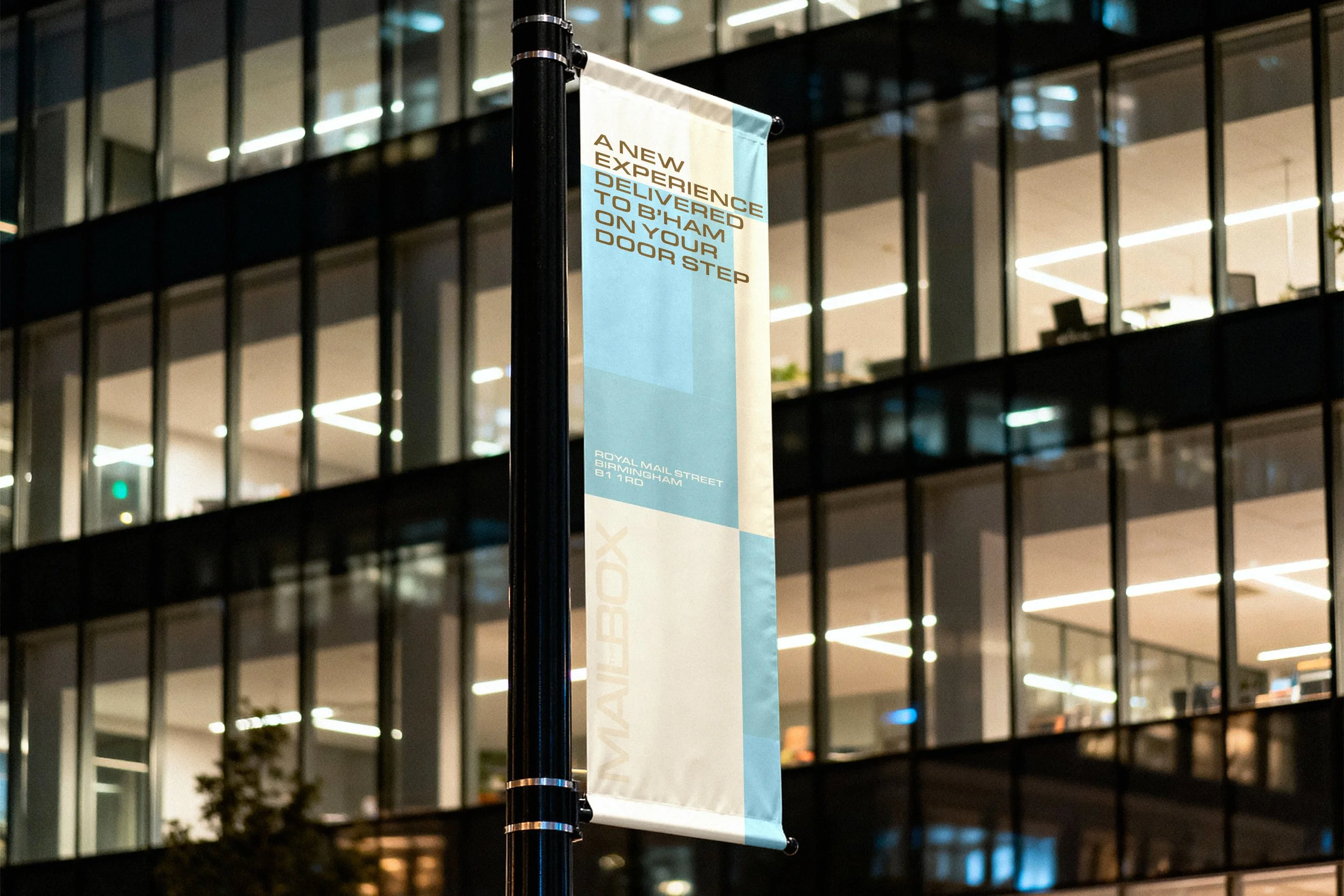
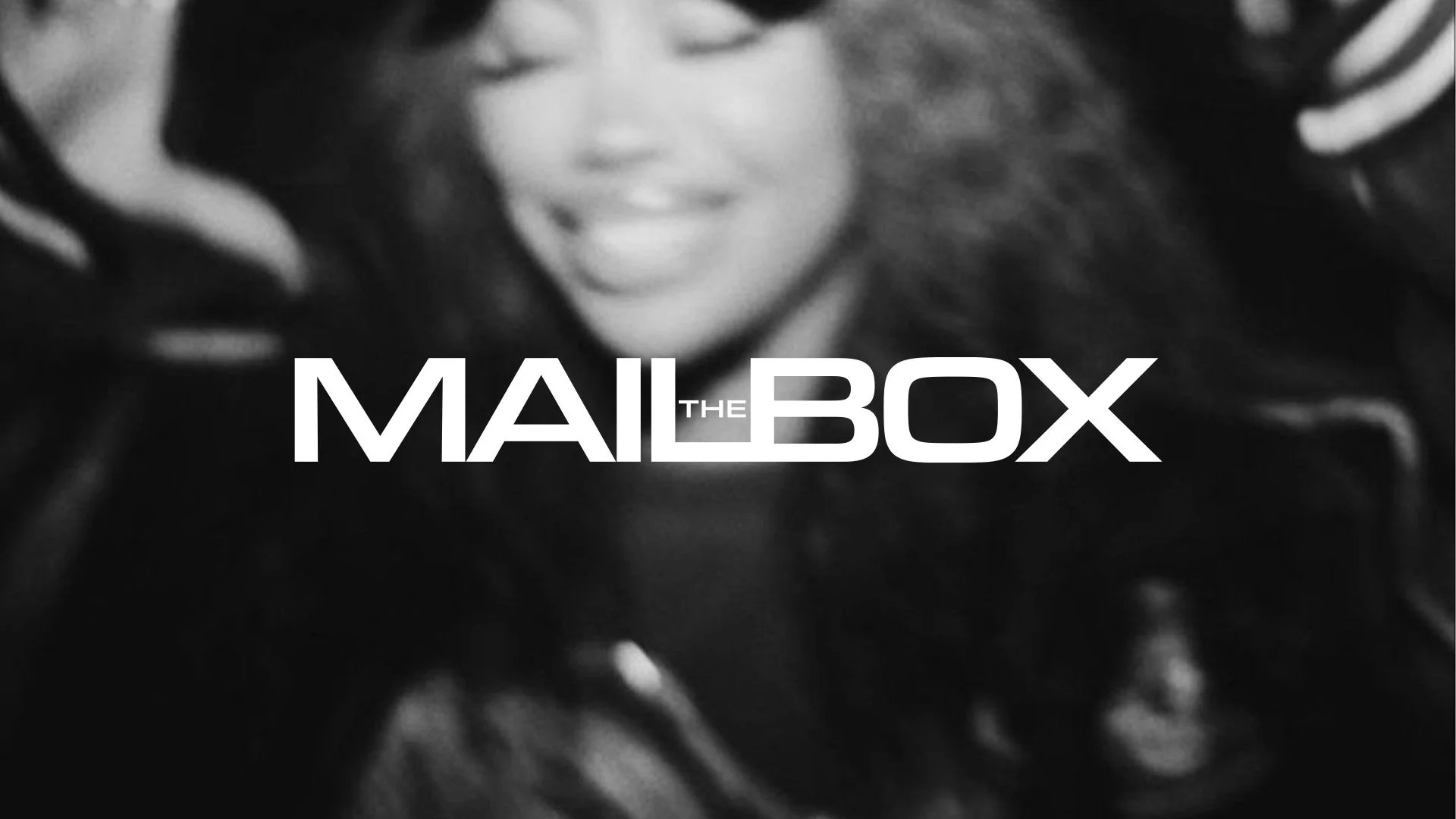
The identity is built around the idea of experiences being collected, connected and delivered across the city. Inspired by the modular structure of the original Royal Mail sorting shelves, square forms become the foundation of the visual language, creating a flexible framework that adapts across every touchpoint.

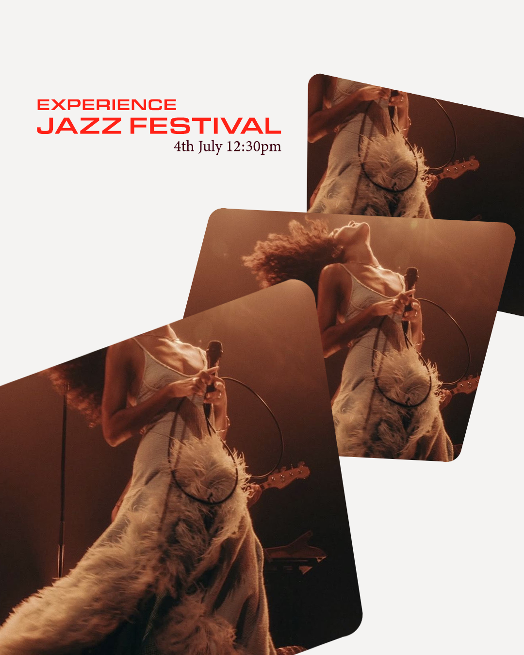
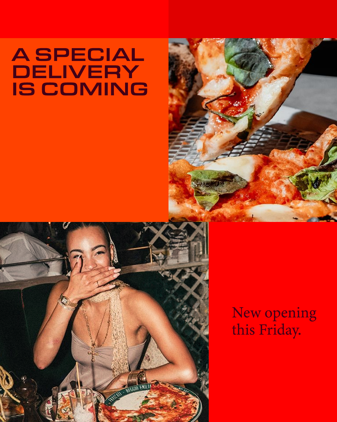
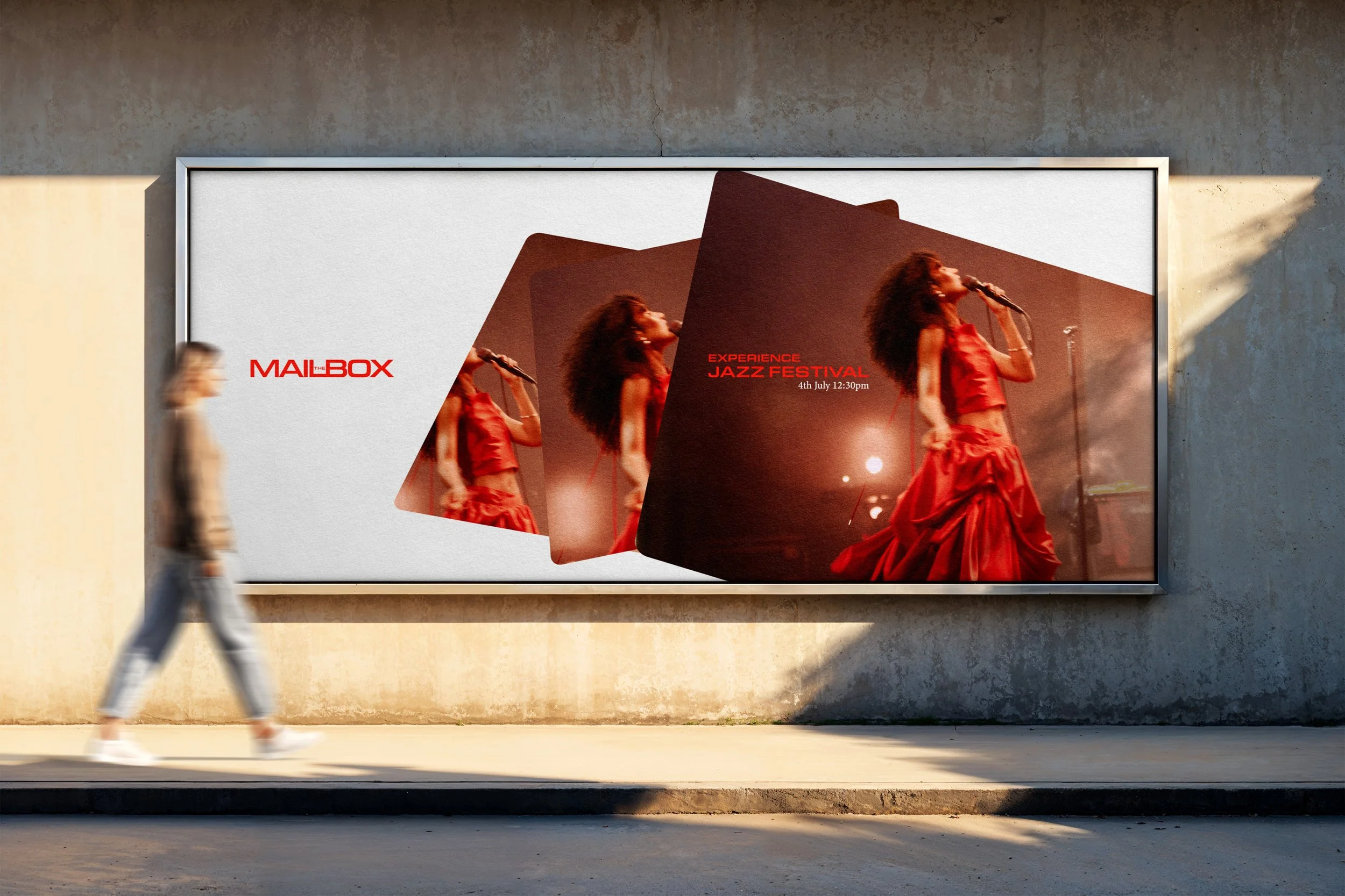
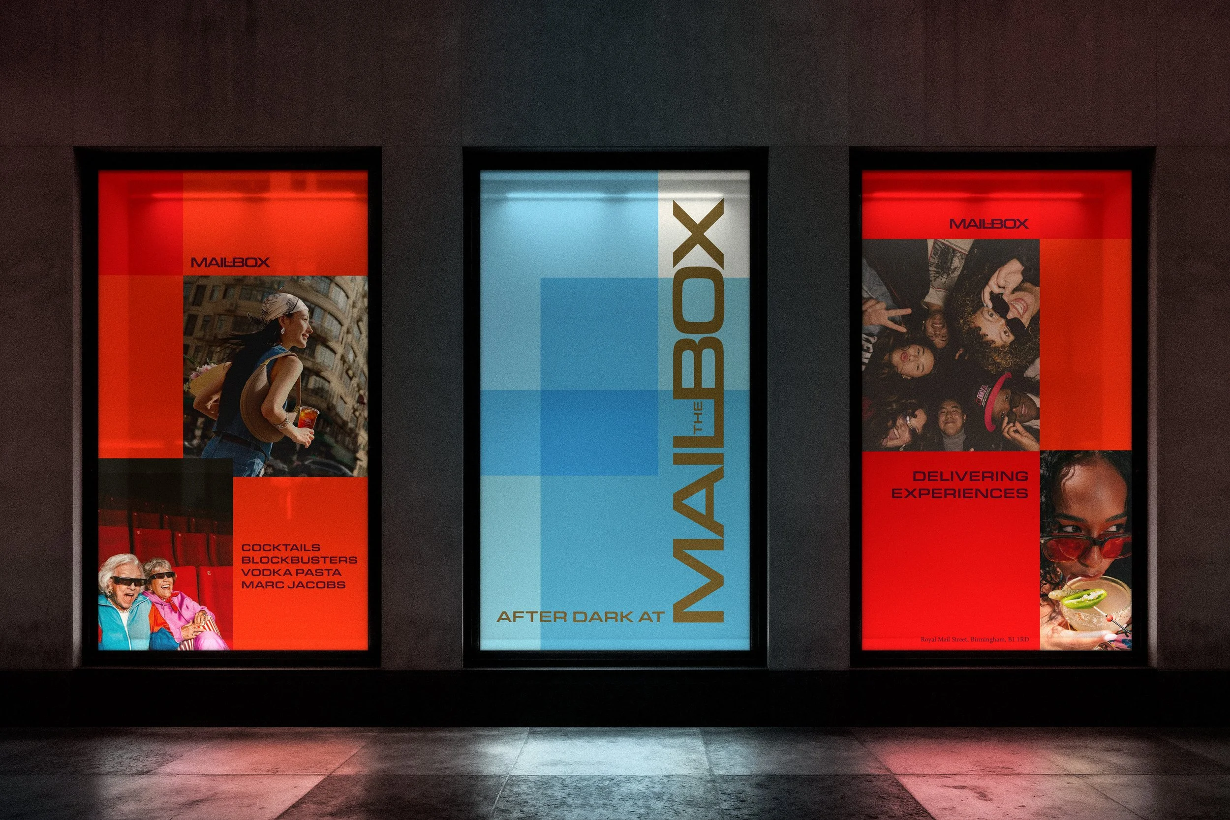
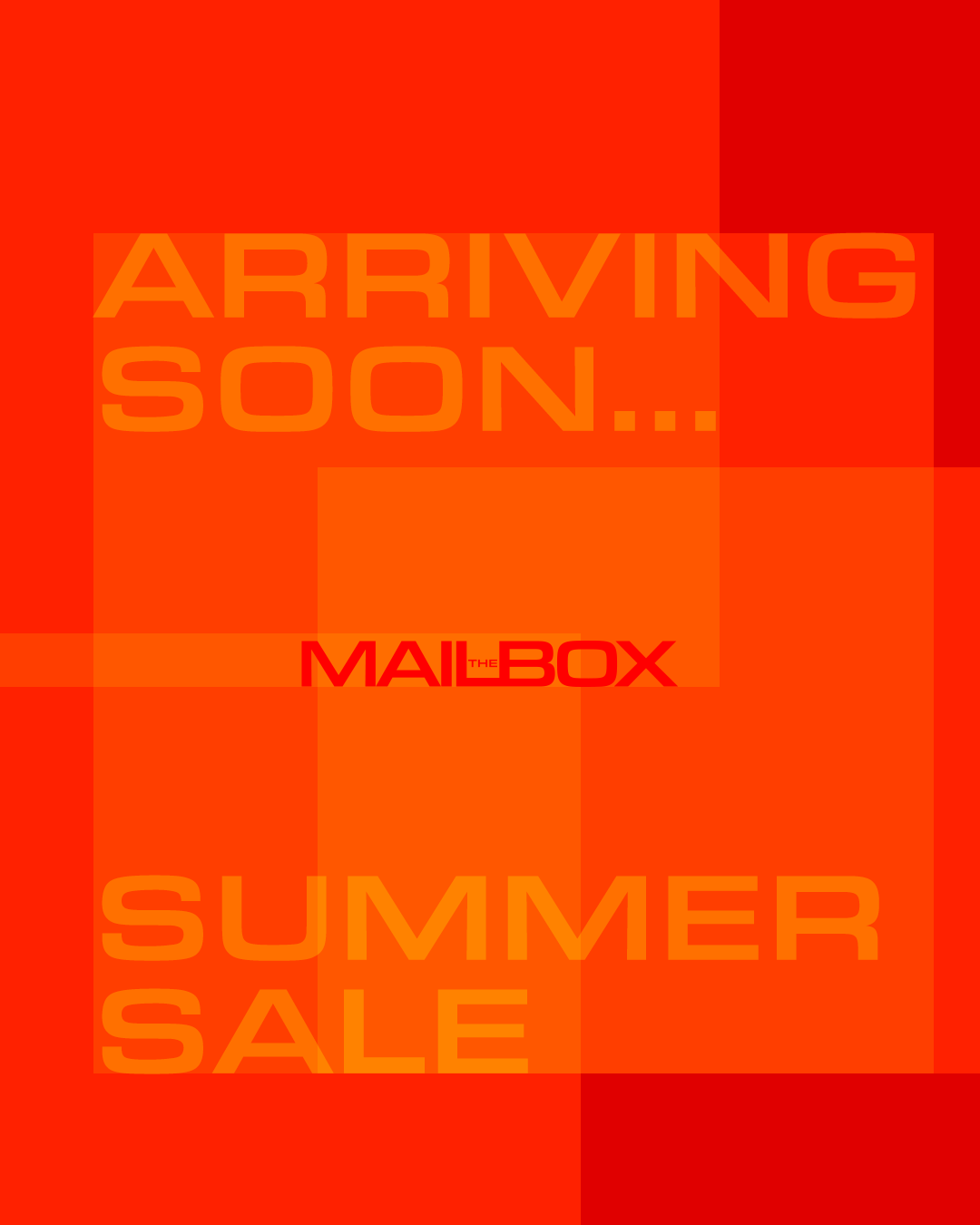
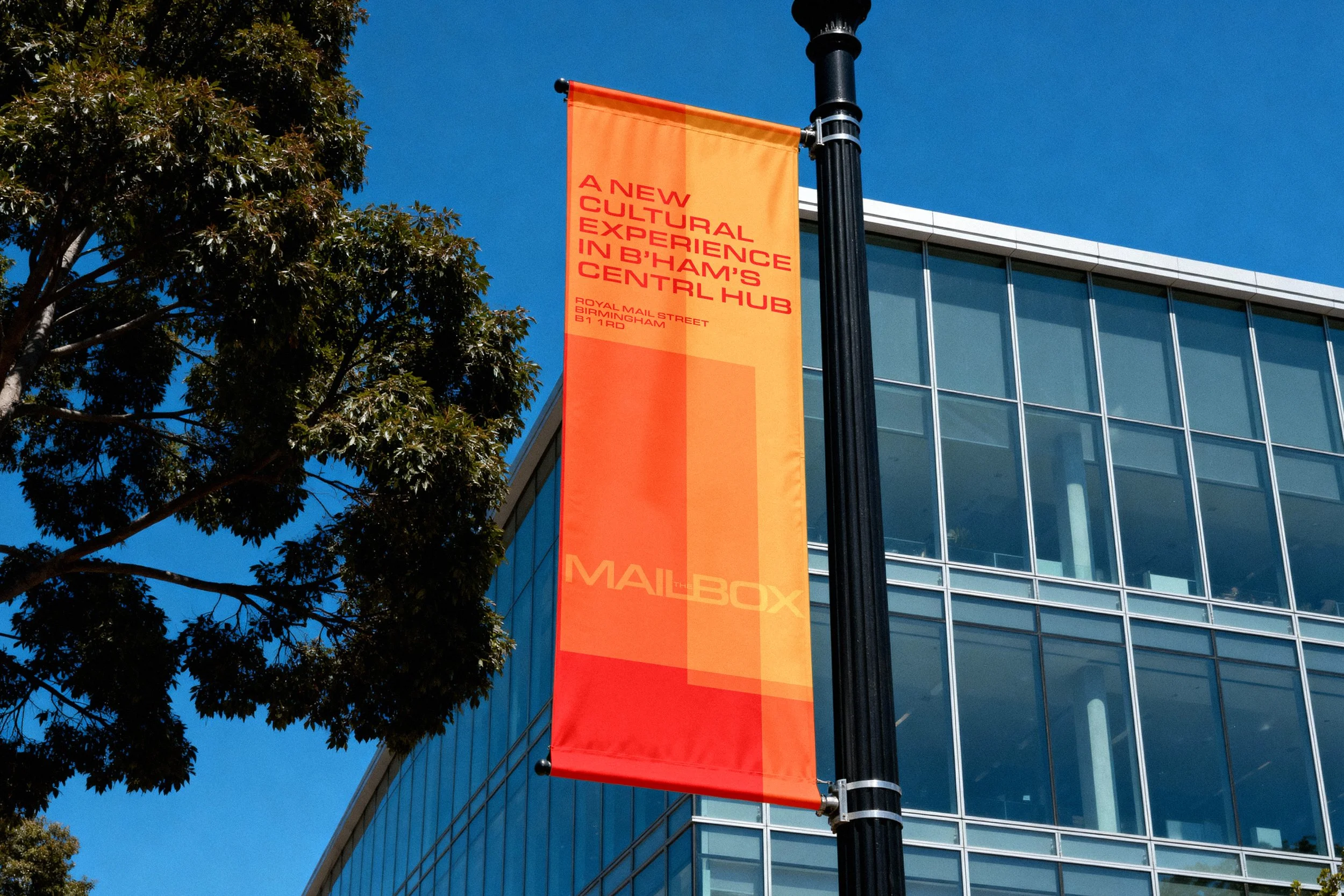
The campaign expression combines overlapping square modules with bold typography and geometric grid compositions to celebrate movement, discovery and the variety of experiences found within the destination. Together, these complementary systems create a cohesive identity that extends across campaigns, editorial, environmental graphics, digital applications and motion.
A warm, welcoming tone of voice subtly weaves The Mailbox's postal heritage into its messaging, ensuring every interaction feels connected to the building's history while reflecting its role as Birmingham's contemporary destination for culture, retail, dining and entertainment.

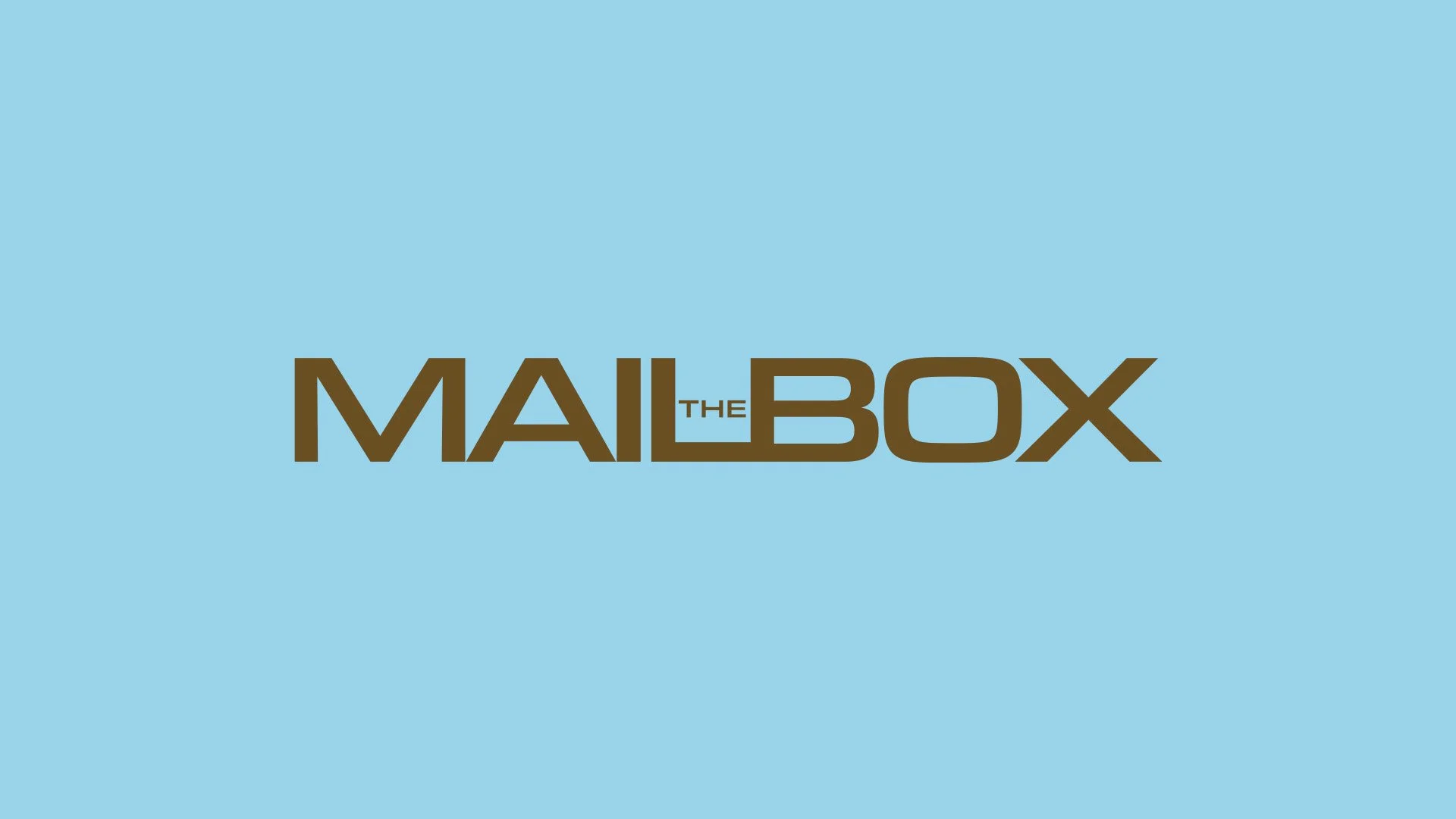

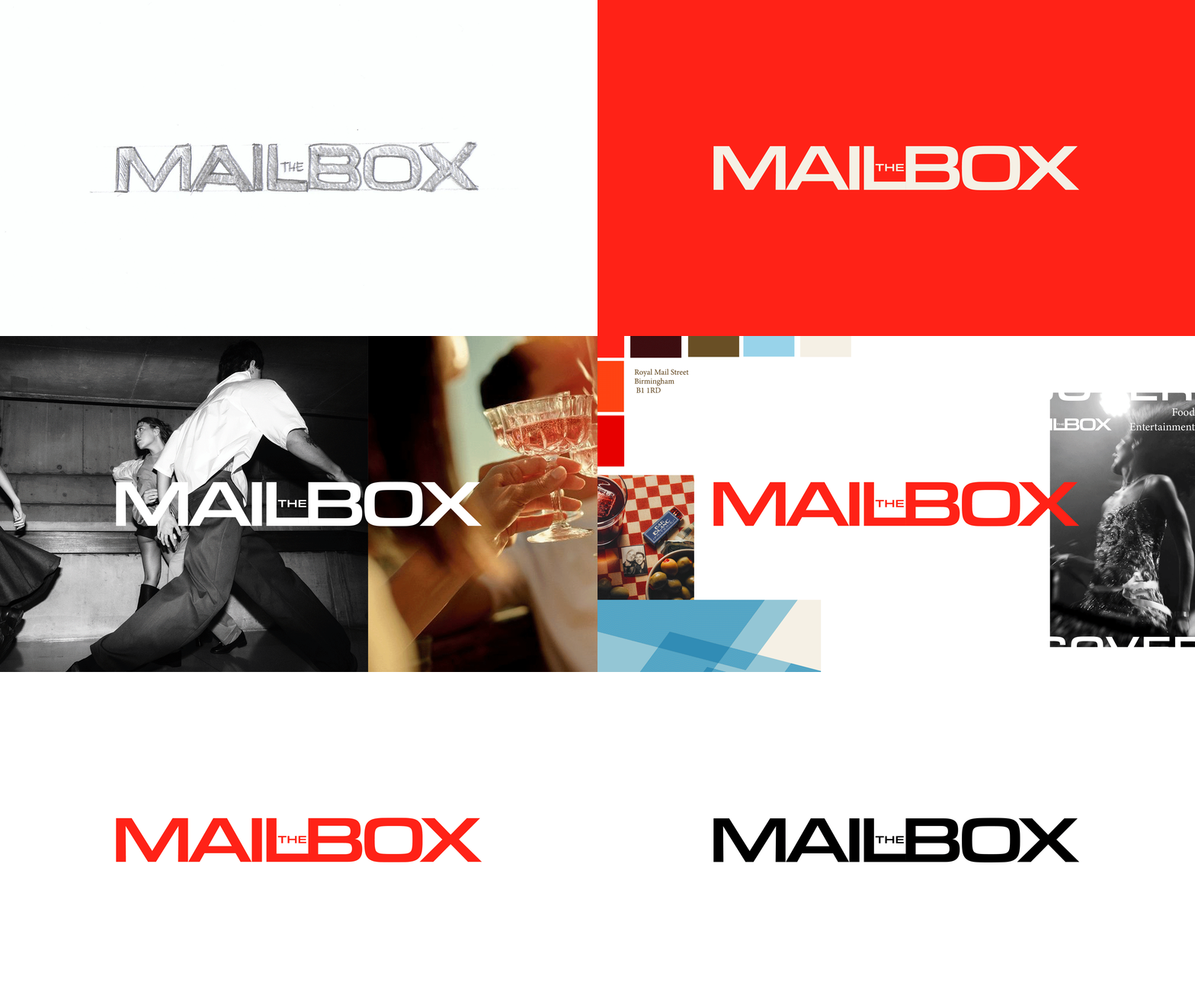
The wordmark has been refined using a bolder sans-serif, with subtle proportions inspired by the form of a traditional letter slot, strengthening the connection between The Mailbox's heritage and its contemporary identity.